@ApB so you want theming and more specifically a refreshed default theme?
Refreshed default. I don’t care about theming and neither i am too fond of the ambience stuff but it doesn’t annoy me either.
Its not about changing colours. As i said there are many elements of the os that feel dated.
1 Like
You SHOULD care. Because more popularity and a bigger user base will bring in -among other things- more usability (as in important apps, banking etc).
1 Like
Theming is more to me then just colors. Fonts, Icons and maybe some finer positioning.
Yeah. I don’t see much value in it TBH (ie start messing with default buttons etc). As long as the default becomes good enought its fine for me.
Sure I also prefer to have a good default, so I don’t have to mess with it.
hmm i am unsure what to think. mostly i think it is ok, does the job very well.
Better to have a design that stays intuitive and simple, than having to relearn with every update because the UX / design committee people have to justify their employment.
3 Likes
![]()
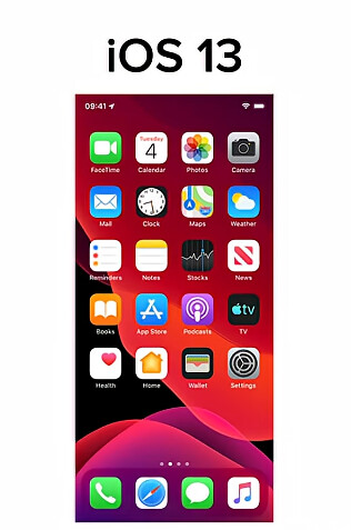
just reminding me iOS update from 18 to 26 or so to ‘modern’ style and users asking where the camera app goes even icon stays on same place ![]()
or that in modern way in camera app the photo preview is now cropped to circle so you barely can see what is on photo you just captured to decide if you should shoot again or not … … …
the android is total rubbish so i will not even mention how ugly is ![]()
the point of good OS is not how much blur and other effects are there… this way of UI updates has primary one target to slowdown your device and force you to get new one…
btw who define what is modern look? don’t we remember when MS releases win10 and file explorer was just white window without almost any lines/separators/borders. they said it is clean and modern style - but it was worse than win 3.11
also i don;t like the ‘modern’ icons where they are all single color outline symbols and you have to watch on them for ages and explore what is what …in the opposite with colored icons you can see in microsecond position of the icon you want to click on… like our tv provider now updated EPG and all tv stations in list having BW logo until you switch to that station you get colored logo, moving down in list and looking for some specific tv station is now pain and much slower as you must check the logo carefully instead of focusin for example for while+yellow (nat geographics)
well time to time some “smart and modern” designer try to improve things what are already fine, anyway he only makes UX worse so they mostly return back to colors (aka thunderbird folders, they were colored, then tried to make them all in same color, but quickly returned to different colors in default)
the point: do not change SF UI dramatically ![]() better focus on fixing bugs like Xperia 10V camera, improving things like (actually not working) Xmpp feature for media share, groups omemo … … … .. . . . . .
better focus on fixing bugs like Xperia 10V camera, improving things like (actually not working) Xmpp feature for media share, groups omemo … … … .. . . . . .
2 Likes
I must admit, I have also experienced the same. But I really don’t understand, what exactly makes SailfishOS look old? I mean, the icons don’t look like skeumorphism straight from old iPhones for example.
I also asked this question to this person who said to me my OS looks old and he also couldn’t really tell why he felt that way.
1 Like
If you read and quote that part of my message but you reply like this, I don’t think there’s any point to continue this conversation.
Reading is one thing, but understanding is another one apparently.
I’m not sure to be honest. Maybe it’s the style of icons that is similar to older Android or Symbian versions?
Is it because almost everything looks flat but not with current standards?
That’s for Jolla to understand i suppose. From my side, I just learned to cope with it and try to reply with some funny comeback lines ![]()
1 Like
Maybe it’s because they are not as “cool” 3D like Apple’s or the new Microsoft Office icons?
I really like the style of SailfishOS and with a dark background I think the design works very well.
The UX experience is quite bad if you have a bright wallpaper though because of the semi transparent background in most apps.
I think that there are things that need adjustments, just to name some.. The notification popup does not fit the rest, it looks like they forgot to style it.
In general I like the store, but for the longest time I thought all comments were 2+ years old because I did not realise the oldest once were on top. Things looked abandoned. Maybe it’s a skill issue.
3 Likes
Definitely agree on the notification pop-up, which doesn’t fit with the rest of the interface, and light ambiences needing more work to be useable in any situation. I keep trying them and keep moving back to the dark versions, even though I prefer light themes.
As for the store, most comments are in fact 2+ years old. Almost everything’s been happening outside of the store, on Storeman/OpenRepos, mostly because developers have been needing more than what’s currently allowed in the store. It’s understable but it does give new users a strange impression when they open ‘the’ store, and it’s a wasteland, especially compared to opening Storeman. But I’m sure Jolla’s trying to allow more things in time for the new phone, so the store can be livelier again and people won’t be required to immediately run to third party software sources.
Personally, I find all this vague criticism a bit annoying. It doesn’t help Jolla at all when there are no concrete examples of what exactly is wrong and how, or even any suggestions on how things should be fixed.
There was mention of fonts and icons. Okay, what exactly is wrong with them? Is this just subjective criticism again? If so, then just use theme packs and customise it to your liking, as you do on Android.
When it comes to UI elements, I haven’t seen any examples of what is wrong or outdated. Do we want something closer to AuroraOS?
I remember when SailfishOS arrived and some people complained about the transparent look of SailfishOS. Well, now iOS is moving in that direction too. Or take KDE — it has been getting tons of criticism for its UI/UX. Yes, some of it has been valid but most of it has been because it didn’t follow the current trend and doesn’t look like GNOME or Windows/macOS/Android.
Are there need for some tweaks? sure, but not a overhaul. I could see why some would be wanting something closer to what AuroraOS has done, but all this vague posting doesn’t help anyone.
6 Likes
I look at this rather as feedback rather than criticism. It should be ok to point out something needs tweaking, like the notifications or store order that I mentioned earlier to give a concrete example.
I am not a designer and can not come with a final design suggestion, but I am sure there are multiple designers that would love to work on SailfishOS if the developers are open for suggestions.
Finally, I do not think the OS needs an overhaul and I do not think anyone is saying that. But all software go through iterations and incremental updates to fix UX and UI issues that community flags.
1 Like
Providing feedback on something, without clear examples does not help to change things.
What I notice in the UI for SailfishOS is, that there are inconstencies in the GUI introduced by co-authoring with Aurora. The message received banner comes across as not in line with the overall philosophy with the bubble approach. The answering call GUI is changed and not following same paradigm of Sailfish OS design and I made a request for reverting that or at least make it optional.
There are inconsistencies in the GUI introduced over the course of 13 years of development, which don’t seem to adhere to the Sailfish OS design philosophy. If Jolla had the man-power to make things consistent throughout with swipe and pull actions that would be helpful. In some pages I have a “light bubble” at the top for navigation and swipe does not appear to work. In others I can only swipe.
Never the less the overall look and feel seems fine with me. Though there used to be a GUI design guideline, which appears to be sidelined.
@ApB it really would help the conversation if you can produce concrete examples in what you would like to see changed. What are your grievances. No generics, specific Jolla (or community) actionable items.
4 Likes
Hello, actually, when this topic was brought up, I didn’t think it would lead to this much discussion. But if we are going to talk about the downsides and examples — meaning in a concrete way — then let me express this.
First of all, Sailfish OS absolutely does not have a completely terrible interface or anything like that. In a real sense, even after all these years, it is still very good. When it comes to swipe, they are great masters in my opinion. Swipe is their area. You already proved this clearly back in the MeeGo days.
However, I realized that @pentti touched on a very good point in the sentence he wrote, even though he disagreed: “It just does not follow current design trends.” I think what he said actually summarizes the situation directly, briefly, and clearly.
The reason iOS has genuinely been successful in interface design up to this day is that it makes small changes little by little, without changing the main factors and core context, and still gives the user the feeling of something new.
For example, let me give Sailfish OS as an example. I am a new user. After updating to 5.1, a wallpaper called Ruska arrived, and I am using it right now because it literally refreshed my eyes. It felt like something new. Think of it like that.
Of course, in the iOS system, their team and teamwork are really huge, and maybe it may be difficult to keep up with them. With this many responsibilities, of course it may be hard to spare time for design. But I have been an iPhone user for many years, and the people who design it, as I said, almost never easily change the main factors and main purposes. They only give the feeling that the main purpose has evolved a little more, and leave it at that. This way, they constantly give the user the feeling that it has become innovative.
I do not know the Android side; I used it only for a very short time. But since I have used iOS for a long time, as I said, this is the situation.
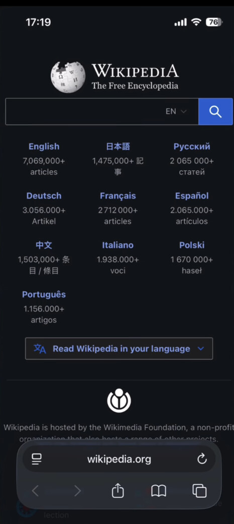
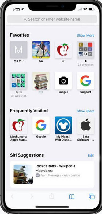
If Jolla’s possibilities allow it — I mean, if it is not possible, of course they should not tire themselves out this much for this work — but small changes could be made. For example, new interfaces could be brought to the web application. Even iOS Safari, over the years, although its main shape and appearance were not messed with too much, once had the search bar at the top, then it moved to the bottom, then they made it more transparent. In other words, they always try to make it feel like there is a change, like something new. If possible, I would like this to happen in Jolla Browser.
SAFARİ
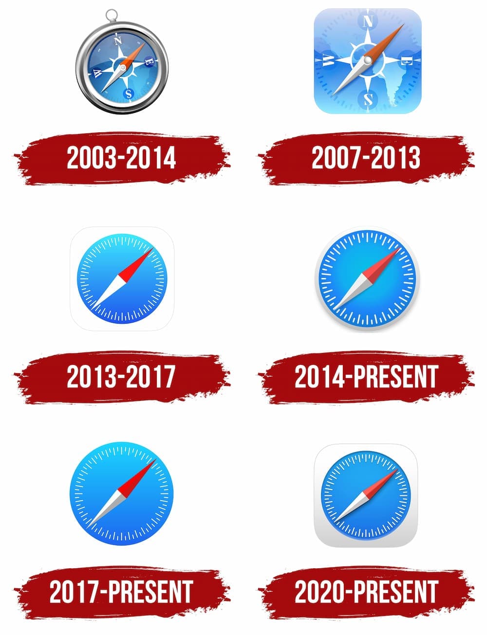
iOS UPDATE
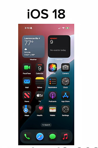
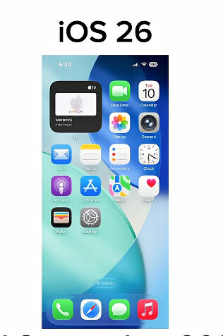
The main forms and purposes did not completely change; they were only pushed toward small evolutions.
3 Likes
The stores show the biggest differences for sure
1 Like
I think the only thing that I could agree with that could use a touch up is the homescreen and notification screen, but I dont really know how to fix them, but would be cool to see some concepts.
But the rest of the UI is amazing with its consistency and gestures
2 Likes
Just recently Google Play Store introduced search link button at the bottom of the screen, it opens search bar at the top of the screen. Earlier the search bar was at the top of the screen as default, when you opened Play Store. Now you have to go first to the bottom of the screen to click the search link button, and you could assume that it opens search bar at about the same position. But no, it opens at totally opposite part of the screen, at the top.
In my opinion the earlier system was much better and simplier.
This is just an example about what kind of change I do not want to see in Sailfish, just for the sake to feel that there is something new.
3 Likes