Absolutely agree with your statement, except for the Windows mobile UX. It was different but I used MeeGo & Maemo before and those were so much advanced at the time, 15-16 years ago when the mobile UX was still not set and an interesting topic. Thinking about the relationship of SailfishOS and the „original” gesture OS, namely MeeGo by Nokia and Intel which was sabotaged, copied etc. Please do not compare SailfishOS with Google-Android or Apple-iOS, it’s pointless. This duopoly is not innovating anymore and the thy won’t anymore. They achieved what they wanted. They earn their money with their users data, not UX competition period. If one wants to compare UX is the sense of how fresh it feels, please wait for thr new Jolla phone. I have had this in my hand, even though running the previous SFOS version 5.0.x.x. I do believe and hope SFOS 5.1.x.x will be further polished and some adaptation is done for tge upcoming Jolla phone. A fair comparison would be with latest Ubuntu touch (ubports), recent /e/OS and latest LineageOS and HarmonyOS. Those are still innovating, im particular UbuntuTouch & HarmonyOS but the Android derivatives have the issue to be built on Android open source and do feel like the Google-Android, which the broad masses see generally as the ‘state-of-the-art’. However some unique features I can see in /e/OS, LOS etc. beeing different but still not as smooth and nice to use with natural gestures likr SFOS..If I take the privacy aspects aside, I still prefer using SFOS over any other system that I used. It’s not outdated, absolutely not.
How is it fair comparison with 2 Android custom roms that you are excluding from the Android umbrella like they’re not 100% Android, a Chinese Android(?) fork that copies iOS and UT that its UI felt like alpha 13 years ago and it still is just as unpolished?
In my book the first comparison (if there needs to be one, not sure why though) should be with the predecessor and there’s nothing that I can think at the top of my head that I like more on sfos compared to MeeGo. If anything it’s the other way around.
If it ain’t broke, don’t fix it.
Why bother with technology at all then? I mean the landline worked fine, not broken…
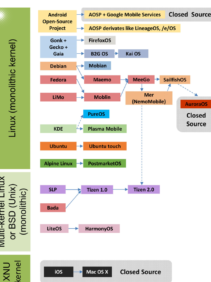
I got your point and sorry if I mixed it up regarding HarmonyOS. It seems to be a mix of AOSP and OpenHarmony and is trying to give users the illusion of iOS UX im some way. Some years ago, I made this figure (see below) but it’s not upto date anymore.
Regarding MeeGo, indeed this was the origin of SFOS and Nokia spent many millions (hundred) of Euro’s in the development of it. I’m glad it wasn’t wasted and SFOS is inheriting some of it..
Of course UI design is very much subjective but for me no need of scrap and build. It’s unique, beautiful, yet not seem to be outdated. But perhaps it’s nice to have modern icon sets (yes it’s also subjective).
It’s subjective, for sure. But I never understood why the page design (card design) of the first versions was kept. In the first versions of SailfishOS, there was a lock screen that was its own card, there was a card with quick toggles, and one with notifications (or were they combined?). And—last but not least—the app drawer, also as its own card. And that’s exactly how it felt—like you were moving cards around. You could even answer or reject a phone call by swiping the card up or down. The concept was easy to use, and now everything is starting to resemble the controls of other systems. It would be nice to have a choice…
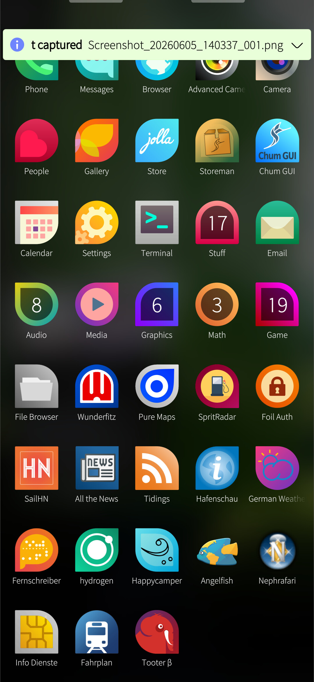
The app drawer, icons, font and notification popups are the most bizarre elements in sfos in my opinion.
The font style, size, position and separation is not easy in the eyes. That is a simple fix with some optional additions in settings of course but still big of an improvement. This also shows in the keyboard for me.
The notification popups look completely out of place with the rest of the styling in silica. You have to wait for scrolling texts to see what it’s saying and you can’t just see everything with the appropriate transparency like it should and then swipe it up like you would expect (aiming and swiping 5 pixels in height right or left is the epitome of inconvenience for usability).
Icon theming is all over the place with a dozen different thematic icon frames or completely random icons from third party apps. That look very inconsistent and not appealing at all.
Example from the other thread. Every color is a different icon style and depending on the third party apps you have you can end up with even more.
And the last thing is the app drawer. It looks static.
There is no continuous scrolling, no other animations, and it’s paged vertically.
No mater how you setup your layout, you have to constantly add apps bundled at the bottom part of each page to be able to reach them and make sure you have more apps above them. If it was scrollable every single app would have been reachable except the first few rows. I would prefer to have widgets there as an example like every other phone I have instead of doing finger acrobatics, or swiping slowly to open the app drawer and stop it halfway.
When people say sfos needs a redesign this is what they mean.
Not to change what makes sfos, well, sfos.
It triggered me that I hope there’s an option to order the apps alphabetical indeed.
s/old/distinguished/g … I get that all the time.
I have to admit I like this, though I think a scrolling option might be ok. I hate it in android where you basically must use search. Am I the only one that likes to organize with folders? I have a row in the middle I can reach with a thumb …
A folder view EDIT I assume this is what you don’t like since the icons are at the top?
I did attempt to start doing thematic unity of icons, more or less poorly. I do agree it would be nice to get better icons (german weather service badly needs a better icon). On the otherhand, if the icons are recognizable, that helps.
Folders are fine, but I could never get used to opening my most commonly used apps from them. I don’t know if it’s the extra taps, the need to open multiple folders per session or something like that. I always end up using them for mostly unused apps that I need rarely, and as spacers for other apps I need to be at the bottom.
But the biggest problem with folders as you’ve showed already is that it’s not a small window expanding around the area the folder is positioned, but it’s another page that sends the icons at the top.
But overall when I talk about design changes these are the things that I’m referring to. Small, meaningful adjustments, preferably optional wherever applicable that just make using the device easier without changing anything drastically.
Yes it’s true that the positioning at the top is a pita if you’re using your thumbs. Opening from the bottom and anchoring to the bottom would be nice or as you suggest ‘expanding’ around the position your finger/thumb is at …
Sounds patchable.
LauncherFolder contains a LauncherGrid which is a GridView.
Should be possible to anchor at the bottom (or even centered on the last touch coordinates), and/or use a different verticalLayout for arranging icons.
(but: it has more functionality than just display. Drag and drop, icon rearrangement, etc. Editing will be a bit more involved than is obvious)
I’m not sure I completely understand what you mean here. The icon shapes are part of the visual design language. They provide choice where it makes sense to app developers while restricting shapes to a consistent set.
In my opinion, this is often put to good use, where the shape emphasizes the icon. Messages and Email for example. In some other cases the shape seems arbitrary, but it still servers to make the app distinguishable from other apps.
Maybe there should be a rule about using the square shape unless the shapes adds meaning? I’m not sure how that would work in practice, though.
Agreed. On the other hand, this1 is where apps present a “brand” - it’s sort of the point to set it apart from other apps/icons. How many colours should be allowed in the palette? And if these change over time to keep the OS feeling “up to date”, how should we deal with 3rd party apps?
1I think icons and covers are good places to present an app “brand”.
I put my most used apps at the top of the first page, which keeps them within reach since I only pull up the first few rows of apps.
I do agree on folders, though, since these always open fully and aligned to the top of the screen. (I still use folders.)
What animations or other kind of “dynamic” look do you suggest?
(So far, I have only seen someone request animated icons, which I would absolutely hate. I don’t want to see a casino in the app drawer.)
One thing that has bugged me is the install dialog, how the content of the button is all they way on top of the button (the + and “install” text). Some of the things should have been caught during QA, it’s small things that make it not as polished as it should be.
Edit: Is there a place to flag these kind of things? I guess it is some kind of bug report
I think centered on the last touch would be great. Editing could be done in edit mode, which could revert the folder to the standard format we currently have.
We have multiple sailfish looking icon designs and I’m confided that one of them would be more than enough (take as an example poetasters folder screenshot above) to keep the same identity and uniformity.
Other platforms (current and extinct) were able to have all the apps framed in specific shapes and I didn’t see anyone complaining that can’t be differentiated.
Simple example from MeeGo. It’s just a “squircle” shape that most Android launchers offer to this day. Most would allow you to change the shape as well.
Regarding the apps page, as i explained it just needs continuous scrolling in my opinion to be more reachable (with scrolling you can stop wherever you want, not with static page switch) and I guess a typical rubber banding at the bottom.
Just like Sailfish OS, then. All good, I suppose.
Using shape + content rather than just content makes it easier to distinguish.
I have yet to see a scrolling window on Sailfish where I can scroll so that the first two lines are displayed at the bottom.
If we’re still talking about the app drawer, I can stop wherever I want. As I told you above, I use that to keep the first few rows within reach. I use it several times a day. Please don’t reiterate misinformation.
If you are using a translator I would recommend trying another one. No one with basic reasoning skills that is able to successfully use the forum, read and type should come down to this conclusions, so I want to believe there’s a huge language barrier and a very bad translator involved.
If not, I’m sorry but I can’t help.
Cheers!