All the screenshots make it obvious that SFOS is in desperate need of a redesign/refresh.
It looks like it is from 2009.
Hope jolla gets to it sooner than later.
All the screenshots make it obvious that SFOS is in desperate need of a redesign/refresh.
It looks like it is from 2009.
Hope jolla gets to it sooner than later.
Really? I think it still looks quite nice. And if I look at UI which is from 2009, I can’t really understand how you come to that conclusion
no it literally does not, that’s just your personal, incorrect, opinion
It looks quite modern indeed
I second that. Of cause taste is very individual, but I really love the look and feel of SFOS. That is still light years ahead of the ugly Android or even more ugly iOS look and feel
I’m curious every time I hear that.
While heavily subjective, can you pinpoint specific UI elements that are ugly in latest Android and iOS and beautiful in sfos?
Personally like sfos for multiple reasons, but it is a fact that it’s stuck in a different era since we didn’t get UI and graphical updates for a dozen years.
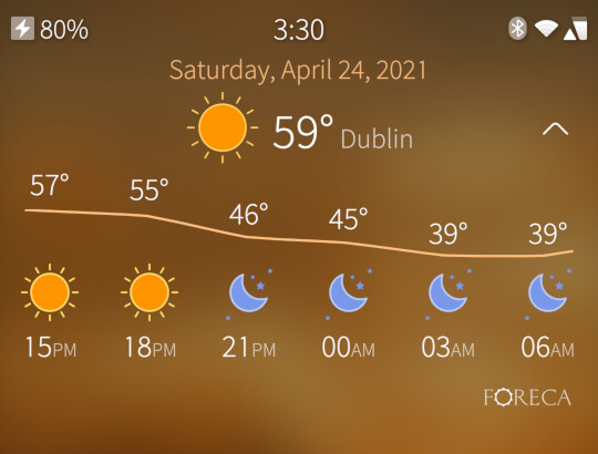
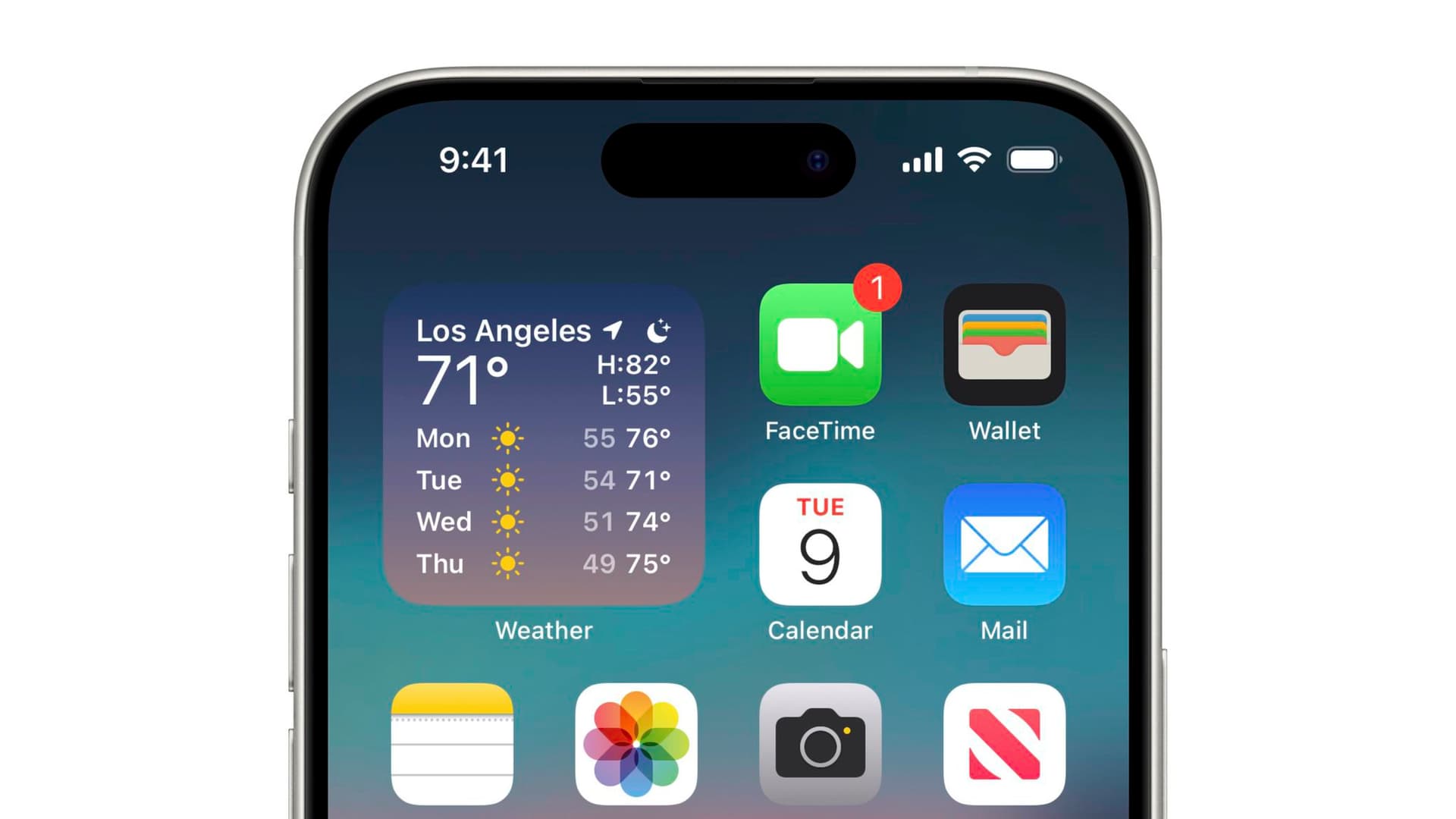
WEATHER
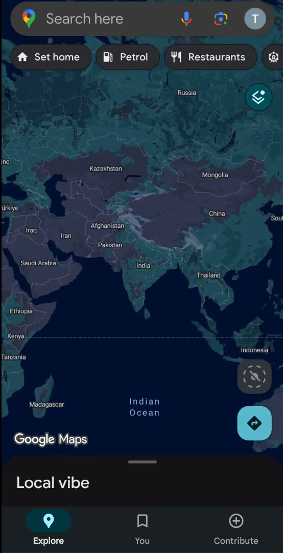
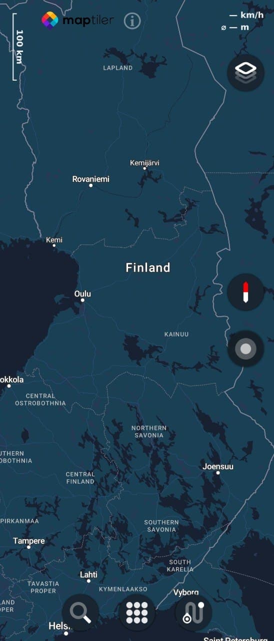
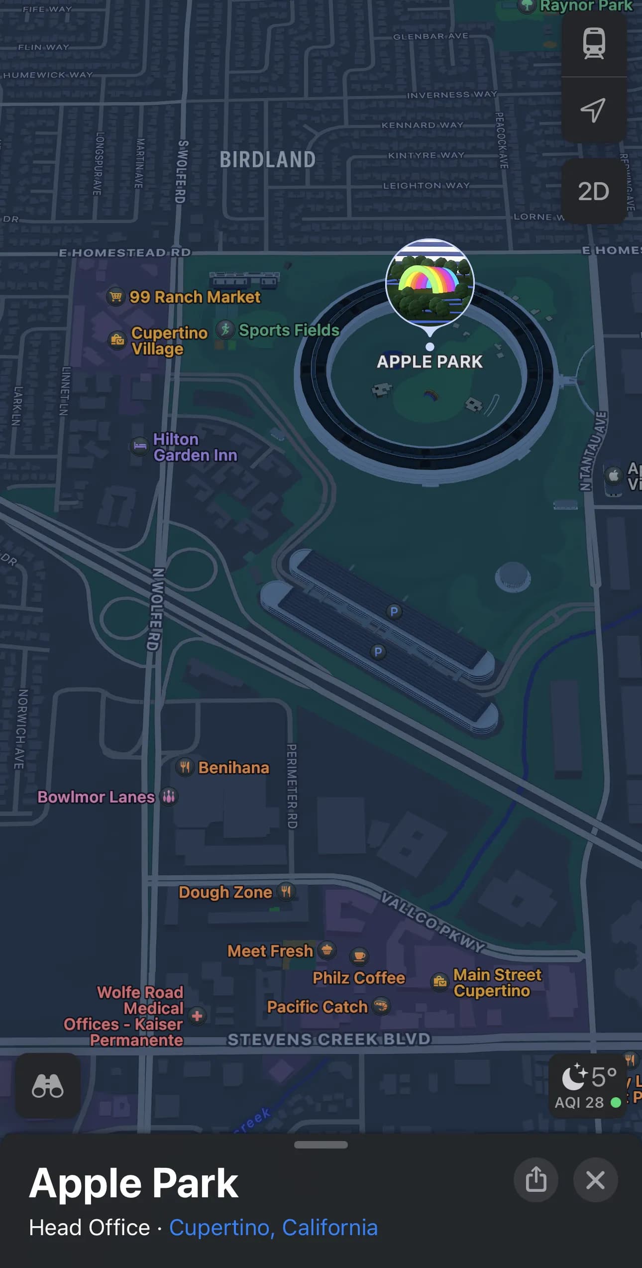
MAPS
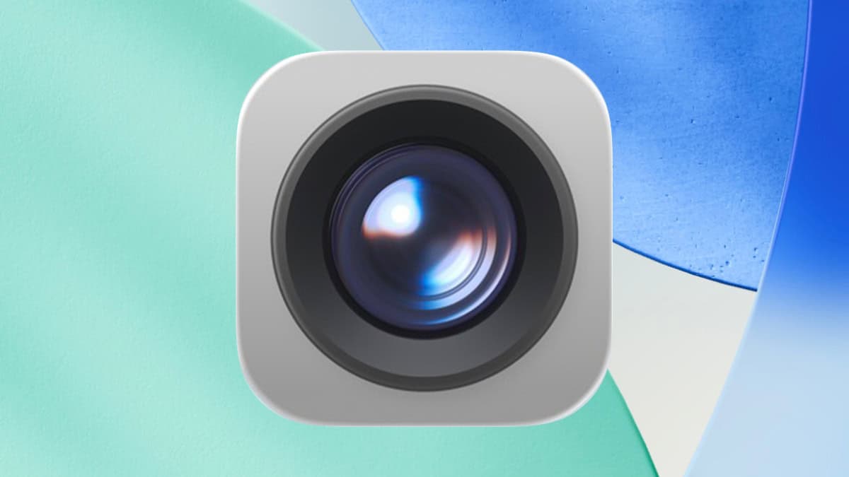
CAMERA
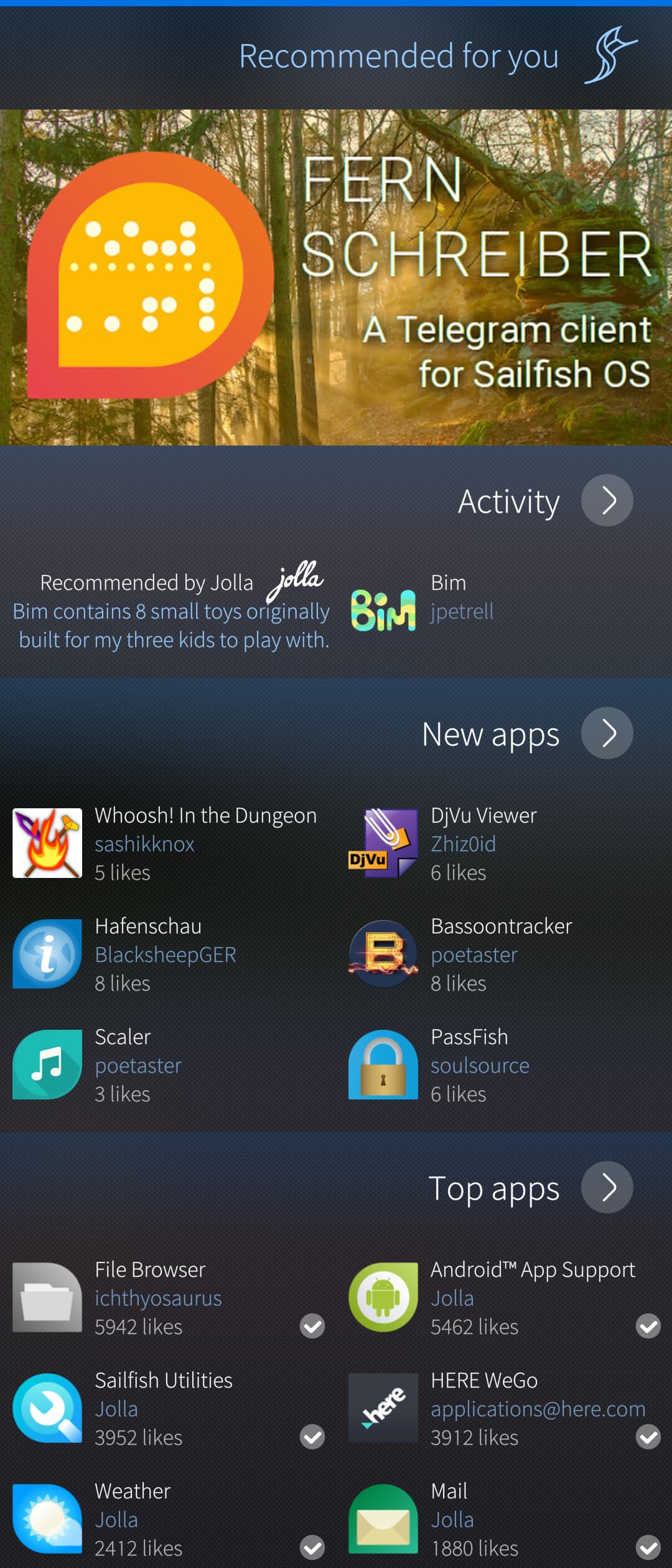
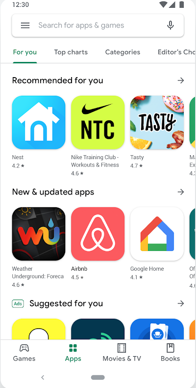
STORE
So, in my opinion, Android is worse, and it has always been bad. Android has never truly succeeded when it comes to user interface. If it had, many Android phone brands today wouldn’t be bringing their own interfaces.
The photos I sent are just my own opinion. To me, Jolla showed a more successful approach here. If we’re going to list its weak points, of course there are an insanely large number of them in the interface, but compared to Android’s UI, I think Jolla is quite a lot more successful. I’m sure that if it were given more attention, it would become even better. Their purpose represents being different.
Apple had been successful in user interface for years, but after the latest iOS 26 version, people started to dislike it. Even I didn’t like it.
What is your opinion in terms of comparison and user interface?
Also, strong disagree. Android and Ios are bland, full of dark patterns and unfathomable depths of menu diving. Sailfish is sane.
Its not about menu diving nor about patterns. (even thought there are stuff we can fix there also) Its about the looks.
Its the looks of the interface that is dated. If people don’t see it i cant do much. And its not like it aged gracefully.
Your post makes me wonder why we no longer have down votes. 
I really don’t understand what you think / see that is ‘dated’ … everything on the web and in apps has been RACING to some medium where it all looks the same. It has all the aesthetic qualities of a committee decision in a grey boardroom with bad filter coffee. Sailfish looks nice. Feels good.
I miss Windows 10 Mobile in that comparison. That and SFOS had ben the best UIs I used so far. Especially Apple is something I cant even handle anymore, so much unintuitive features. Android has at least the option to use another launcher…
I was quite partial to the BlackBerry 10 line of phones (Z10 in particular). The interface was intuitive and easy to navigate, right up there with SfOS.
You will probably understand it when jolla decides to hire a designer to fix things.
And i am sure that if he does a good job all the fanboys (of the unhealthy type of fanboism) will also cheer his work.
Lets hope they don’t. The current design is what makes Sailfish unique and a real alternative to the American indoctrination and the brainwashing that is happening globally. You seem to have swallowed the bait whole.
It is not some specific item to point to, it is the overall concept. I enjoy the unified look and feel of SFOS and the ambiences concept. All native apps follow a consistent theme.
In my ambience the UX has a glow, which is very pleasing and I was unable to replicate that outside of SFOS.
The overall look and feel of an iOS device I had to use with my previous employer was for me the ugliest UX. But this is just my personal personal preference…
Yes, that was an easy to navigate mobile OS, my beloved passport
Agree. One of best UIs ever. I still have Z10, and 2 Pasports. But they are useles now.
Hmmm. I spent 8 years doing print book and magazine design. Including some award winners. When I switched to software, the first big web project I made (for Mercedes Benz) won a ‘Cyber Lion’ in Cannes. So, I’m loathe to just take that toss away remark lightly. Either say something with substance or stop insulting my intelligence.
If you’ve done work in the design field and SFOS doesn’t look dated to you i can say anything honestly.
Since your last sentence is grammatically incomplete, I will just conclude that you don’t really care about the substance of things as they are or they appear.
EDIT: sorry, that was rude.
Without going into my biography at length, the first important designer to influence my own practice was Kurt Schwitters. Kurt Schwitters - Wikipedia Every decade and most continents have furnished the one or the other what is now called a ‘seminal’ designer who I tried to emulate or at the very least comprehend. I’m partial to the 60s in America. I did a lot of 90s post-post de-constructivist stuff as a young man. Since about 2000 I have seen nothing of merit emerge in Design (well, maybe in industrial design, but not in graphic design).