This just reminds me of how some windows users are complaining that Linux Desktop is not giving them the same experience like windows
16 Likes
No half any edges for anything please.
The top menu working inside apps is a bad enough concession to Android users already. There is absolutely no reason to have in-app top menu or app drawer - going to the home screen takes fractions of a second (and there they are whole-surface swipes!).
4 Likes
Well, I guess the idea of it being customizable would be just that. That I could customize it to do what I wanted.
Probably First impressions - #6 by rla88 also check the app nephros suggests in next post as the 96 value was 10II specific, but might help if you use a lot of android apps that use in-app swipes and they collide with sfos ones
3 Likes
Do other systems (with much more manpower in the background) offer that?!?
5 Likes
You “can” customize that to a big extent by learning qml, tinkering with some files openly accessible to you (after activating developer mode and being root). But dare to not break it, happened more than once to me, latest with C2 
I guess all of your demands could be done as you wish. But giving this as options would be he’ll for Jolla to take care of.
There is patchmanager and it’s web catalog, did you notice that?
And yes, some of your points regarding AAS are valid  (but then …)
But above -we, as user- have the power to change it as we wish, it is in our hands…
6 Likes
Billions of flies cannot be wrong, right?
This is a niche.
4 Likes
And please do not feel criticized, at all.
The situation with the store(s) ,
- harbour, official Jolla
- chum, community driven/Jolla hosted, open source, source code available
- openrepos community driven/hosted, open source, only assets, no sources
is not good!
But is is as it is.
9 Likes
In that regard i’m with Apple. There is one best way - that should be it.
Also imaginge the testing and bug exposure explosion of having such central things configurable officially…
4 Likes
Hello and welcome to the dark side  first of all thank you sharing your honest feedback. Always good thing, even if I for example don’t agree with everything.
UI thing will most likely get much better soon when muscle memory kicks in. Took maybe week or so for me and after I just loved it! The video stutter problem is currently reported to be affecting Jolla phone so expect to have that fixed Soon^TM
10 Likes
I guess you can swap it so that side swipe opens the app drawer. This is a little bit how it functions on iOS and earlier Android versions (now it is an app drawer swipe from the middle and up on stock Android).
I’ve been testing this for a week or two now, had never heard it before. After figuring out the long swipe, this is very useful gesture and I’d love to see this being included in the gestures menu by default.
9 Likes
Didn’t they miss the crashes with blue screens? 
3 Likes
GPS height value is almost meaningless on it’s own, and should only be used to measure relative height changes. The height reported by GPS is relative to the surface of an idealised 3D ellipsoid that only roughly approximates the shape of the Earth (ignoring hills & most mountains). I am currently 100m above ground, supposedly, using my Android phone.
1 Like
Isn’t the top 20-25% of the front page of the Jolla Store dedicated to recommendations carousel changing banners for different apps? You can also change the sorting of apps between newest/most rated/most downloaded.
Or the Android app has flagged it’s current view as secure, and SFOS can’t snap a screenshot of it to show you on the cover.
As far as I know, Browser is the only Jolla app, that doesn’t fully follow their own swipes paradigm, and this is one of the most asked features for the browser after engine updates.
2 Likes
No, actually, this is a subject that could be discussed at length. As someone who has been an iPhone user for many years, to speak frankly, SFOS has the advantage over the iPhone in that, for example, you can close an application with a single swipe, whereas on the iPhone it takes two gestures.
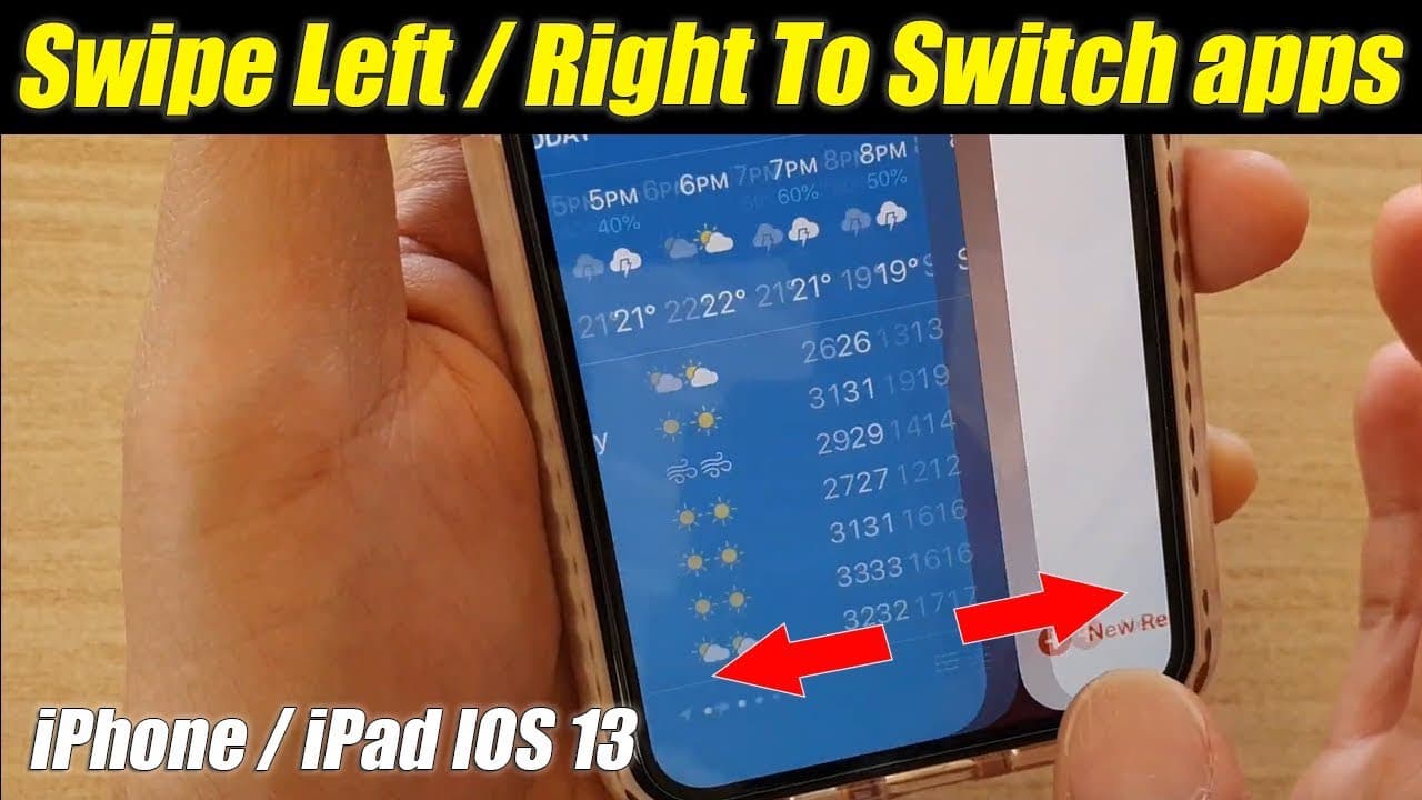
But now we’re talking about switching between applications. On the iPhone, you can swipe across the thin bar at the bottom and move between applications with a single finger gesture, but unfortunately you can’t do that on SFOS.
In short, if we’re going to discuss the actual overall problem here, there are areas where SFOS is far superior. Whoever designed it back then thought things through very well, but they failed to consider one thing: how efficient is it when used with one hand?
To be completely honest, on the iPhone I can perform many functions very easily with one finger because so many controls are located at the bottom. But what about SFOS? Think about it carefully.
2 Likes
31 posts were split to a new topic: Widgets opinions
I think what @Podginator meant was that those recommendations aren’t based on similar apps you’ve already installed, they’re just general recommendations by Jolla and therefore somewhat less likely to be things you’d also want to install. But whether that’s really something you’d want on a phone that markets itself towards privacy-minded people is debatable. It has merit when you’re explicitly searching for new apps, but on Android and iOS, the purpose of those recommendations is predatory: to make people install a bunch of things they don’t need, to increase their screen time, increase the amount of ads they can sell and increase the amount of data they can extract from the user.
But, it’s understandable that a new user has no idea where to look or what to look for, and the spartan functionality of all three software sources (Store, Storeman/OpenRepos and Chum) can make the search for apps feel overwhelming. https://sailfishos.app lets you find native equivalents to Android apps, but a new user isn’t necessarily only looking for replacements for specific apps.
1 Like
THIS HAS GONE TOO FAR!
Stop this ongoing nonsense. You BOTH have turned a thread for reviewing a phone into a useless back-and-forth over nothing (ABSOLUTELY NOTHING!).
If you still “feel” the need to argue, just send private messages to one another and spare us your childish bickering.
And @PolatBirdal, you don’t have to share every single thought that comes to mind, you know. You’re like a dog with a bone. Please fight the urge to reply needlessly and overshare (not specific to this thread). Also, fight the urge to reply to this comment.
37 Likes
Percentage of people that had jumped on Purism with PureOS, would be interesting to compare. And how many of them will ditch it since the new Jolla is only about 30% of the cost of a Purim phone.