I MENTION IOS AND ANDROID AS EXAMPLES, JESUS FUCKING CHRIST
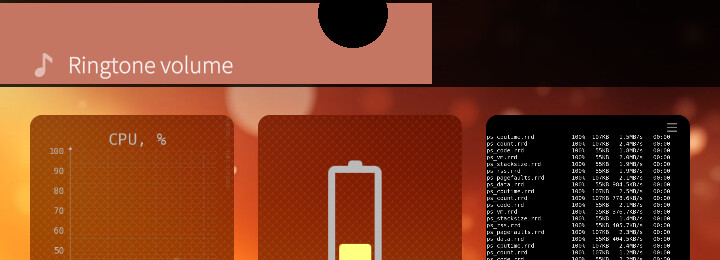
The volume bar in Sailfish has been one of the ugly points since the start - it’s flat, bright, horizontal across the entire top of the screen, and on notched screens it’s giant. It takes up a lot of space despite not being interactive, often obscuring something you were trying to look at. For example, if you’re on the home or events screen and change the volume, it hides the time and all the indicators.
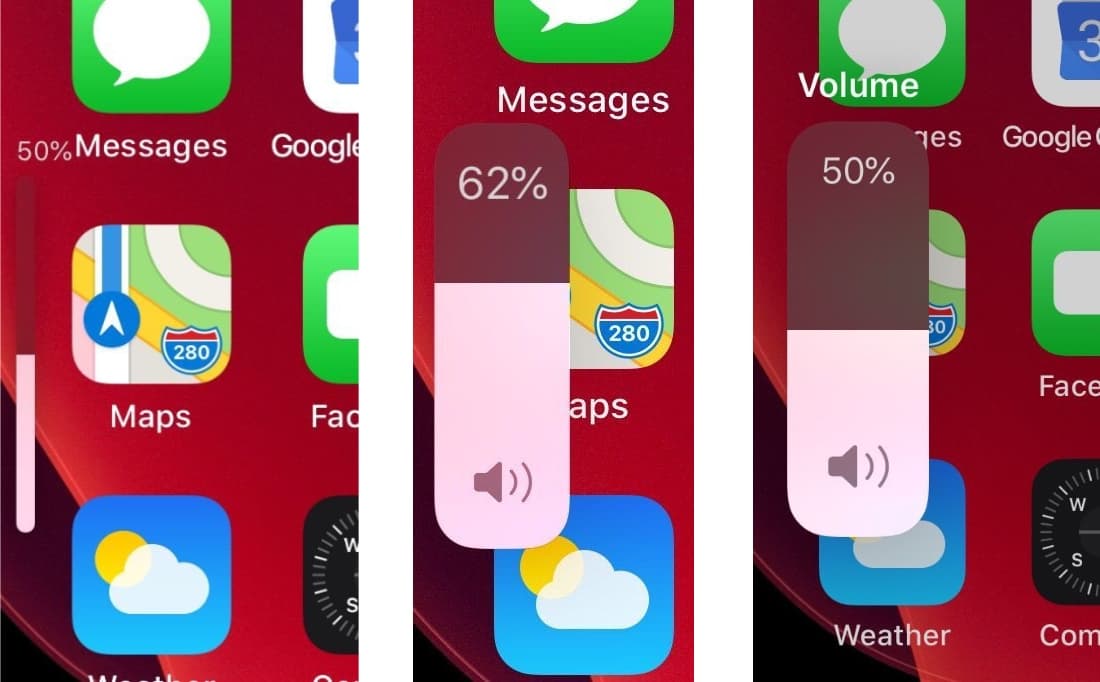
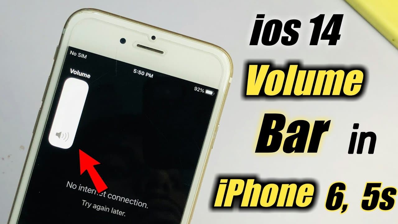
iOS and Android changed their volume bars to be compact and vertical a while ago, taking up only very little space. A similar compact vertical volume bar would work well and look good in Sailfish, too.
@nephros has a patch in the Patchmanager catalogue called ‘Finer Volume Control’, which will take care of that need! But I agree the finer adjustment should be possible by default, without a patch.
It isn’t! It’s completely flat, which clashes with the rest of the OS. The volume bar has always been a design afterthought and has always needed improvement, and ironically the way it currently looks in iOS (the thin bar) would look more at home in Sailfish than the giant flat bar.
With the influx of users people have no idea about the design philosophy of Sailfish. It has a clear thought through layout and we should not change that around. If you want Sailfish core and Android look and feel, use Aurora.
Indeed, but on the N9 it fit, because it already had a top bar showing the time and network indicators, and most importantly, the MeeGo Harmattan UI was flat. The volume bar got grandfathered into Sailfish but always stood out because Sailfish did away with both the flat UI and the top bar.
(And it never looked big on the N9 because it was just a very compact device.)
Now that volume sliders can reside in the Top Menu, perhaps those sliders could be used instead.
The status indicator line could become attached to the Top Menu. Bringing down the Top Menu would also bring the status indicators down with it.
The Volume sliders would reside just above this line, or could be fixed below the lock button and Ambiences line, with the other buttons dropping below if the Top Menu is opened further. This would require the Top Menu sliding behaviour to match the app drawer and have the ability to be paused mid-slide.
Pressing the volume rocker would also drop the Top Menu to the point where the volume rockers are exposed
A vertical volume bar makes sense to follow the intuitive orientation of the volume buttons, but may be complicated to implement, since such a feature does not exist yet.
Maybe that’s an idea for later, since I would love an update on that bar, it really looks out of place with the notch, and the volume issues of the jolla phone 2026 really make the lack of functionality stand out. (we should have ‘audio output’ and ‘finer volume control’ integrated in core at least)
This would actually then look kind of like on the Nokia N9!
If this with the notch is really such a big problem (I don’t have my Jolla Phone yet, and since there’s none on my Xperia I can’t judge), there might be the need for an improvement, but I’m strongly against just copying what Android and iOS do. Because that’s the reason everything looks so similiar, because Android and iOS have been copying each others ideas also for years, and I really want to keep the unique design and UX of Sailfish.
I don’t think I advocated for copying anything, but a less obtrusive and more intuitive volume bar is something to take inspiration from. The only reason Sailfish’s volume bar is unique is because all other interfaces have left their big, obtrusive volume bars behind. iOS used to put a massive volume icon in the middle of the screen when adjusting the volume, obscuring everything you were looking at. At that time, Sailfish’s volume bar was of course much better.
I’m convinced the reactions would have been the exact opposite if I’d simply created a mockup of a short vertical volume bar without mentioning iOS or Android at all. After all, I haven’t read any counterarguments that tackle the volume bar itself. Everyone just keeps ranting about some strawman wanting to copy everything iOS and Android do.
Not everyone. This white knighting is very detrimental to design discussions.
It’s actually part of design analysis, to look around for similar solutions, then check why those solutions fit or don’t fit to your use case and how.
As of where we stand, I think the main issue is that Jolla has stopped designing UI a long time ago, and only seem to respond to the express needs of their industry customers.
So all we can do is make a community effort to give an interesting proposition, maybe a patch, in the hope Jolla decides to adopt the proposition for the added value it gives their customers. This approach should avoid to get improvements that are rushed and not agreed upon by this community.
For once I am on the iOS side. Not a fan of most of iOS, but the volume feedback being in between the up and down button and reflecting the physical state in that way is actually brilliant design. It has a physical space that is correlated directly to the relevant input, it’s as good as it can get. I would total rip that off but do in Sailfish style.
And it is like someone else mentioned in another thread, the volume feedback and the 5 second remorse timer both feel out of place UX wise. The volume especially, does feel like a patch rather than like part of the OS. The sliders in the top menu look way more sailfish, and I would be very happy if one of those was just appearing to the left of the volume buttons as feedback.
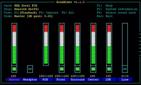
And the point from that reddit review is also very true, the audio management is bad. It’s always a bit of a mystery what the various volumes are set at, same problem in iOS.
I want to see all the sources and sinks, and what the volumes are at.
I’d say that originally the thin bar was fine but the way it was adapted for notched displays looks kind of weird. I feel like this could have been just a quick fix with an intention to make a better design later. Probably just not the highest priority.