[C2] Volume bar looks ugly

REPRODUCIBILITY: 100% (always)
OSVERSION: 5.0.0.5
HARDWARE: Reeder S19 Max Pro S - s19mps - s19mps - 1.0.0.2 - aarch64
UI LANGUAGE: English (UK) (user: en_GB, os: en_GB.utf8)
REGRESSION: yes (since: 4.6.0.13 - aarch64)

DESCRIPTION:

The bar at the top of the screen that appears while changing volume using the hardware keys looks weird/ugly.

EDIT: The same issue affects notification “popups”, i.e. short-lived, transient Notifications.

PRECONDITIONS:

STEPS TO REPRODUCE:

  1. Hit one of the volume keys

EXPECTED RESULTS:

Not a designer, but I think it would look better if it didn’t fill the space to both sides of the notch.

Or, if it just overlayed the status bar at the top of the screen, and went through/under (in z) the notch.

In the case of Notifications, I think they should do the same as Remorse popups and full Notifications, appear completely below (in y) the notch.

ACTUAL RESULTS:

MODIFICATIONS:

  • Patchmanager: no
  • OpenRepos: yes
  • Chum: yes
  • Other: none specified

ADDITIONAL INFORMATION:

Device Owner User: defaultuser
Home Encryption: enabled

the initial version of this bug report was created using Bugger 0.9.10+git7
3 Likes

Please share screenshot!

I would, but the screenshot-by-pressing-both-vol-keys action hides the bar!

I have to find one of those screen shot apps with a delay.

Please take a photo with a digicam, I’m curious!

Yes, acknowledged that the volume UI is not ideal now. We’ve talked about doing some bigger changes here.

Same applies to the banner notifications, I suppose those were meant. Transient notifications can be also rounded popups and the user can’t tell from the looks whether it’s transient or not.

6 Likes

the native screenshot should work, it overlays a button (moveable I think) and captures everything underneath. Enable from topmenu.

3 Likes

Huh, never used that one. Cool

Here’s a shot, ImageWork-ed the notch in the middle. You’ll have to “picture” the large rounded corners to the sides:

3 Likes

That comes from the notched phones! I don’t see an option to make it in another way.

I suppose the bar could be lowered :thinking:
(dieing over here :rofl: )

7 Likes

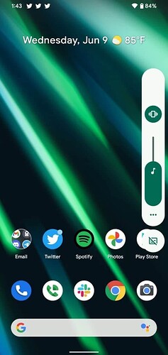
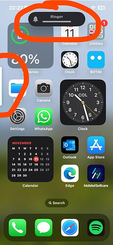
Nowadays Android and iOS have a vertical volume pop-up somewhere to the side of the screen, which also feels more natural because the volume buttons themselves are vertical, too. This would also work around the annoyance (ever since Sailfish 2.0) that you can’t see the time or connectivity icons when you change the volume.

Android (everything on the right) vs iOS (media volume to the left, ringer at the top):

6 Likes

Nice and handy! (20 chars)

what is also nice about the android one, is that the three dots on the bottom open a popup which lets you set each type of volume separately (choose audio output, ringtone, media, alarm, notification, speaker volume

4 Likes