I think having the tab header at the bottom looks nice, but on the other hand, it also looks out of place with other headers like in Clock or Settings, which are at the top. I was thinking whether you could make it possible to swipe from the normal to the private tabs like in Clock or Settings, but then it’d become more frustrating to swipe back to the web page you were reading.
Perhaps we’re all looking at this the wrong way, and tabs shouldn’t be on a completely separate page in the first place. For those who can install Android applications, it’s worth taking a look at Firefox for Android. I think they’ve (finally) managed to create a well thought-out design that’s reasonably intuitive, doesn’t require a hundred taps to get to where you want to go, and just works™ - all it needs is a more swipable interface that doesn’t require two-handed usage. Clearly, OMP has already looked closely at some aspects of Firefox’s design, because the new menu pop-up is eerily similar in both looks and functionality.
Well, you could even completely imitate the home screen by having the tab grid show up without close buttons, and let the user long press to show big, easy to press close buttons below all tabs. That would allow you to quickly close a bunch of tabs whilst also preventing the odd accidental closure (which can’t be undone).
Well, yes, I agree, it would also be possible to rely solely on buttons as long as they’re big and easily accessible (left and right handed). The problem with current UI is they’re hard to reach and inconsistent.
Imitating other parts of the OS would just do Sailfish well after the consistency of its UI has been beaten up update after update
Thank you for the brain storming about closing tabs in the tab list view. I actually like the idea of long press to imitate the home screen and having a similar animation of tab items that are zoomed out a bit and big close button in the bottom centre. I’ll try to implement such an idea. It doesn’t look like too complicated and not too much changes. Might be a good starting PR with higher chances to get accepted.
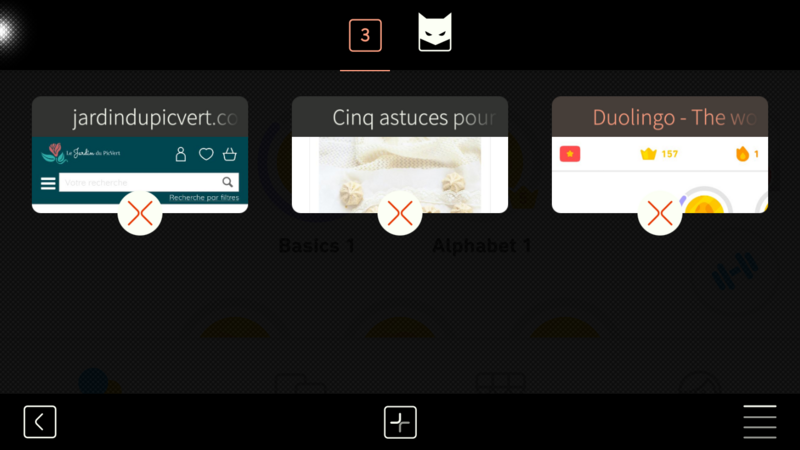
That was my first reaction, but to get to that page, you’re coming from a page with a bottom toolbar of the same size. So it looks actually quite consistent, if you think of it as a toolbar and not as a tab bar (even if technically and logically, it is a tab bar).
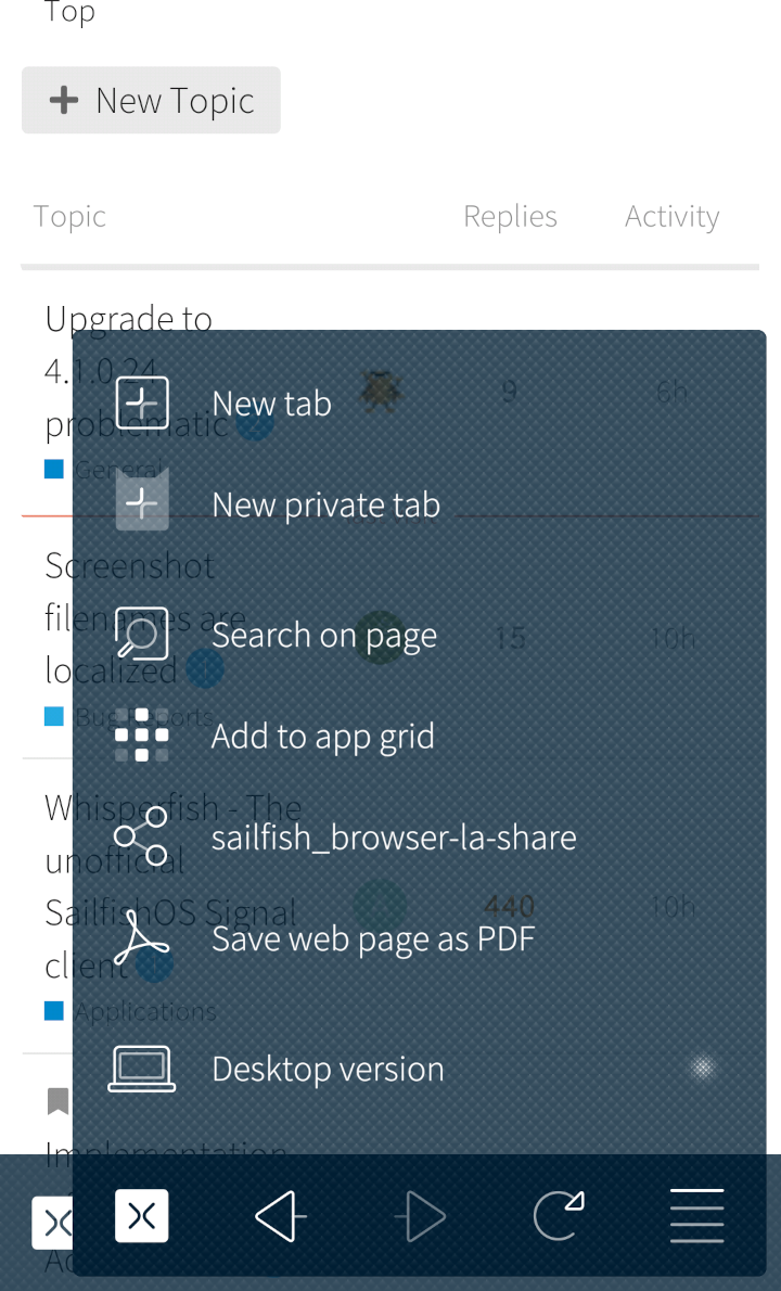
Making the pop-up menu wider is definitely a good change (on top of the close button fix), otherwise many menu options get ellipsised. I’m just wondering, though, how do you add a bookmark without the bookmark action?
Still, the menu itself is a bit of a mess, too. It contains three different kinds of menu items: actions, links to different parts of the browser, and switches. I know (desktop) Firefox also has actions, links and switches, but in (desktop) Firefox, there’s a separator between the different kinds of menu items. I don’t think the extra space makes for enough of a visual distinction. Mobile Firefox, on the other hand, doesn’t have any actions in its pop-up menu, only links and switches, again with a separating line between them.
But there’s the ‘Bookmarks’ link that shows you all of your bookmarks, and the star button that adds a page to or removes it from your bookmarks, and that button now seems to be missing, or am I misunderstanding something?
Ah, yeah, you’re right, that was an accident (the diff got a bit hard to read at some point and I rebased this a lot). I’ll probably add that back in place of the menu button, since you can just swipe down to close and accidentally favouriting the page is not as annoying as refreshing by accident.
In that case, perhaps I’d move the arrows to the right, so that the arrow for ‘page forward’ is where the menu button is now. Because it’s rarely used, tapping it by accident would be even less bothersome.
And another idea: it would be great if these pop-up menus were able to ‘stick’ by holding them in place, like the app launcher, but that’s probably something Jolla needs to do.
Moving the private/tab counter to the bottom makes sense. Let’s see if the PR will get through. If the maintenance is too high, we would probably have to drop it or see if some simpler solution is possible.
Let see what could come out of a discussion there. I’m open to amend anything so the general design of this page regarding tab actions could be improved.
The design idea coherent with home screen is very nice. I would love if it would also allow to swipe the tabs away to the left, like apps in the grid view when the patch “no home carousel” is applied.
Damien, thank you very much for your efforts. Looking great, lets hope someone at upstream acknowledges the value.
One comparatively minor nit I have is that the UI does not really follow system color schemes (Ambience colors). Basically it’s all black and white, tinted with a bit of the primary color.
I have a little patch here which uses proper Theme colours instead - is there any interest among those following this threas here that the browser UI gets more colorful as well?
There’s something to be said for the current design: a plainly colored UI doesn’t clash which websites that much - making it respect system colors can sometimes have some ugly contrast.
OTOH glassy instead of flat opaque UI backgrounds are hallmark of Sailfish UI, and the Browser looks very different from everything else (as does the Email viewer).
I like system color in Browser menu Anyway, it would be great to use it with blurred background. See ShaderEffectSource and FastBlur QML elements. Not sure it will be working with web view.
That’s simple, using Sailfish Materials.blur instead of my custom enlarged original Jolla mottle glass thingy^TM. I just have that in that screenshot because I add it everywhere.