@dcaliste has a different patch for that, too, higher up in this thread:
1 Like
I think it’s a good idea. It would be great to get such a patch reviewed and merged (if accepted) upstream. It would improve consistency a lot, as much as using pulley…
3 Likes
First and most simple version, against upstream/next rev 0e401c5f. Sorry for posting this here, I can’t be bothered to make a PR just for 15 lines of color changes 
diff --git a/apps/browser/qml/pages/components/PopUpMenu.qml b/apps/browser/qml/pages/components/PopUpMenu.qml
index 814b9900..9e446962 100644
--- a/apps/browser/qml/pages/components/PopUpMenu.qml
+++ b/apps/browser/qml/pages/components/PopUpMenu.qml
@@ -141,9 +141,9 @@ SilicaControl {
                         width: footerLoader.width
                         height: footerLoader.y - y

-                        color: Qt.tint(
-                                    popUpMenu.palette.colorScheme === Theme.LightOnDark ? "black" : "white",
-                                    Theme.rgba(popUpMenu.palette.primaryColor, Theme.opacityFaint))
+                        color: Qt.rgba(
+                                    Theme.highlightDimmerFromColor(Theme.highlightBackgroundColor, Theme.colorScheme),
+                                    Theme.opacityFaint)
                     },
                     Item {
                         id: decoratorParent
diff --git a/apps/browser/qml/pages/components/PopUpMenuFooter.qml b/apps/browser/qml/pages/components/PopUpMenuFooter.qml
index 7dbdd65c..3f2648bd 100644
--- a/apps/browser/qml/pages/components/PopUpMenuFooter.qml
+++ b/apps/browser/qml/pages/components/PopUpMenuFooter.qml
@@ -17,9 +17,9 @@ Rectangle {

     height: Theme.itemSizeMedium - Theme.paddingMedium
     implicitWidth: content.width
-    color: Qt.tint(
-               Theme.colorScheme === Theme.LightOnDark ? "black" : "white",
-               Theme.rgba(Theme.primaryColor, root.overlayOpacity))
+    color: Qt.rgba(
+               Theme.highlightDimmerFromColor(Theme.highlightBackgroundColor, Theme.colorScheme),
+               root.overlayOpacity)

     Row {
         id: content
diff --git a/apps/browser/qml/pages/components/TabItem.qml b/apps/browser/qml/pages/components/TabItem.qml
index 8f475995..a72e92e4 100644
--- a/apps/browser/qml/pages/components/TabItem.qml
+++ b/apps/browser/qml/pages/components/TabItem.qml
@@ -57,7 +57,7 @@ BackgroundItem {

             Rectangle {
                 anchors.fill: parent
-                color: Theme.colorScheme === Theme.LightOnDark ? "black" : "white"
+                color: Theme.highlightDimmerFromColor(Theme.highlightBackgroundColor, Theme.colorScheme)

                 ColorOverlay {
                     anchors.fill: parent
diff --git a/apps/browser/qml/pages/components/TabsToolBar.qml b/apps/browser/qml/pages/components/TabsToolBar.qml
index ce1c6fcc..ec71c80b 100644
--- a/apps/browser/qml/pages/components/TabsToolBar.qml
+++ b/apps/browser/qml/pages/components/TabsToolBar.qml
@@ -33,7 +33,7 @@ Item {
     Rectangle {
         anchors.fill: parent

-        color: Theme.colorScheme == Theme.LightOnDark ? "black" : "white"
+        color: Theme.highlightDimmerFromColor(Theme.highlightBackgroundColor, Theme.colorScheme)
     }
So, selecting Theme.highlightDimmerFromColor(Theme.highlightBackgroundColor was more or less a random choice for the background color base, but it certaily is better than defaulting to black/white.
2 Likes
Soooooo, 4.4.0 should have a close button again. https://github.com/sailfishos/sailfish-browser/pull/905
Feel free to bikeshed, if the overlay should close or not after closing a tab :3
5 Likes
Thanks goes to https://github.com/deepbluev7 to drive “close button” through. I just merged it.
5 Likes
Finally some closure! (Btw, deepbluev7 is me, I just chose a different username for some reason :3)
4 Likes
Great work!
I love the Qt6 snaps in there  .
.
1 Like
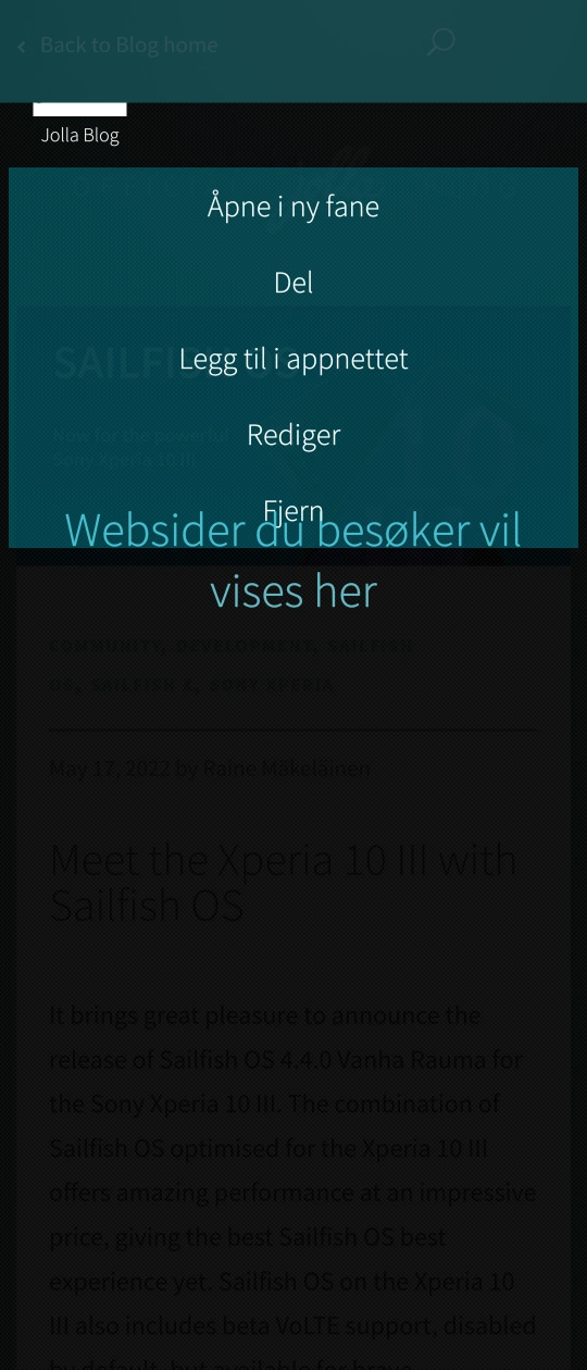
First I created this post in #bug-reports then I thought about #design at last i saw this thread 
Ttile: Menu on top of default text in browser. papercut / minor issue
REPRODUCIBILITY: Always
OS VERSION: 4.4
HARDWARE: Xperia X / 10 III
UI LANGUAGE: Norwegian
REGRESSION: ?
DESCRIPTION:
Minor cosmetic issue with the menu overlapping text in the browser.
(May be best to remove help text)
PRECONDITIONS:
Have bookmarks in the browser
STEPS TO REPRODUCE:
- Type in the name of a bookmark
- Remove all remembered sites in history that have the same name as your bookmark
- Tap and hold the bookmark
EXPECTED RESULT:
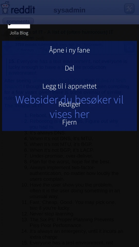
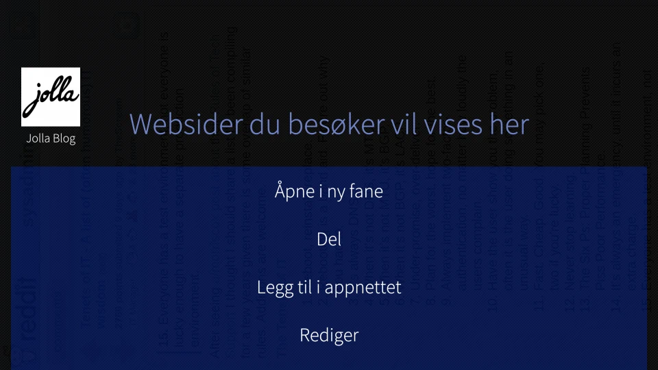
Favicon does not get thrown halfway into the void and the menu do not overlap “Websites you visit will be shown here”
ACTUAL RESULT:
Menu overlays text in portrait mode, but not in landscape.
MODIFICATIONS:
None.
ADDITIONAL INFORMATION:
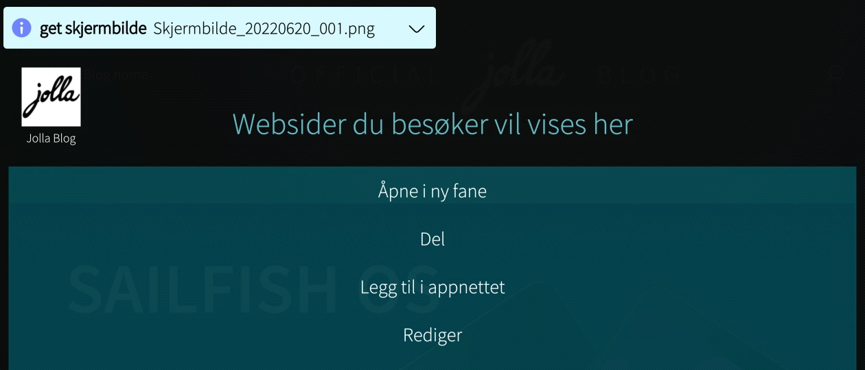
Images from Xperia X
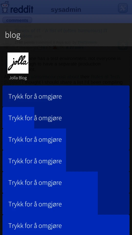
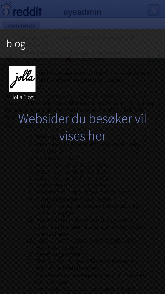
From Xperia 10 III
Hmm, maybe this to snuck in in the 4.2 update (because that’s what you are saying by posting here?) and wasn’t noticed because of the bigger issues. It sure isn’t pretty, although it looks like two intentional design choices colliding.
Hmm, i translated this in 6 of November 2020, in time for the 4.0.1 release… never mind.
1 Like
Two issues.
When you open a new private tab from the menu (tap the lines > new private tab) the keyboard doesn’t come up and you have to tap the address bar.
You cant leave private mode in landscape.
Also leaving private mode should lead to the tab view instead of the main page. At least to me this would feel more correct.
1 Like
Is it a good idea to start collecting bugs and issues in this thread?
I think we should keep using #bug-reports for this. Otherwise they’re bound to get lost here.
The browser (as with the OS itself) has a few UI issues that would be nice to be fixed but i don’t think there will be any progress.
1 Like
I think @rozgwi’s point is that these particular ones (start of thread) where generally fixed and this thread should now be considered done. Arguably the issues you mention are somewhat related to this redesign, but they probably get better attention on their own.