Sailfish 4.2 got a big browser UI upgrade, and it is a bit of a mixed bag honestly.
The good:
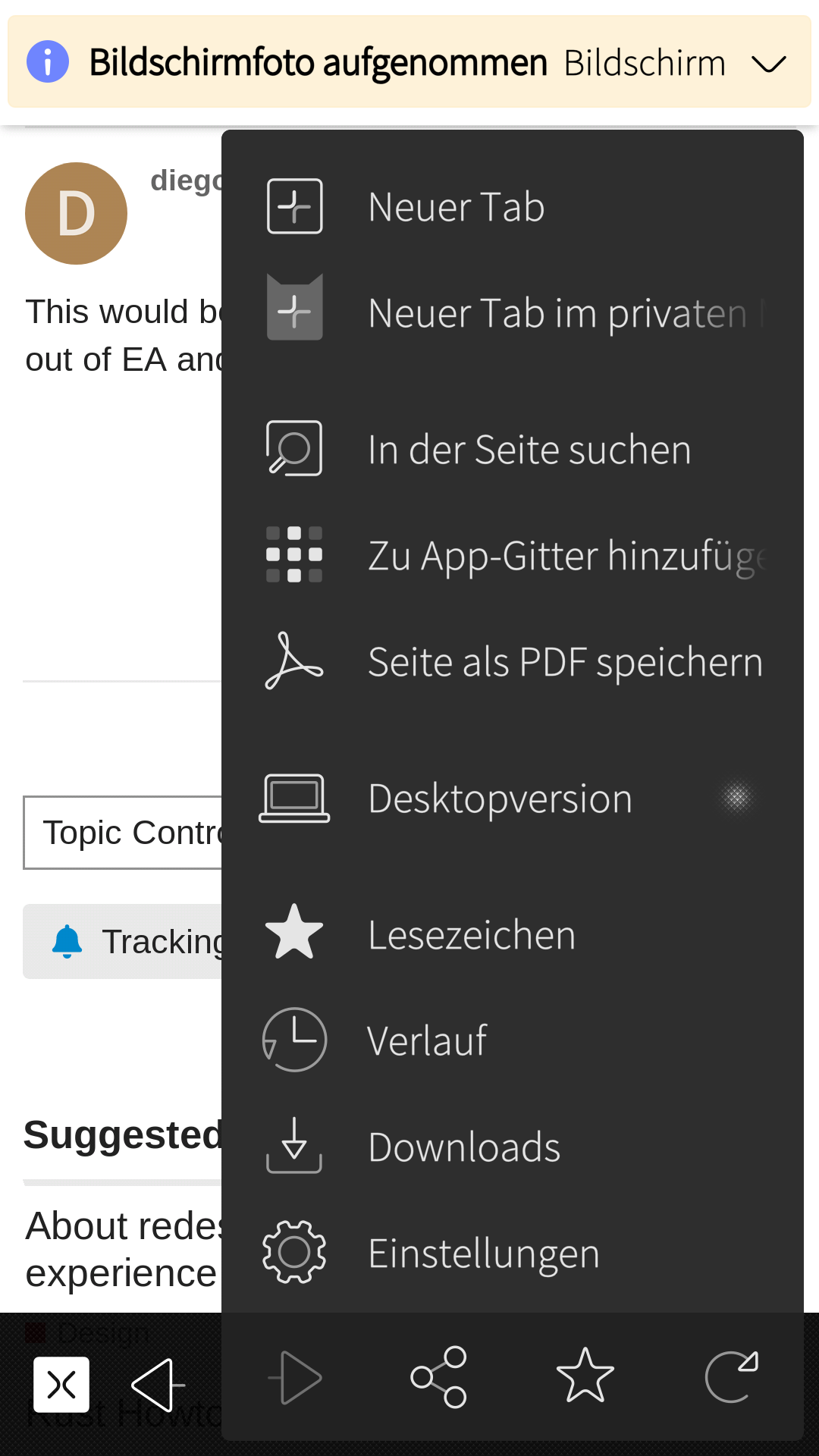
The new menu
Adds features and looks good while doing it
It gets the not-requiring-needlessly-precise-input paradigm pretty right, in that tapping elsewhere closes it and does nothing more
Swipe down to close would have been nice… i seem to recall seeing a commit message to that effect?
The new tab view
While not a huge improvement, it seems more in line of with where the design seems to be going
Seems to make better use of landscape mode
The not-so-good:
The new menu
Discoverability of that there are more options below the bottom just isn’t there
Cannot close tabs from the main view
Don’t people close tabs anymore? I do it all the time.
Adding a redundant “close menu” button where this used to be is just the UX design equivalent of a slap to the face
It is till possible to get stuck in private mode (in the open tab dialog which can’t be dismissed)
The strange:
The bottom bar in the new tab view
Looks pretty bad and not in style
Is completely redundant in that it is on top of a page with fully working back gesture and pulley menu
It has a back button
Maybe i have built a bit of a reputation of being “chief Sailfish apologist”, but this is just too rough.
Just a quick lunch post, please contribute, and i’ll probably think of more things.
Haven’t tried it yet, but I have a quick tangent question - maybe I’m missing it in my quick scan of the release notes, but seems like there’s no update in web engine?
I fully agree. The problem for the new menu scrolling: There is a scroll bar, but you can only see it - IMHO it is to thin - and it is shown after the scrolling. What about a - say some pixels thicker and in a color other than the menu and of course show it on opening the menu already?
Oh wow, yes there is. Stealthy!
If it had just not gone quite all the way to the top, and not been all the way to the edge, that would have been pretty helpful indeed. I was thinking some kind of graphical element where the menu docks to the toolbar would have been the solution, but maybe this is better if we just would have seen it more easily.
I agree with pretty much all of your points. I didn’t know the menu was scrollable until you mentioned it! And the close and back buttons are really weird. I’d rather have the private mode button at the bottom than the back button. It just feels redundant and inconsistent with the other apps. Furthermore the close menu button shouldn’t be there OR it should be where the open menu button was. Currently double tapping the menu button will reload the page. Instead it should just close the menu again imo. Also ideally you would have the new tab menu at the bottom of the tab list too, since scrolling up to open a new tab with the pulley is a bit more effort, while you usually are at the bottom of the tab list and the new tab button would then be redundant.
Thank you @attah for starting this thread. I’ve found that some of the design changes are good improvements, some are less good. Here is my opinion (sharing some points with yours):
The tab page
The new look is better in my opinion. But I have some concerns about minor details:
On a small form factor device, like the JollaC, the tab preview are to big in height. I can only see two tabs. So I need to scroll a lot. It would be nicer maybe to calculate the preview height based on screen height, so three tabs are always visible. Even having something like Theme.itemHeightLarge would be more appropriate in my opinion.
One can gain some screen height by removing the bottom tool bar. It doesn’t bring anything. The + button is the first action of the pulley and the x one in the swipe back action.
Why using specific icons in this bottom toolbar ? In the rest of the OS, the button are round. Here they are squared. I guess it’s to go with the tab button from the main tool bar, but I find it more out of place than linking to this.
The page doesn’t open with the pulley menu visible, the page is actually a bit scrolled so the menu is not visible. This means that to use it, one has to scroll this bit amount up, then the menu appears but the scroll stop because we reach the top, and then one has to scroll up again to open the menu. A minor inconvenience.
The URL page
Thank you for the addition of the history button there, it’s very well done in my opinion. Natural and convenient.
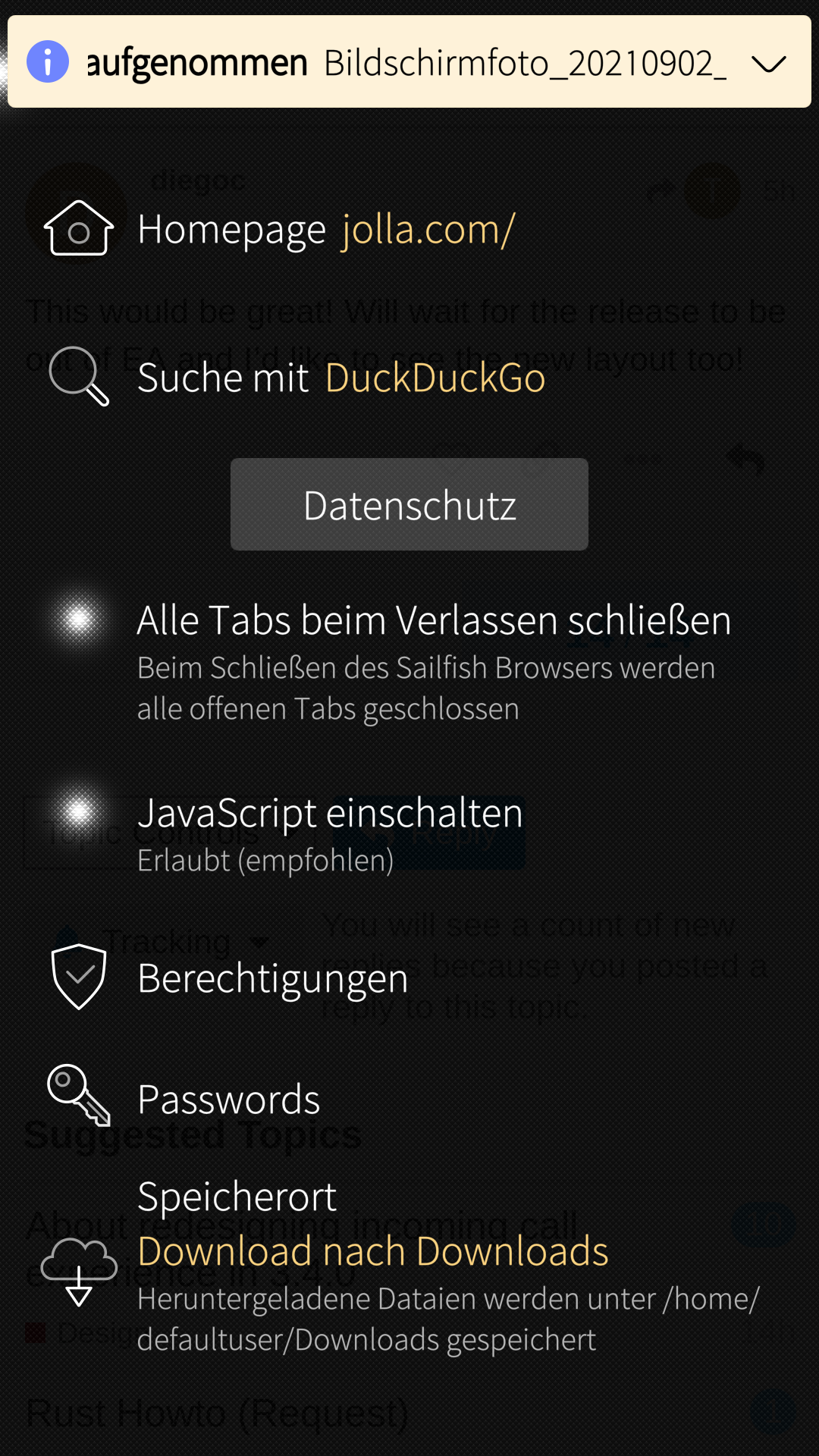
The menu
Having it as a floating menu instead of a dedicated page is ok in my opinion. I find it a bit crowdy.
the two top entries (new tab and new private tab) are redundant with the tab button. I guess it’s done on purpose, but it would gain clarity and simplicity without.
The “bookmark” and “history” entries are also redundant with tapping on the URL.
I have one small complaint, how the experience is degraded if you have a lot of tabs open.
Previously if you opened tab view, if you were let’s say on tab 10 of 20, it would open half down the tab list, with the tab you are viewing on screen.
But now it always opens at the beginning of the list, so you have to scroll down and search for the tab you are on.
This together with removal of close tab button makes the experience worse.
Otherwise the redesign looks really good, and seems quite snappy, just needs a few tweaks in my opinion.
Previously if you opened tab view, if you were let’s say on tab 10 of 20, it would open half down the tab list, with the tab you are viewing on screen.
But now it always opens at the beginning of the list, so you have to scroll down and search for the tab you are on.
That’s bad
I haven’t upgraded yet, but saw the notes about rwmoved close button. Since that is the way I normally close tabs today, I didn’t agree to this change, but thought that I had to change my ways, to use the tab view. But with that view “broken”, I guess that’s not possible (I have a lot of tabs, 50+). This is a huge step backwards for UX, unless there’s another way to close current tab.
Discoverability of that there are more options below the bottom just isn’t there
Back to UX. This is just bad imho. Even after reading this thread and seeing screenshots of the two menu (normal and open) it took me some time to understand the functionality (but maybe I’m just stupid )
As for closing the menu, I think tapping outside is ok but oftentimes too far away for how I’m holding the phone. Swipe down to close the menu would be such great addition and integrate well with both pull up to expand as well as swipe down to close the keyboard.
The new tab view is a bit too screen real estate hungry, even if it works on my Xperia, since its form factor handles it. And I’d still prefer pulleys over toolbars with buttons.
Small eye sore for me is that the back button (on the normal toolbar) and the forward button (on the menu toolbar) are misaligned. Also the alignment/grouping of the menu items is looking strange/off.