Browser redesign in Sailfish 4.2 feedback thread

The problem isn’t looking as android or not. The more i look into the browser the more i feel that the layout was designed by people that don’t understand SFOS and that they just slap functions wherever they can/feel like. Add to that long reaches (due to HW) and the problem becomes bigger.

And its not only the browser that suffers from that. There are a lot of inconsistencies in other parts as well. We had a thread in the past about that but noone at jolla seemed -and seems- to care for stuff like that. And they pile up.

4 Likes

@ApB most od this weird changes came from OMP. We don’t know if they use Sony devices or they have some smaller phones with different form factor.

My gut feeling for OMP is that they are trying to make the apps they “touch” more easy to use for users that are accustomed to the tap everything paradigm (android, ios). As a result they fuck up the SFOS UX.

Don’t think that device size would make a difference when you are trying to achieve the above.

3 Likes

Those can be explained, in my eyes, by the fact that both iOS and Android require two-handed use, and so OMP doesn’t realise that they could also build their software around using only one hand.

Did anyone bring this ‘tappening’ up in a community meeting yet?

At some point (probably at the old forum and some here) there were topics about inconsistencies in the gesture usage paradigm and apps like the camera, the email, various “paper cuts” and all the small things. I also seem to recall discussion about various topics like that in the meeting but nothing specific and i don’t think anything came out of the whole thing.

Maybe someone could bring it to the community meeting but i don’t have high hopes. Even if they are small they still need some manpower and will for jolla to get them fixed.

1 Like

Browser is somewhat different from many other apps by Jolla - it is open source. I am also rather annoyed by these changes in UI. That shift of close button to top right and having it so small is also a blunder. Earlier design of tabs selector was one of the best ones, now it is … not so.

As it is open source, anyone can fork it and adjust UI to something that they like more.

8 Likes

Browser is somewhat different from many other apps by Jolla - it is open source.

I fully agree. That’s a key here. And since I’ve reported and somehow complained already on this forum about the disappearing of the pulley menu in the tab page, I’ve started to see how to get it back.

It’s still highly work-in-progress, and I didn’t create a PR yet to officially discuss it with maintainers. Indeed, I’ve broken one or two things, there’s a regression on the “open a new tab in private mode” feature for instance.

Getting back the pulley menu on this page raises a (minor) technical issue : the top part with the selector between normal mode and private mode has been changed recently to a Silica TabView (which is nice). But contrary to the clock application, the SilicaGridView (which is the fickable), hosting the tab grid, is containing a Silica.TabItem. While in clock application, this is the reverse. In clock application, the pulley menu is working fine, moving the tab header down. In browser, if you add back a pulley menu to the flickable in TabGridView.qml, you obtain something broken, because the tab header stays on top of the page and the pulley. As far as I know, it’s not a major obstacle to rewrite TabGridView.qml the opposite way, with SilicaGridView being a child of a TabView. But it’s extensive changes.

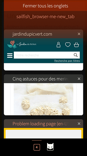
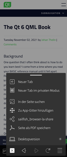
To investigate something different with minor changes, I decided to try to solve another one-hand usage accessibility issue also : move the tab header to the bottom. Here is the screen shot :


(there’s also a bug with the pulley not expanding on all width to be corrected)

Code is currently in https://github.com/dcaliste/sailfish-browser/tree/pulley When ready I’ll create a PR for it, so it can be discussed with maintainers.

But as @rinigus mentioned, there’s no guarantee that it can be accepted. On the contrary, I’m thinking that it will be rejected because designed decision was already taken for (ugly, inconvenient) bottom tool bar with buttons. Doing what I’m doing in this future PR is not revolutionary or even imaginative : it could have been done from the start. So we may have to face the necessity of a fork : -( Which would lead to a very unpleasant situation where at each new official release, the fork lags behind and brings an additionnal burden of forward porting forked parts… Something I’m not eager at all to be in or to do.

Anyway, what do you think of this “design” ? I’m not a guy with more than 7-8 opened tabs. So the solution of the pulley requiring to go to the top to open a new tab is not an issue for me. But it could be for others. That’s a valid complains for instance. One we need to discuss and have argument pro and con before trying to convince maintainers.
9 Likes

Replying to myself, I forgot to mention that I’m very grateful for the work done by Jolla and OMP on the browser : maintaining along releases a perfectly functional engine binding on top of Gecko for QML usage is something that I admire a lot. My previous post may seem a bit bitter but that’s not the case at all regarding this project.

2 Likes

The necessity to return to the top of the list to access the pulley could be easened by reverting the order of the tabs (newest on top).

3 Likes

Even with many tabs a fast flick/scroll gets you to the top. Alternatively you can add an arrowed scroll bar (or whatever they are called) that many other apps have. Or another pulley on the bottom. Quite a few solutions exist. Even the button is not totally bad but the placement is something to be considered.

Another annoying issue is how you close tabs. The x is pretty small. But TBH i cant think of a solution to that other than a bigger button. :neutral_face:

I didn’t try yet to open many tabs, but I think that the quick access to bottom or top thingy is automatic when the list gets long enough. If not, it’s just a matter of setting a property of the VerticalScrollDecorator to true (and debug if not working right away). But sure, having these quick access stuff should be there.

That’s for another PR ; -)

I’m trying to find an idea for this also, but get stuck for the moment. Since the tabs are presented in a grid (visible on landscape), swiping them away is not a possibility (in addition to the fact that we want to keep the swipe to the right to navigate back in the page stack). One idea, but I didn’t try, would be to reserve the full right hand side of the tab item (with a custom transparency gradient for instance) as a mouse area for deletion (of course with a remorse). But I’m afraid that it would be visually ugly… Which left us to the drag to the left solution. Even for a grid view, with a proper animation in could be pleasant. But it’s a lot of work.

I would suggest to close tabs by swiping, since that won’t interfere with the page stack and is consistent with how apps & keyboard are closed…

Mmh, I may get you wrong… Vertical swiping is already used to move the tab grid up and down. How to affect a down swipe to tab close in that context ?

I think, @sigurg meant horizontal swipe. Now, horizontal swiping on a active webpage does nothing, so this swipe action is available to close a tab.

1 Like

I’ve run into a few (relatively popular) sites which refuse to load given the outdated engine, but that’s OK considering how much snappier the experience is as a whole. An update is much needed, however.

1 Like

@dcaliste, thank you very much for looking into it! Moving the private/tab counter to the bottom makes sense. Let’s see if the PR will get through. If the maintenance is too high, we would probably have to drop it or see if some simpler solution is possible.

As for close buttons, would be great to get them in that next PR to the bottom left. And bigger, as they used to be…

1 Like

RtoL swipe is unutilized but still kind of feels weird for me (given that i am right handed and swipe LtoR for the remorse timer for example). Another idea could be to have a separate “close tab” mode activated with a long tap. And then use whatever swipe gesture.

Also:
One more suggestion for the open tab pulley (if possible technically). Since the bottom part (where the buttons reside in your patch) is stationary -meanin doesn’t move with the tab scroll- and is an easy reach point is it possible to add a pulley there and be activated only if you pull the bar upwards? Kind of similar to the way the media player shows the shuffle repeat etc buttons.

The pros: it would be an elegant solution as Sailfish already does something similar i.e. when you’re in the home screen and have apps open as cards, you long press and you trigger new actions. In the browser case, it’d be swype down to close. Both left and right handed people would be happy. The cons: you’d have to position yourself next to the tab you intend to close before you activate the swyping mode, since you cannot scroll vertically at that point. If you need to close many tabs it could be cumbersome. Maybe tabs could become much smaller and if you place your thumb where there’s no tab you can scroll… Just thinking aloud.
And about buttons, how about placing them middle low? Good for left and right handed ppl. Just like app cards in the home screen…

1 Like

@dcaliste @rinigus Should we bring up the browser design changes in the next community meeting? I’d be interested in getting my patch merged too: https://github.com/sailfishos/sailfish-browser/pull/905

Currently Jolla’s design direction for the browser is not quite clear and it might be good to bring that up?

3 Likes

It might make sense to duplicate the menu at the top and the bottom, so you only ever need to scroll half a list to access the menu?