
I am not a fan of this forum either, for the same sorts of reasons. This is me being polite. You don’t want to hear what I really think
1 Like
Anything better out?
I definitely did not like askbot and its questions, answers divisioning and hereby splittering the timely order of posts.
Did you ever try to follow up in a timely manner something on OpenRepos?
But this here comes closer to standard timely ordered forums as they were known. What is wrong with that?
A post which is replied to holds a link to the answer. And if done continuously you can then follow to the next answer on this reply and hop further and further. Leaving out all the other ‘chit-chat’ in between.
Of course this here does not follow this reply-answer-reply scheme as it might be an option.
But also: I personally do NOT use threaded view for Outlook based mail viewers (never, I just hate it) as I loose the overview pretty soon (and deleted stuff I did not want to).
So maybe this is just a personal attitude? But I do not know anything better out.
2 Likes
Wait what… did this break the reply chain? I was trying to reply to DaveRo post that has two quotes and it ended up as reply to peterleinchen… or just some weirdness, retry
Now seems to work, to repeat the post I will try to delete now:
Actually this post is listed in ‘replies’ in both of the comments you quoted, so yeah
1 Like
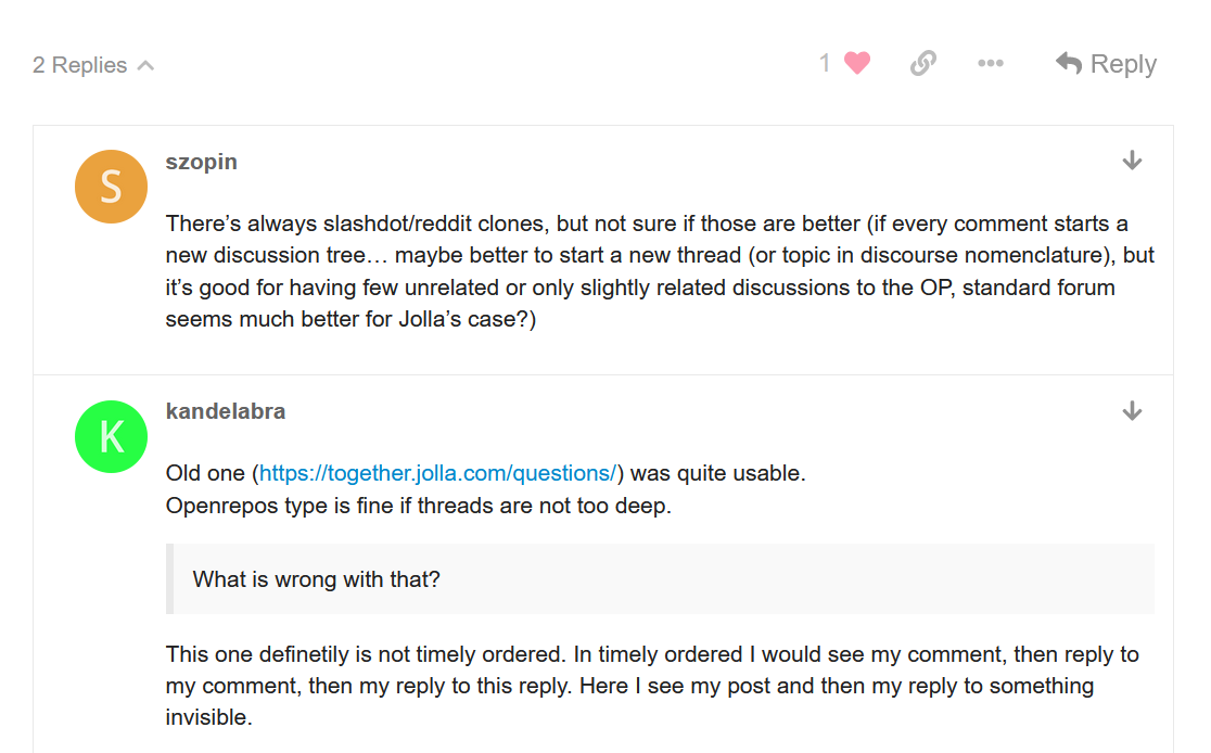
There’s always slashdot/reddit clones, but not sure if those are better (if every comment starts a new discussion tree… maybe better to start a new thread (or topic in discourse nomenclature), but it’s good for having few unrelated or only slightly related discussions to the OP, standard forum seems much better for Jolla’s case?)
1 Like
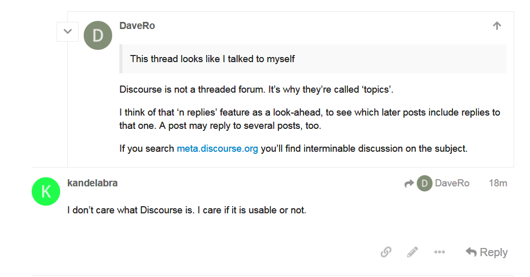
I don’t care what Discourse is. I care if it is usable or not.
1 Like
It is very much usable if you treat it as a forum and not as a threaded general discussion forum where people come into a topic to start offtopic discussions (discussion branches or what have you). No idea why forums lost popularity in web 2.0 but it still seems the best way to keep discussion on topic, if you want to have a separate discussion to the OP just start a new thread
1 Like
Old one (https://together.jolla.com/questions/) was quite usable.
Openrepos type is fine if threads are not too deep.
What is wrong with that?
This one definetily is not timely ordered. In timely ordered I would see my comment, then reply to my comment, then my reply to this reply. Here I see my post and then my reply to something invisible.
I do not like threaded view in Outlook or Gmail. But Outlook never drops something that was in between my replies.
Yeah, this is very wierd.
I think I just misclicked as the second attempt replied as expected
Never got used to TJC really, comments got hidden very soon and tracking what exactly bumped a thread was a pain, expand all ‘see more comments’ click on the answers part sort by newest, but the answers to answers wouldn’t bump it, so if someone commented on an answer in the middle neither sort would bring it up, it was a mess if you wanted to check what’s new and often would just skip the hassle if the question wasn’t important to me. Sure for collecting questions - answers it was probably ok, but as a place to discuss anything, ugh
3 Likes
It’s not so usable at leat due to layout:
Original post is aligned wrong. It’s start should be placed more to the left than tha answer or at that same level if it is flat timely ordered forum or shown as a quote but not like sub-branch of previous branch.
Not sure if bug but all the ‘replies’ I can expand align fine
Still I think it’s just a matter of giving it time and getting used to (and maybe not expecting this to be reddit and more of a focused discussion)
But anyway it doesn’t explain first picture in the original post. Why it’s shown like if I talked to myself?
Well, “branch” can be flat, but why the timed odrer is broken?
Though if there is such thing as reply you can’t avoid trees anyway.
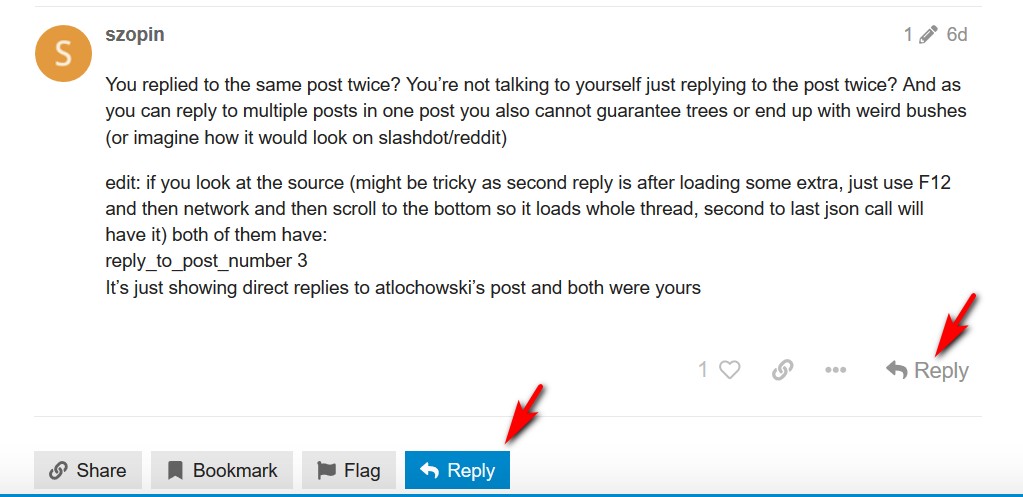
You replied to the same post twice? You’re not talking to yourself just replying to the post twice? And as you can reply to multiple posts in one post you also cannot guarantee trees or end up with weird bushes (or imagine how it would look on slashdot/reddit)
edit: if you look at the source (might be tricky as second reply is after loading some extra, just use F12 and then network and then scroll to the bottom so it loads whole thread, second to last json call will have it) both of them have:
reply_to_post_number 3
It’s just showing direct replies to atlochowski’s post and both were yours
1 Like
That’s possible due to horrible layout. Two Reply buttons in the proximity, andthe blue one draws user’s attention making the other one poorly visible.
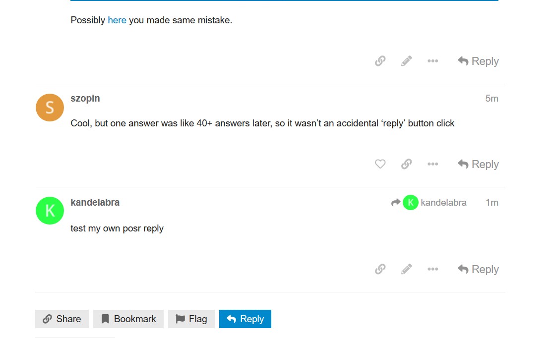
Possibly here you made same mistake.
Cool, but one answer was like 40+ answers later, so it wasn’t an accidental ‘reply’ button click
test my own posr reply
More recent post seems to be always at the bottom so no matter how much post were posted since OP. Buttons are near.
Indeed, your second reply to atlochowski was:
post_number 39
Your first was:
post_number 17
The higher number appears below the smaller one, as expected?
Edit: look I’m not really sure what you’re trying to argue but it’s obvious from the second reply it was conscious as you even clarify your position from first one (sorry for being vague about nfc paying support? that was mentioned vaguely in first reply about… being able to pay with my sfos smartphone?) are you sure you misclicked ‘reply’ because of terrible design and then clarified your original answer just by accident?
I don’t care what Discourse is. I care if it is usable or not
Hum. While I think you’re right that it’s not immediately clear how replying to individual posts and the OP/topic have different effects your above quote is kind of a problem. To me at least it reads like: ‘Don’t care how this thing’s supposed to work, make it work like I expect it to’. I mean Discourse has a certain philosophy in mind when presenting it’s interface the way it does. Don’t need to like it but sure it don’t help to just ignore it. There is a user tutorial.
And to me the general reply button looks very different to the one for individual posts (mostly viewing topics with my phone): It’s got a square blue background.
But: It took me a moment to realize why it was there and how it differs from the simple gray ones