Although the description of Design category states “Questions and proposals” and this is not one, I’d still guess the category is more fitting than General.
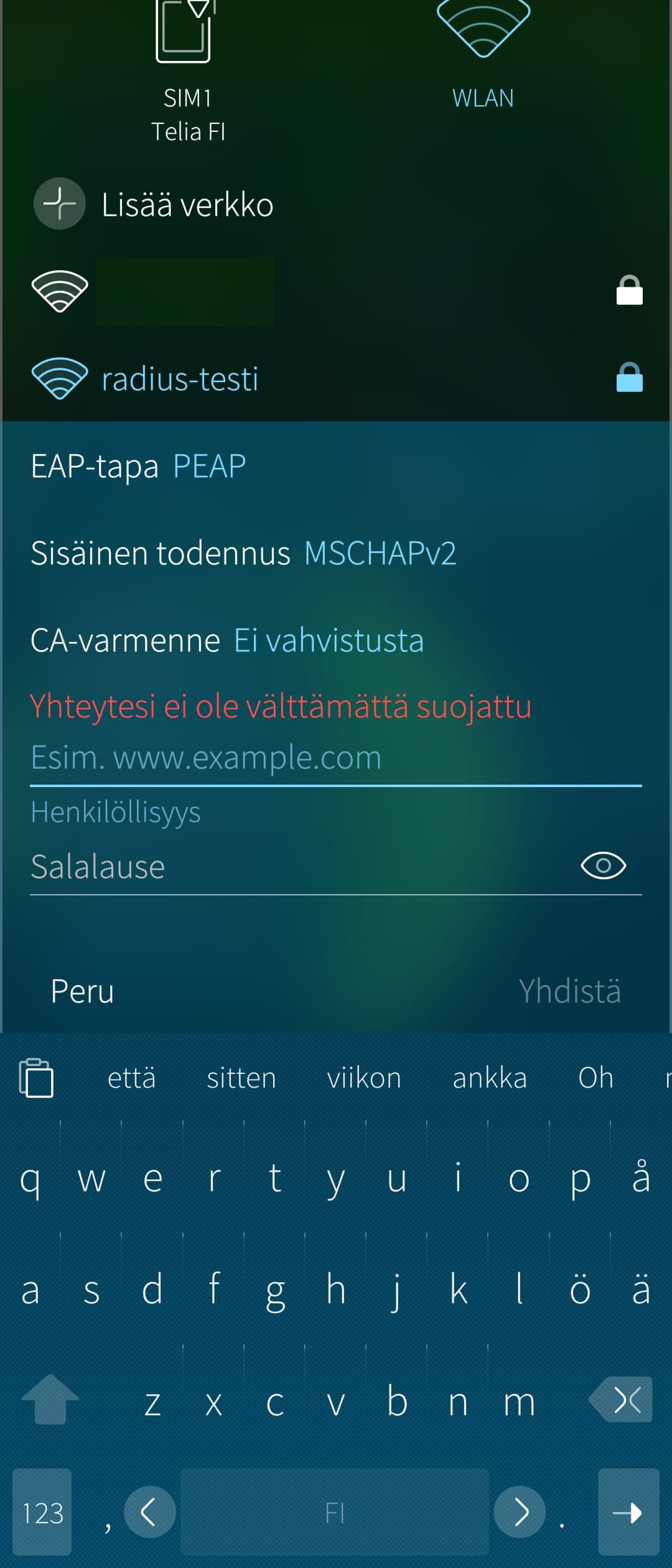
I’ve been testing out a RADIUS authenticated WPA2-Enterprise WLAN setup today on various devices & operating systems. After seeing quite many quite bad UIs, I just have to admire the usability and fine looks of the Sailfish UI here.
For comparison, e.g. a OnePlus. (Screenshot was not possible since “the page contains private data”, that is, an empty identity field.) Note that the checkmark in upper right corner is in disabled state, in contrast to the enabled cross in upper left (dark gray, instead of slightly darker gray). In addition to account details, the “CA-sertifikaatti” must be changed from the default option to be able to proceed. This, however, is not communicated to the user in any way.
The translation differences are probably tangible to Finnish-speakers only, but I’d summarize the Sailfish UI to contain actual proper Finnish without anglicisms, and actually descriptive titles of various options.
This UI is not something users see every day, or compare with other systems, but after one does, one really has to appreciate it. I just wonder if there are still, after all these years of sailing, more such hidden UI gems somewhere for me to encounter one day.
Yes full agree, SFOS is the most beautiful mobile OS I know (I tested abt. 5 OS’es meanwhile). It’s the best regarding a straight and logically user interface and also appearance!
Theres a second reason for me that i didn´t like on Android/Lineage. They changed parts of the UI and input-concepts too often and much. That really annoys me. Sometimes theres no need to try inventing the wheel for new.
(edit:bad idea. See below)
OT but this could apply to the browser too. (no idea how it works on IOS or others).
The browser could have “back” and “fwd” gestures. (Swipe L/R from inside the screen).
Impractical as there are too many uses of swipes within a browser window besides scrolling down, like maps, captcha elements, painting surfaces… if you get a fullscreen map you can’t navigate suddenly
Agreed. The SFOS mail app is very much suck. But I only use it to see if I need to check something on ONE account. I have a lot of mail accounts and it all self hosted. And I like typing. On a keyboard.
I want to use it to clean up my mails during toilet sessions
But it takes way too long to delete a single mail. I wouldn’t write on either if I can avoid it.
Yes. The problem is that the browser has become a universal operating system. If you’ve been hacking browsers as long as I (ncsa mosaic, aprox.) it’s not so surprising, if somewhat irritating. Anyone who’s been paying attention will see that companies like QT have been desperately trying to beat the browser boys to the punch. In fact, QT corp has succeeded to a … degree. But it’s kind of like the search wars. The vc capital folks have turked the game.
Oh, man. I’ve been doing a bunch of game dev crap (aka, exploring what can be done on SFOS with godot/sdl) and if something is irritating, it’s desktop / mouse gesture shit being generalized. Touch screens are so COOL for building interesint UIs. But it’s so difficult to develope for them because, well, the pc is not a touch screen device. It’s a catch 22.
Well, that just goes to prove that you can’t dis-satisfy everyone.
There’s always one person who has just got to be delighted with whatever you’ve done.
I love the mail app, too! For a smartphone, for me, it’s the best way I can imagine. Surely a smartphone is in principle more or less BS for serious and comfortable work, but for that whats possible on a 6" screen I’m very happy with the mail app.
And I have modified the keyboard and it’s only on SFOS where I can do this.
I actually quite like the SFOS mail app as well. The UI is simple, clear and easy to understand. The problem, for me at least, is it doesn’t work properly with modern account types. Its fine if you can use it with old single factor authentication protocols like POP and IMAP, but try to use it with 2FA Exchange accounts and then it becomes seriously flakey and unreliable - from regular sync failures and account lockups to folders randomly missing. I went through a ‘sweet spot’ phase of using SFOS mail with muliple Office365 work accounts using imap access, but now MS have withdrawn/are withdrawing all single factor access to Office365 accounts so I can’t use SFOS mail any more and am back to my iPhone as a daily driver.