Multiple people, along with me are (very) not happy with the last design changes, and it’s only getting worse. Jolla stopped following SailfishOS guidelines (even erased them I think) and last changes were free for all kind of thing. None of the original SailfishOS principles are followed any more, and it doesn’t seem to get any better. And because many people I know (including myself) are very angry, well not even angry just disappointed at this point, I’ve been thinking about how to fix it as I tend to follow sfos guidelines strictly in my apps.
And as a result there are 2 possibilities. The good, hard one, and bad easy one.
Good one would be to redesign **** out of glacier, and switch to nemo completely with support for sfos apps and/or run glacier on sfos instead of silica. That would be way better in long-term, but it’s way too much work for a single man like me.
The Bad one, actually doable one, would be to create a patch that would fix every single **** design in sfos and therefore making it cute, pretty and usable once again.
But I’m still thrown apart between these options, and I haven’t decided which one to pick. So I thought I could share my thoughts with you guys, gather opinions and maybe see if there’s bigger demand on that. Please don’t bite :<
Goes back to his cave to curse at other’s code and redesign apps
My gripe with the tab menu is that the tabs don’t move and center as you switch so it feels kind of meh. I have suggested this more than once in various design topics. No idea if @jpetrell likes the idea or not and if they are going to look into it.
For the top menu i don’t see anything weird -its the same since forever as far as i remember- but if someone can improve on it i’d like to see his ideas.
It was explained that the buttons in the email app are a result of the newer engine not working well with pulleys. There was a patch for it but i have no idea how well it works. If its not the case and can be proven that the whole thing can be done without buttons i’d love to see this change merged in. I agree on the white.
Also the layout of the email app is reverse and this needs to be fixed for the sake of consistency with the OS.
Other than the engines i didn’t see anything weird with the browser lately.
Haven’t used the notifications yet. (just updated to 4).
As for the tab menu in the setting yes i also thing its unnecessary and that the apps and accounts categories could be added as a section in the normal settings -looking the same. And it feels a bit slow. like its dropping frames or something as you transition. Also i dont like that the apps section resebles the launcher. It would look better as a list IMO.
I have no idea what you mean, so I’m even more confused now
Here’s core of the problem. Sailfishos, by design, is HEAVILY against buttons. You have no idea, like, we once spent days thinking about how to organize things in microtube just to avoid buttons. Meanwhile, jolla “eh just put button like android”
You can copy text. it just takes a loooooooooong press and moving around the selection indicators is not nice at all. And the copied to clipboard notification you get should be on top of the screen
People love to moan about the dreaded buttons taking over Sailfish, but at the same time they also love to gloss over all of the instances where buttons have been removed from the interface to make way for more swipes. Case in point is the new events view: they’ve added the possibility to attach a few buttons to a notification for quick actions that you would otherwise not be able to do at all (!), meaning the functionality is a net improvement over what came before, and on the other side they’ve revamped the way you get rid of unwanted notifications by no longer requiring you to tap tiny round buttons to the left of every notification or notification category you wanted to remove the notifications for, instead all you need to do now is swipe them away.
Another example: in the Settings application, you used to have to press a button all the way at the bottom of the list to be able to access the accounts and applications pages, now since 4.0, all you need to do is swipe left or right.
With regard to complaints about the top menu being too much like Android: it slides down from the top and has quick toggles for whichever settings you want, which is similar to but also more extensive than Android. It doesn’t hold your notifications hostage, so the only times you need to use it is when you want to toggle something on or off, which for the majority of people is actually not very often. For example, most people nowadays don’t even turn their WiFi or mobile data off anymore, ever. The bottom menu in Sailfish 1.0 was much more like Android than this one: you also had to use it to get to your notifications.
This doesn’t mean that there is nothing to be criticised. The look of the new notifications doesn’t fit in with anything else, the same way the cover for the Notes application has looked bad ever since it was inexplicably redesigned many years ago. In the same vein, the left-aligned headings in the redesigned Events view go against the entire rest of the Sailfish interface, where headings are right-aligned, so unless the plan is to make everything else left-aligned, too, the new Events view looks strangely out of place.
However, many of the oft-repeated criticisms aren’t based on what Sailfish is or has ever been, but on what the person criticising has always wanted Sailfish to be. I, for one, wish the best of luck to whoever thinks they can design a system that exclusively makes use of gestures.
You missed the point where they removed removing all notifications via simple pulldown menu and just added another button instead. When making a point you need to consider all aspects of a topic.
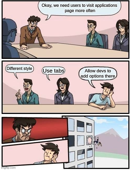
Problem is not whether or not is it simpler to access them, problem is if there’s even a point in accessing them. I will explain via meme
And also there was nothing wrong with having it all the way on the bottom, there’s no need to prioritize that useless page.
Again you missed entire point, problem is not what it does, problem is how it looks. It looks 1:1 like android switches and doesn’t use silica elements at all. 2.0 menu was using silica elements and it was all just fine but they just had to make it look more like android without using abience color or anything
Same as look of the buttons on them, again they could go with silica buttons but why would they, its better to fuck up the job
well, not the one i mentioned. All i mentioned was breaking SailfishOS guidelines made ever since beginning of sfos hell even go to Jolla youtube channel, click their first video ever and you will see how many recent changes don’t fit what that video shows.
That’s not the point either, buttons sometimes are best solutions but hell no always. But recently jolla just looooooooooooooooooves buttons
And when you swipe it feels slow loading the tab. As i said before the two options could have been added to the top of the settings in a User section and be done. Tabs are really nice. Overusing them is not.
On an unrelated note what i think also started to creep in the SFOS design is that the text size is kind of all over the place in many areas of the phone. Notifications included whic contribut a bit in making the whole thing look cluttered…
The switches in the top menu do use the ambience colour, so I have no idea what you’re complaining about. The text is white (or black if you use a light ambience), just like the vast majority of text everywhere else in Sailfish, but if a switch is toggled, it as well as the text below it gets coloured in with the ambience colour. The lock button is white, but gets coloured in with the ambience colour if you tap it. There’s a little tab at the bottom of the top menu, just like the one that indicates that you can pull up the application launcher. I can go on and on, but the fact is that the top menu fits inside Sailfish perfectly fine.
The old style switches and especially the old style buttons looked very amateurish. Android may be a horribly designed mobile operating system, but it gets at least a few things right. It’s not that Sailfish is “imitating Android”, it’s that Sailfish is implementing better designs (in general) and those designs also happen to be implemented in Android (because they’re better). You know where else you can find those designs? In every single other modern operating system, whether it’s on desktop or mobile. Not because Android did it, but because it’s good design.
The application settings aren’t useless at all, they’re where you’re supposed to edit your application’s settings. You’re grasping at straws here.
Aren’t you annoyed that we have settings in the apps and setting in the settings app? My opinion is that settings should be in the app and the app section in the settings should be about permissions (more fine grained if possible) and anything related to how the app interacts with the OS.
THIS. Tabs are epic when used correctly. In settings they’re insanely unnecessary
If they were using sfos Theme class or standard elements then it wouldn’t be a problem
so? they’re not the ones that need colour. you pointed out another mistake on jolla part thanks
looked very sfos aswell, worked same way too
As if devs were able to add applications settings there. Currently you can edit only like one time configuration options of STOCK apps only and don’t touch it ever again. People had trouble finding depecher’s settings because they were on apps page and that was insanely unnatural to them. There’s no need to make them separate page if there’s no need to go there
there are settings in apps becuase devs can’t put settings in settings app. If anyone does it they still have sttings in app that open settings in settings app because again noone goes to apps page in settings because THERE’S NOTHING USEFUL THERE BECAUSE SOMEONE THOUGHT THAT MAKING THAT PAGE AND NOT ALLOWING DEVS TO USE IT IS GREAT IDEA. GOD DAMN IT JOLLA
I still don’t see why app settings should be in a separate app. Makes the whole thing slow. Ie you want to modify something you have to leave the app, open the settings apps, navigate to it modify it, go back to the app and do what you want. Even if its launched from within the app you would still have to go through the whole opening a new app launch. Which is pointless.