meego was too much pink for me when i had maemo, but now i think meego had peek design and it is the most beautiful ui today. since sfos started to become unreliable i switched back to an n950 with meego and will only switch to the jolla 2, which i bought too, when they turn off 2g
2 Likes
He has an N950! Get him!
Kidding. I still have an N9 and sorely miss using it but starting from SIM to APIs, certs - it’s too much hassle to keep up.
Man, do I miss that thing.
4 Likes
I love the N950 so much; it has a design ahead of its time. I dreamed for years about owning it. It is more than just a device. In fact, Nokia was going to release it as Lauta just because so many people were jealous of that device, but then that disgusting, selfish guy’s note came: “We are on a burning platform.”
As an additional question, why did SFOS become unreliable for you?
Regarding Volla OS:
That doesn’t have to be the case. In the Volla Launcher settings, there is a “Display and Menus” menu item, and within that, an option to “Show frequently used apps.” If you disable this option, all apps are displayed, and they no longer shift around.
1 Like
Hi @nthn- yes, I got this right, but permitted myself to ask the question, anyway ;–)
Speaking of apo launcher. I somehow find myself difficult to find an app compare to I do the same for my Google Pixel on Microsoft launcher (yes I know).
The apps of the Pixel are in alphabetical order. Whule SFOS apps are just staying as I put (or comes last when installed).
I’d like to choose the order of the apps. Wonder if it is technically difficult.
S-Mario
Thanks for your reply. I had already tried this on the Volla several times. This makes it even worse because there is no way to arrange icons yourself. They cannot be moved. The result is an illogic mess of apps. I understand Volla wanted to give Android a special twist, but this was not a good idea.
Sailfish UI is better. I wish Threema Libre can have access to camera on the new Jolla phone. Then I don’t need Volla anymore.
1 Like
Kanthal
Funny, my experience with friends is different. When they saw my XA2+ with blood red ambiance, they reacted with: ‘Oh, that looks nice’. They use iOS which still has better looks than Android, but an over-elaborated UI.
2 Likes
That’s nice to hear for a change.
Did anyone start using it and/or switched to sfos?
Trying to understand if they mean it or they’re trying to be nice to you ![]()
if one uses the official ports, the xperia 10iii looses audio sometimes, which is annoying during calls, then the 10iv and v don’t have working cameras, bluebinder is eating charge fast if you forget to stop it, then there is the f(x) tec 1 pro x which is a great device, almost an n950 with sfos, but if i turn it off it sometimes turns itself on, without the display and if i don’t notice the white led it discharges itself. then in general the battery lasts very shortly with sfos. on meego i can almost use it for 2 days even with gps routing for a few hours. oh yes and mms just isn’t working on sfos, if i remember correctly, but that is not a so important feature. my impression is that what’s still working in meego works reliably than on sfos, except for the browser which is very outdated on meego.
i know a guy on facebook in thailand who still has an n950 and is willing to sell it, i bought an n950 from whim with paypal last year.
Of course they are just being nice, almost every single person that saw my xa2 told me that sailfish is beautiful, but not a single one switched
It’s the same old story where they would lack the commodities they are used too i guess…
2 Likes
the switch?? …surely, you mean the design of the console and not the GUI, right? 0.o
the switch’s GUI always seemed really bland and boring-looking to me, especially compared to previous nintendo consoles, I would hate it if Sailfish looked like that.
3 Likes
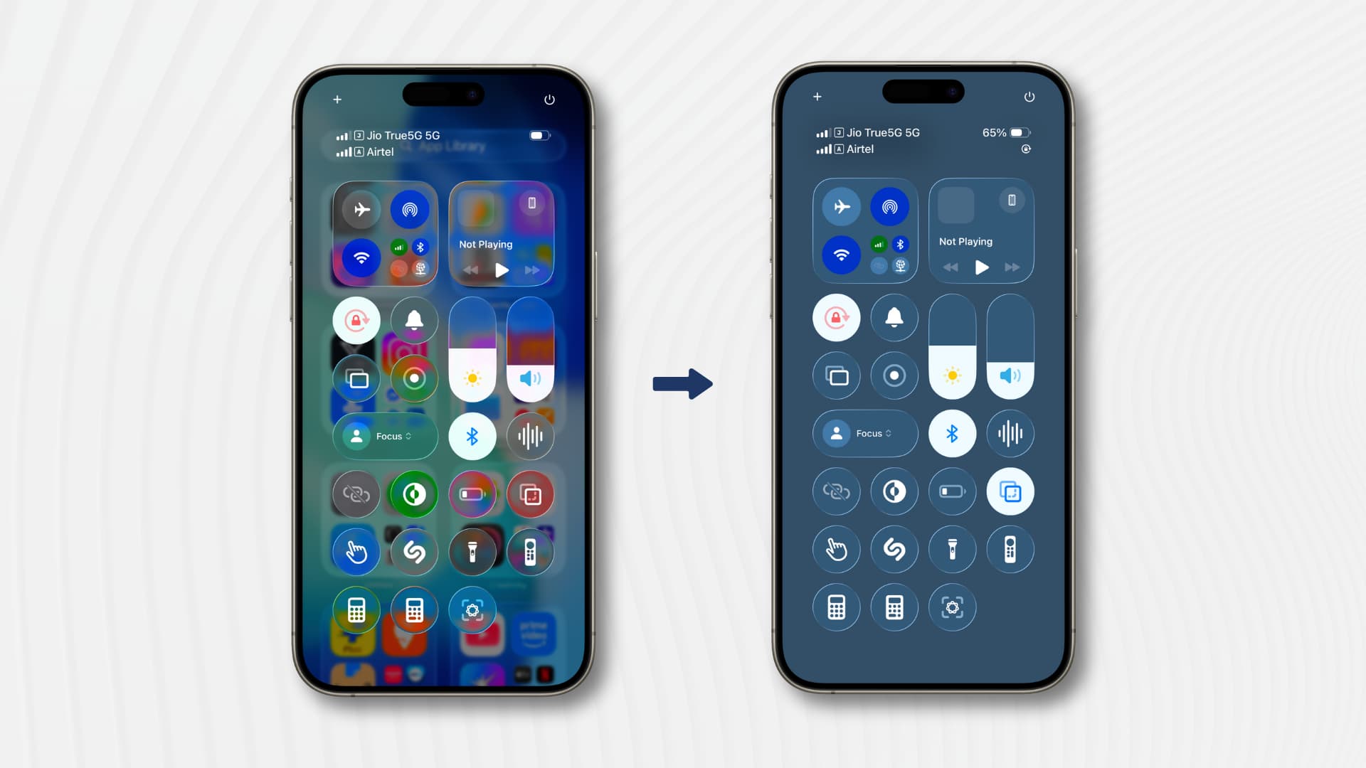
This is what a SFOS refresh could look like in flat ‘modern‘ design (boring and Russian :P)
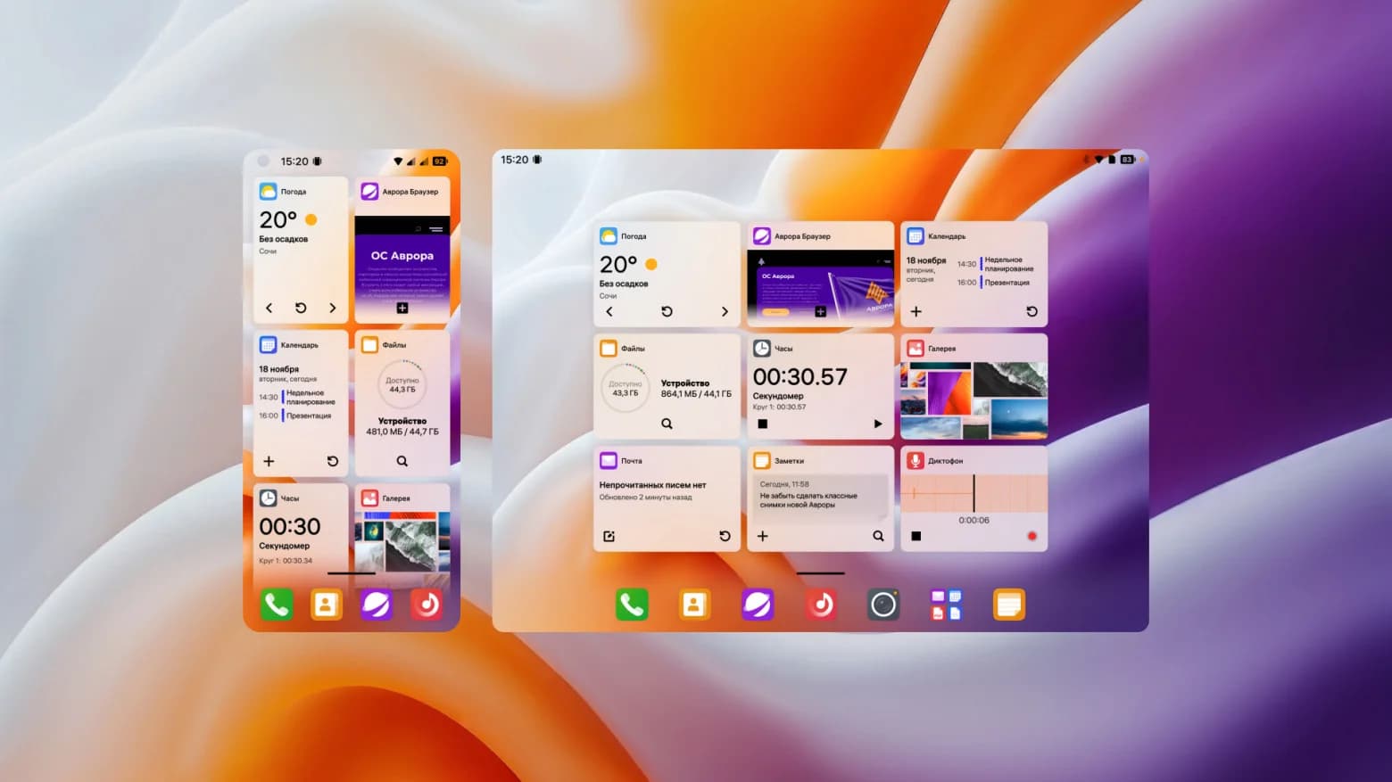
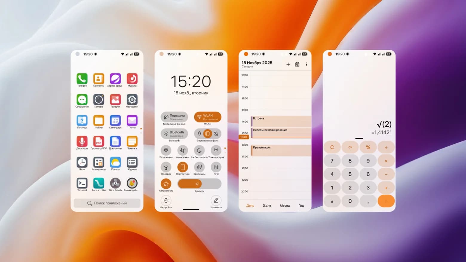
What we have is way better.
5 Likes
Agree, windows phone was epic
1 Like
@sanginteret I absolutely agree with you. It looks just like snother boring Android design. I really like the gestures and the silica design. Whenever I use a Android phone, I miss it’s simplyness and clarity.
It’s interesting to see how they made an alternative button-based main interface and users can just switch between buttons and gestures. But inside applications, everything appears to be button-based, so you wonder why they didn’t just remove gestures on the home screen, too. Still, very interesting to see this alternative take. Some good ideas on the covers, too. And having the most important application launcher always visible on the homescreen is like Sailfish 1.0.
1 Like
That… doesn’t look too bad, actually? I like bits of it – the visual tweaks to cards, the dock at the bottom of the home screen, the app drawer. There are some things here that would not be a bad step for Sailfish to take, IMO.
That only goes for the system shell, though; the apps look like very generic Samsung slop. And adding button-based navigation, and (seemingly) removing ambiances is just wild.
1 Like