You are NOT alone! I wanted to say the same.
I actually like the notch a lot. The best notch I’ve ever seen in a phone model.
Do not change it in any way ![]()
“nudge nudge wink wink”
…or…
“notch notch wink wink”
(Monty Python quotation)
You are NOT alone! I wanted to say the same.
I actually like the notch a lot. The best notch I’ve ever seen in a phone model.
Do not change it in any way ![]()
“nudge nudge wink wink”
…or…
“notch notch wink wink”
(Monty Python quotation)
Thank you for the update! Looks stunning ![]() Hopefully you are able to get functional sample soon!
Hopefully you are able to get functional sample soon!
It’s the same as the original C, isn’t it?
Fine if it can be wrapped so that
Looking good @Jolla ![]()
Oh, thats interesting. Yeah, I agree then ![]()
that looks very nice.
The hardware itself is absolutely beatuiful, but sadly SFOS lags seriously in terms of development and features. So worst case hopefully we will be able to install postmarketOS on it.
I dislike notches, but I agree with this take. We get a few scrap pixels and to use them for status indicators is what makes most sense to me. Filling those pixels with black would also work for me and would stick with the clean design philosophy.
Of course, not all indicators will fit and, to make matters worse, what fits will depend on which phone we’re talking about. No such thing as an ISO standard for notches.
I want apps to stay away from the notch on all devices. Not only is information potentially being masked, the notch also interferes with pulley menus. You first have to pull past the notch in order to reveal the menu items, so menus suddenly seem one item longer than they really are. Try the Calendar, for example.
So my suggestion would be to place indicators in the scrap pixels with the menu indicator (“glow”) below. Pulling would then immediately reveal the first item.
Maybe I need to make a trip to the Jolla office (it’s like 8 min walk from my place ![]() ) and try it out with my small hands (which struggle with the C2 because of the size).
) and try it out with my small hands (which struggle with the C2 because of the size).
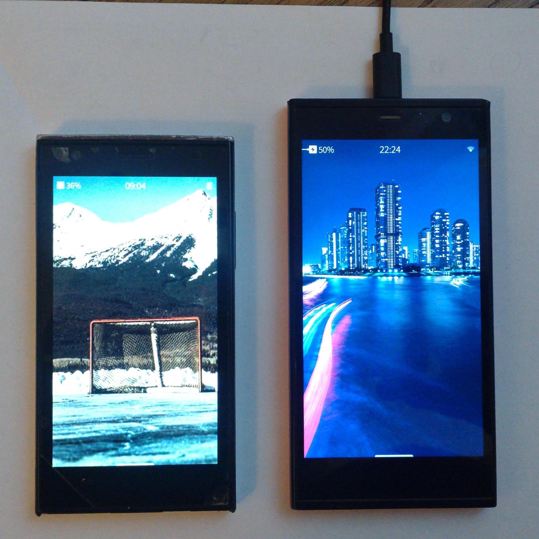
Take the C2 with a notch as an example. On the home screen, the status bar is split into two horizontal parts because of the notch, and it just looks ugly (at least to me). In addition, all Jolla apps Calendar, Mail, etc. are shifted several rows down to avoid the notch’s dead space. The same principle is followed by other apps as well; none of them uses the extra space around the notch.
The always-visible status bar is not part of the SFOS UI design principles. Also, bear in mind that all Xperia devices do not have a notch, and future SFOS devices might not have one either.
Video on #peertube Jolla Phone 2026 appearance model - @fps_gbg – PeerTube
So true. @Jolla you should include the J1 as well.
Looking at it side by side, I already struggle a bit with the Xperia 10 III in some pockets and seems like the J2026 would be a bit wider, but otherwise comparable. Would love it if it was just a touch smaller, but I guess there is not much we can do with screen availability… Otherwise I really like the design, although rounded corners at the bottom might not be too bad. I always found the corners a tiny bit annoying on the J1 and the N9. Also not a fan of the notch, could just as well make that part black, but otoh eh, can be done in a patch. But again, not a deal breaker, in general it looks nice.
interesting observation but I still hate notch with passion… ![]()
![]()
on the other hand it would be interesting to know how many new users are in the pre-order pack? I tend to think that we are all old SFOS infected folks…
Something like @nephros’s patch would be probably really cool to just black out the notch and enjoy the phone without it
patch in question: Project: patch-notchbar
The total disregard for ergonomics is idiotic and i’ll never change that view on phone design.
And i’d like to know how all those “bigger the better“/”moar website on a screen” people feel if they were forced to drive a car that had a steering wheel of 1.5 meters diameter or wear shoes that were 8 sizes longer than their size without any choice for anything else.
The corners feel very similar to J1 and C1. Given J2’s larger size, slightly rounder corners, like on the Xperia 10 III, could improve the overall balance?
BTW do we know anything about protective cases?
They have said somewhere that they will offer those also. Can’t just remember where…