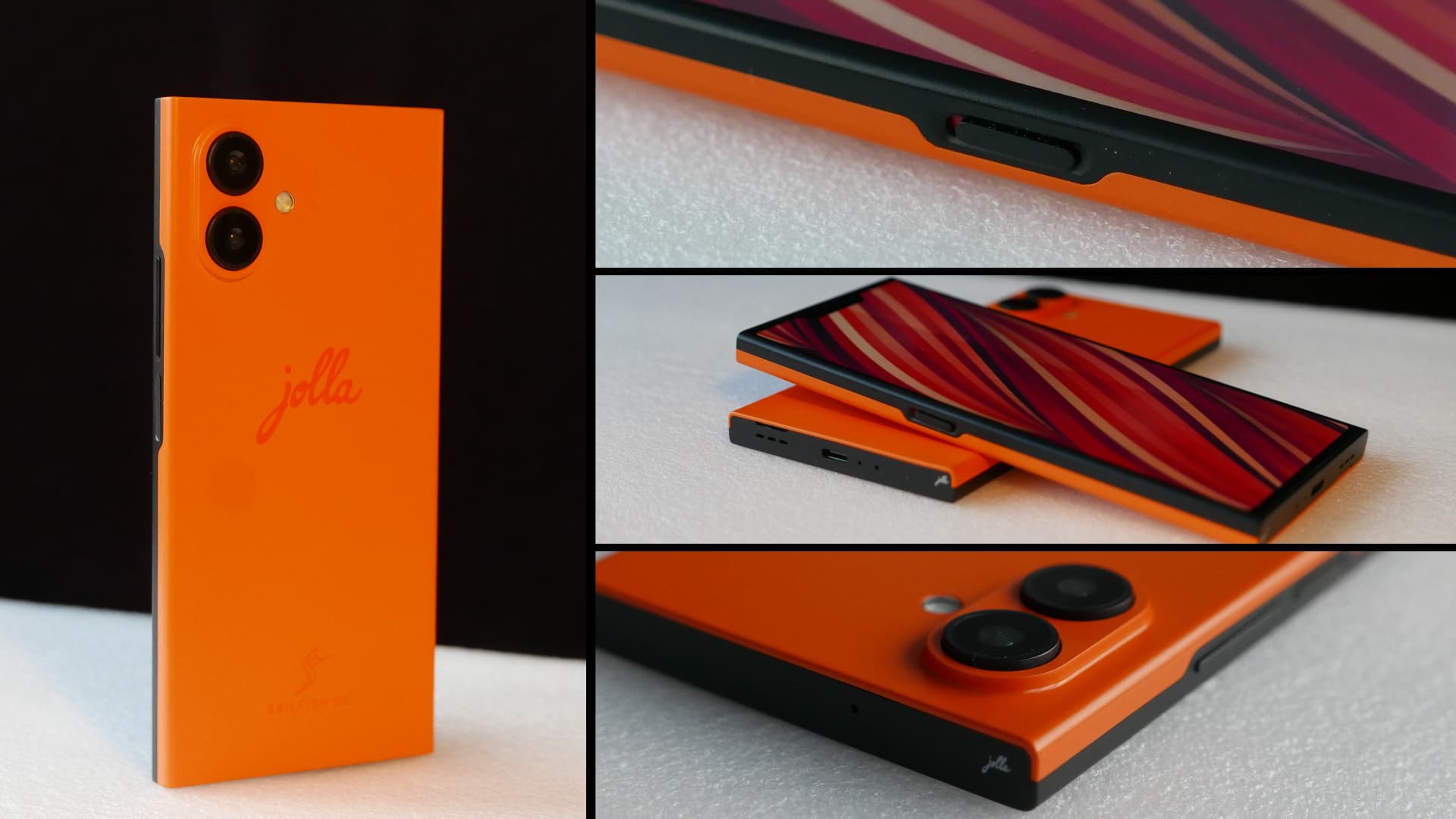
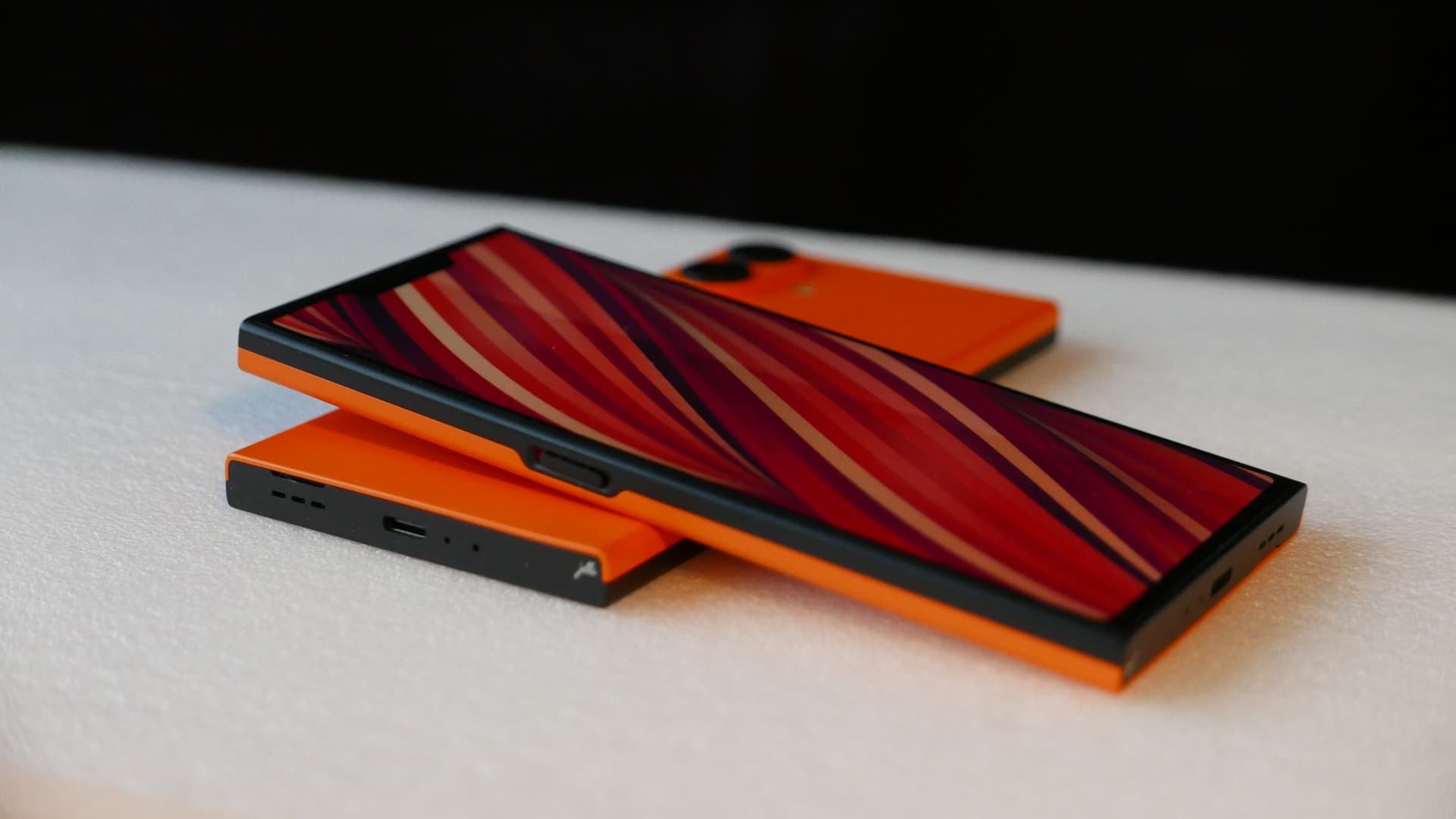
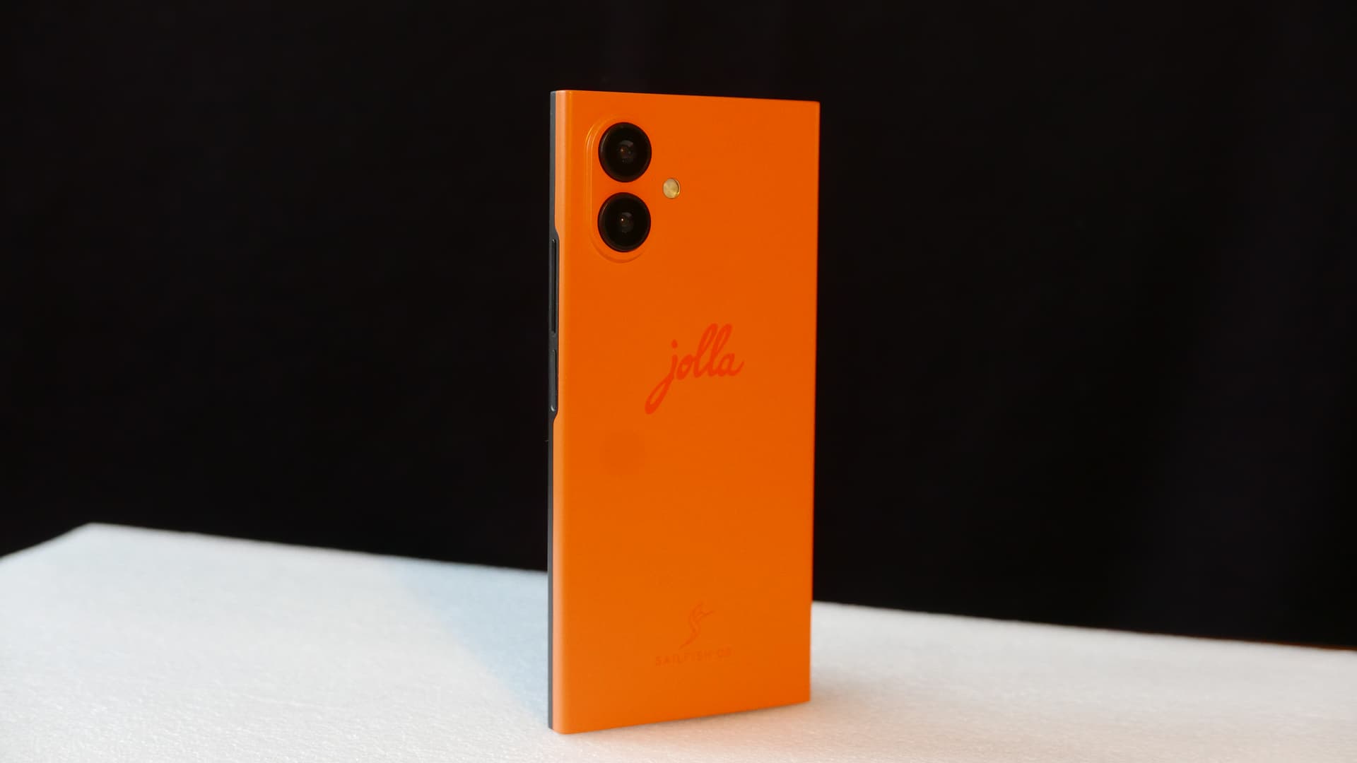
Exciting times, we’ve just got the first appearance models of the new Jolla Phone to our hands and want to share it with you!
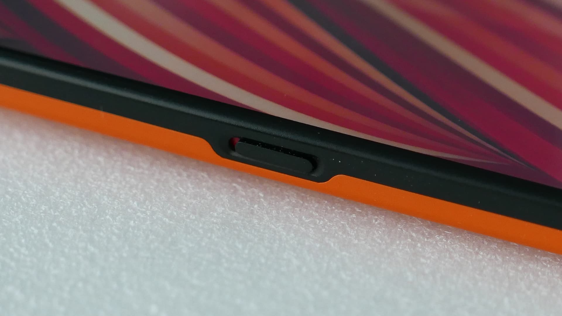
In particular having the product at hand and feeling the actual physical size & dimensions has been an important moment we’ve been eagerly waiting. That’s why we create at this phase of the project so called “appearence models” with the real dimensions, weight, materials and feel as-close-as-possible to the actual device. So not to confuse: the appearance model does not have functioning electronics inside yet - actual functional samples are to come down the road later.
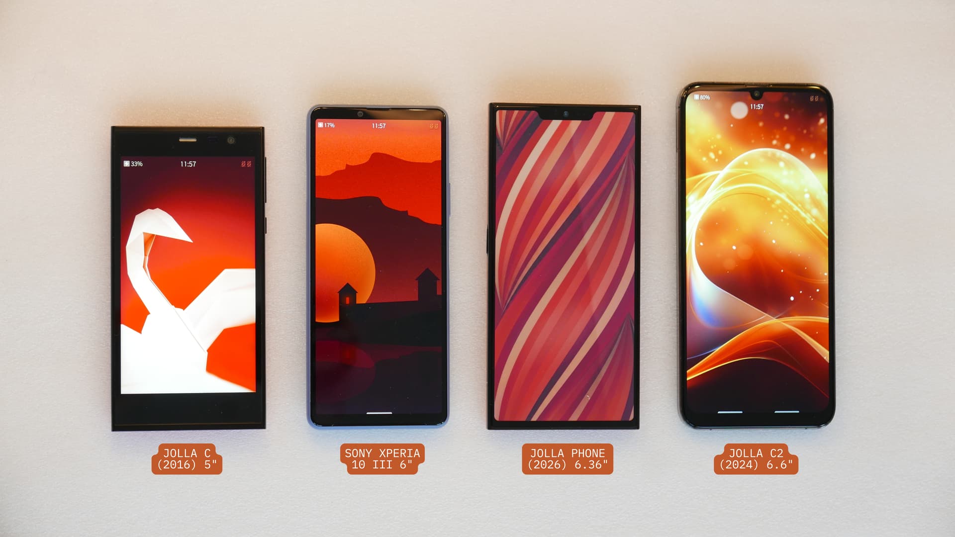
And yes, it does feel very correct at ones hand. Operation with a thumb feels natural and the product is balanced in size and dimensions. The aspect ratio of 20:9 fits well to it. Size wise the upcoming Jolla Phone compares well e.g. to Sony Xperia 10 III, a device very popular in the Sailfish community and with a 6" display.
Attached some pictures and a short video clip of it. Enjoy!
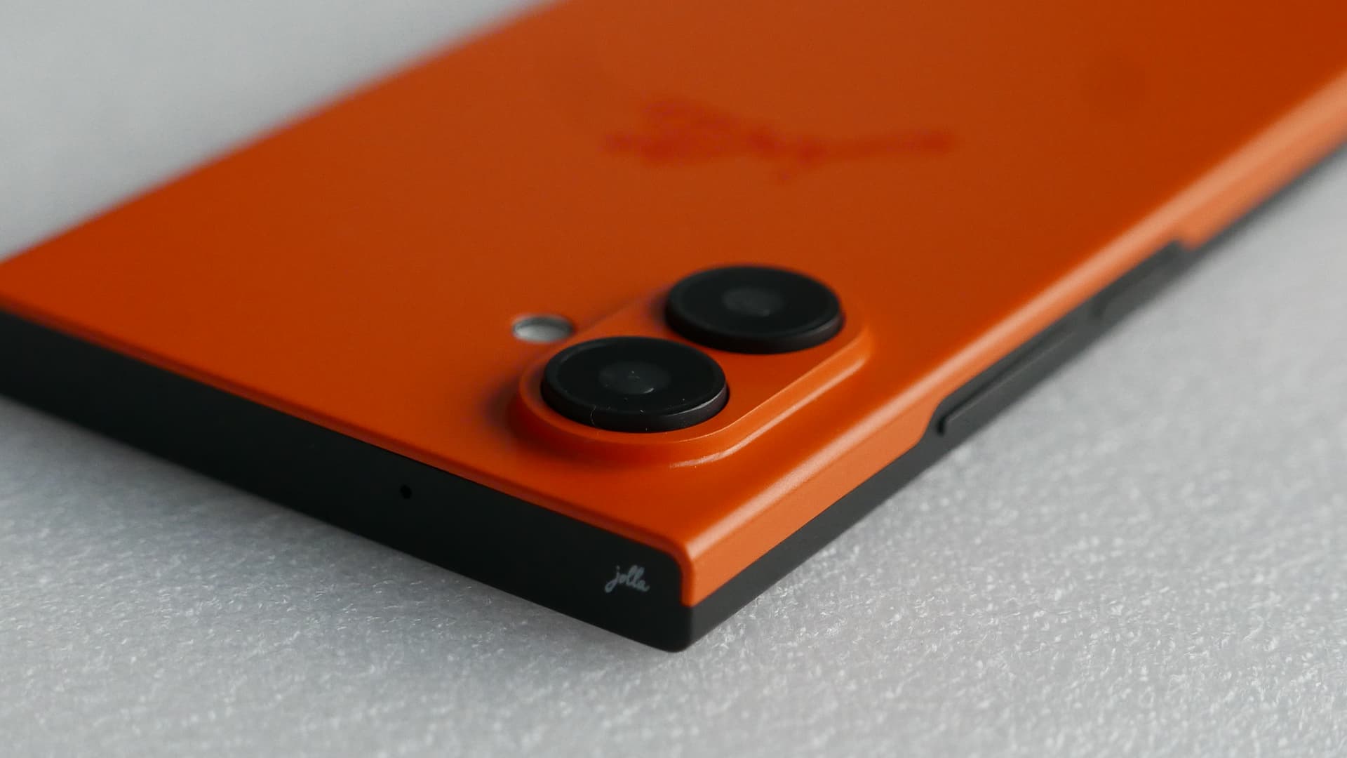
Does look very good indeed! I like how the backcover hugs the corners, with the all-black edges, the orange back accentuates this detail nicely.
Do i guess correctly that the back is attached just by clamping on the sides?
I hope this is durable enough, There might be some wear in that area, especially if taken off now and again, comparing to J1 withe the back formed all around, and ultimately showing wear and cracks.
Also, at least the camera looks smaller on the model than in the rendering.
I do not like the display notch at all, I cannot see the point of having one, apart from causing trouble. I’d better disable if possible that top row of pixels!
Very nice looking phone. It’s a really refreshing design in this age of gray’ish slabs. Are you considering more colors on launch? I’d really love a cyan, or turquoise or teal. That would be awesome
Earlier, on a Finnish tech forum people were discussing the news about the pre-sales, and one user brought up an interesting observation about the notch. He pondered how it might help new SFOS users better visualise how the top-edge swipe is divided into three between the corners (close app) and the middle (bring up the top menu).
I have the (unpopular) opinion to like this notch.
I dislike very much the island (punchhole) models that look like the screen came with dead pixels in the top-center. The narrower, the worse (more visible as “dead pixel”). But the V notch of the J2 is so wide it does not appear as “screen defect” to my eyes. I see a shorter screen in vertical direction, that happens to have extra pixels on the top-left and top-right corners that can be filled with permanent status symbols (time, 5G, signal…)
Applications should not occupy the notch of the V2, because it is so wide it could hide important information from the window. Assuming that, then we have an always-visible status bar. I understand if some don’t want a status bar, but in my case, I like the idea.
The status bar could be diveded so that e.g the left part is reserved for the system level information and the right part could be a Silica component which App developer could utilize the way their liked.