App identity, Silica, and the "dated design" conversation

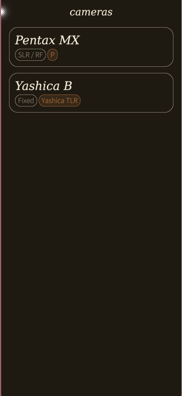
Background: I’m building my first Sailfish app — a light meter for film photography. This post is me thinking out loud after wrestling with the UI toolkit for a while. Warm criticism, not a complaint. I’ve ordered the new Jolla phone and have only tested the SDK. Creating this free native app is a small way of showing my enthusiasm and say thanks to the Jolla crew! I’m excited!


The identity tension no one talks about

When I started building with Silica, I assumed the framework would just fade into the background and let me make the app I had in mind. It mostly does, but there’s a specific moment where it doesn’t, and it took me a while to articulate what was happening.

Sailfish’s design system is built around ambiences and theme colours. Your app inherits the user’s chosen palette, which is elegant in principle, but if your app has its own visual identity (a brand, a specific mood, an aesthetic that isn’t “Jolla default”), you hit a fork: either override the theme and break consistency with the OS, or follow it and feel like your app has no face of its own.

For Jolla-made apps, this isn’t a problem. They are the OS. But for Proton Mail, or a Meta app, or my little darkroom-aesthetic light meter, the mismatch is quite real. The transition between Silica’s default list patterns and a custom-designed page feels like flipping between two apps. You either commit fully to the Silica idiom and surrender your design intent, or you fight the framework constantly.

I’d love to know how others have handled this. Is there a middle path I’m not seeing? And from one who’s never used sfos on a daily basis, what do actual users expect and desire (not just thinking of the prejudiced phantoms in my head :slight_smile: )


On the “it looks dated” criticism

I see this in the forums occasionally and I always want to push back, but felt I think there’s something real underneath it that’s worth naming properly.

Sailfish doesn’t look dated to me. The motion, the edge gestures, the ambience system — it has a personality that a lot of Android skins would kill for. But I think what some users are actually sensing, without quite naming it, is an accessibility gap rather than an aesthetic one.

Modern UIs, especially post-2020 Material You, iOS 16+, and GNOME’s recent work — lean heavily on explicit structure: dividers, card surfaces, corner radii, generous padding, and slightly heavier default type weights. WCAG 2.1’s guidelines push the same direction. The reason isn’t decoration, it’s that these visual cues do cognitive work. They tell you where one item ends and another begins without making you measure the gap between them.

Sailfish is more minimal. Structure is implied through spacing and text contrast rather than drawn lines. That works well on a clear screen in good light. But at arm’s length, or in bright outdoor conditions, or for anyone with slightly reduced contrast sensitivity (which affects more users than most designers expect, a not small amount of men have some form of colour vision deficiency, and contrast sensitivity generally degrades from your mid-30s onward (I’m here :smiley: ) ), the implicit structure gets ambiguous. Where’s the divider between these two list items? Is this a section header or a row label?

The thin system font makes this more pronounced. Text can meet contrast ratio requirements (WCAG’s minimum is 4.5:1 for normal text) and still feel visually light if the stroke weight is low. Contrast ratio measures luminance difference, not perceived weight — a hairline font at 4.5:1 reads very differently from a regular-weight font at the same ratio.

I think this is what might register as “dated”, not the aesthetics, but a certain visual fragility under non-ideal conditions.


A small thing that would make a big difference

An optional accessibility mode with bolder default type weight, explicit list dividers, slightly increased item height would probably address most of this without touching the ambience system or the core aesthetic. iOS has had something like this for years (Bold Text, Increase Contrast), and it made a real difference for a lot of users who didn’t identify as having accessibility needs. They just found the UI easier to read.

Even a community-level convention — “if you’re building a Sailfish app, consider adding a high-contrast text option in settings”.

*I’m curious whether others have run into the app-identity question, and whether the accessibility framing matches what you’ve experienced. Happy to share screenshots from my own app if that’s useful context. :smiley:

Again, I really believe in sfos, jolla and it’s my first post, so don’t hate on me too much* :smiley:

Warm regards from Sweden!

24 Likes

Hello and welcome! What an entrance, first app cooking even without test device :slight_smile: That’s stunning beginning! I’m not a dev and have been here only year, but I have tried to test many apps. I like the native Silica look and feel. It keeps the usage of sfos continues and beautiful. That is reason why I prefer native apps over android ones even with limited functionalities.

That said, I have always thought that when well branded companies start to make apps for SailfishOS, they will for sure want to have their branding visible somehow. But as I have zero idea how things work, can’t really tell how and if that is possible currently. Again, welcome!

Warm regards from Finland!

4 Likes

Okay, now this is the more practical criticism I was looking for.

And yes, this is something that could be tweaked, eventually whenever Jolla has done all the underneath stuff first.

For example, I have noticed that when I enabled the Nokia Pure fonts, the keyboard became much easier to use as I made fewer misclicks. I’m not sure if it’s because the font is bigger and bolder making it easier to see or because it actually made the keys bigger. (this experience is based on Xperia 10 II, so could be a also just device specific issue)

In general I do like the default font (I think its fork of the Adobe source sans which I have been using on my desktop)

4 Likes

I feel it easy to make apps with Silica. The paging system is easy, the app sizes use minimal diskspace, c++ or python can be used if javascript is not enough, sqlite works nicely.

Not to be able to use some apis or libraries limited me in the past, but now e.g. Location is allowed enabling maps to be used in the app.

If you want to fit the app on one screen makes coding harder. You have to use e.g Background elements and javascript to ajust the contents to the Sreen.width and Sreen.height

If we are having more modern Qt in future, that might give me new possibilities.

Like you notice I am happy with current situation. The limiting factor is mainly me.

1 Like

Welcome

For me the SFOS style guide is a big plus for the user. Less needs to learn many app specific tricks, less eye catching effects, more unpretentiuos design.

For me a gui of an app is only a helping hand for the user.

One way here is your own font size setting. That’s easy to realize. Make your own QML type for each text field type. And you can set the background to black with opacity = 1. But please respect the user expection and the environment. So create no app with white background. Only for the browser this is allowed :grinning_face:

1 Like

It’s easy to add decorators, although I usually just use alternating opacity. a number of apps use implicit eliding lines between list elements which can look nice. Have you tried just adding a line using a separator in the delegate?

            Separator {
                width: parent.width
                color: Theme.highlightBackgroundColor
                horizontalAlignment: Qt.AlignHCenter
            }

EDIT: one convention I use is indentation. Icon top left of content for instance (or an avatar), further content indented. That creates a bit of space and acts as a clear indicator.

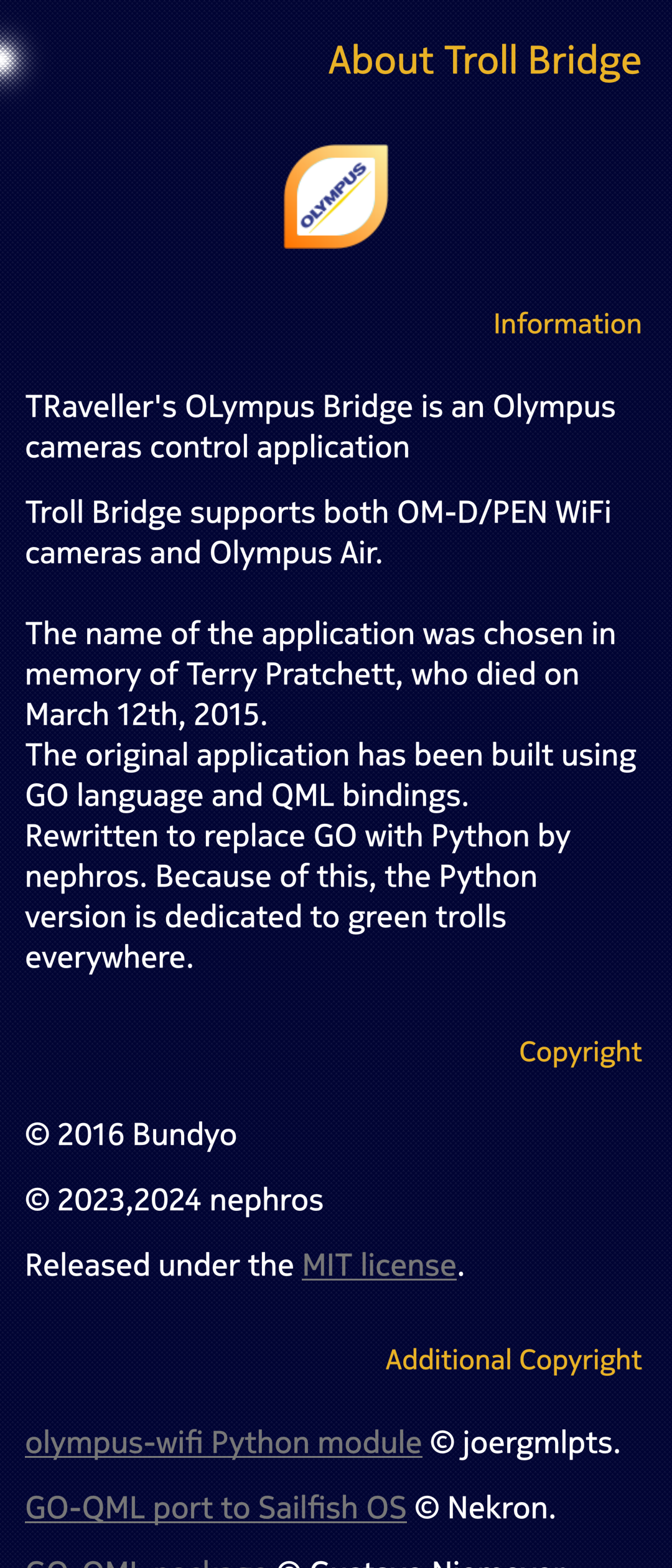
I know it’s not a very good or complex example, but in one of my forks I tried to do ‘Brand Identity’ through simple palette overrides, while retaining Silica UX:


This is done simpyly by defining a couple of colors in the main app component, and then assingning them to the palette of the main window.

Colors were taken from the Olympus web page CSS.

6 Likes

also, there’s literally the SectionHeader {} type for section headers :smiley:

there’s also the palette property group to change all theming aspects. Silica is versatile - if you read the docs.


It makes sense to read the docs and look at existing apps to get a feel for the platform. Sailfish is different and unique - and that’s a big plus. If you want to make an app that fights against the platform rules and design guidelines, you will get into trouble. That’s same on any platform/DE, Android, iOS, KDE, GNOME, …

@nephros’ example is how to do that right, even though I’d say it’s debatable whether it’s necessary to shove “brand identity” down a user’s throat in a FLOSS Sailfish app :wink: .

2 Likes

I hope this works for me too!

I understand that this may feel limiting or weird, and in some instances probably unacceptable. I have a hard time imagining Facebook making a native app that doesn’t 100% reflect the Facebook brand. (I also have a hard time imagining Facebook making a native app.)

On the other hand, look at Tooter, the Mastodon client. It doesn’t show off any specific branding, neither app brand nor instance brand, but does that actually seem weird to you, as a user?

In fact, I feel the design system is elegant in practice, not just in principle. Let me explain why.

If you look at SailfishOS as a whole, there is very little branding going on. Instead, things are centered around user wishes. Have a favourite colour? Pick an Ambiance image and colours to match your preference1 - and the system will adapt and still feel consistent.

Same goes for apps. First and foremost, these are tools for people and canvases for content. I mean, look at how screen real estate is allocated. It’s almost 100% devoted to the content a person is interested in, the very reason they run an app.

There’s no ever-present navigation bar or worse, one that slides in and out by itself. There’s not even a strip of indicators telling you battery level or signal strength. Contrast this with Android or Phosh, for example. (It’s always just a quick peek away, for when you really want to check.)

First, a quick note on consistency. Apps can have their unique visual identity without breaking consistency only if the underlying system is already a mess. I.e, when there is not much consistency to break.

In general I think there are two specific places for apps (and app developers) to brand themselves: The icon and the cover. In both cases branding helps people quickly distinguish apps, in addition to providing brand recognition.

Other than that, the most important qualities of an app are how well it serves its purpose, and how native it feels. People shouldn’t have to learn unique visual cues or procedures to accomplish what they want.

Said in another way, apps and the underlying system are guests in people’s homes. They should follow the whims and rules of the host. This is different from people visiting a shop downtown, or a website, in which case the owner gets to decide - within the rules of the law (unless the owner is too big to care).

I understand the wish for a visual identity of one’s own and I do think @nephros’s example above is reasonable branding. There may be cases where the aesthetic or mood is the reason a person starts an app, and then it’s entirely reasonable that the app provides exactly that.

But please also consider the cases where a person has made their opinion known by picking a suitable Ambiance for this specific moment.

Continuing the home metaphor: As a guest, how much branding can you add to their house without being offending? Will your vivid colours and fancy fonts be well received, or will you look like an intruding clown because they chose an Ambiance conveying tranquility?

Other platforms say “stop theming our apps”. People using SailfishOS are told to “theme the system and apps as you wish, and change theme as often as you please”.

(Edit to make footnote visible:)
1Pick <…> colours to match your preference and sound settings to go with them. Ambiances are such an underestimated vehicle for setting your phone up for any occasion, especially when combined with the brilliant Situations app.

7 Likes

Please bring Troll Bridge back (to CHUM) :heart_eyes:

1 Like

Oh, correct me if I’m wrong but you’re talking about app design now right? The second part of my message was about the “dated look of the OS-discussion”. I can’t modify the sfos to make dividers visible right?

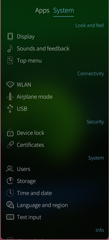
My app kind of follows WCAG quite close, I was referring to sfos, the lists in settings for example

About that first section:

Are you saying you cannot manually define colors when coding for SFOS? I understand that that isn’t ideal either though.

Agreed, I’m pretty sure Facebook will never make a native app for SFOS, nor will most other ‘big app’ providers either.

I still use FratzenJail as a native Facebook app. This is simply a SFOS wrapper around the Facebook mobile website, but perhaps a little more secure because its runs in its own Sailjail box.

The interesting thing about this app is that you have all the standard Facebook branding as per their mobile web site, but in a SFOS window - so it has all of the typical SFOS elements like a pulley menu and SFOS icons for accessing home, reels, bookmarks, etc.

In my view this is an elegant compromise which retains the Facebookiness, but also just looks like a native SFOS app.

2 Likes

Oh, no you can, if you look in my little example above I’ve done just that, I’m not sure I’m going to keep it. I can still make the app with bold fonts, cards and other accessibility cues without forcing my own colours.

As I wrote above, I’m new, haven’t used the sfos live and not seen any other native apps the the settings provided in the emulator. So my experience might really be lacking.

I’m just mentioning the accessability idea as an attempt to understand the feeling some people have when they say sfos feels dated without ever specifying why.

The app design struggles are just me coming from somewhere else entirely first. I’ve only ever designed computer software and websites.

I thought the idea of @jojomen of the app being a guest in the phone owners house to be interesting. I spontaniously don’t agree, but I think that might just be gut reaction rather that a thought through stand point. I’m very open to understand and experience sfos for real when I get my phone :slight_smile:

If we continue the home metafor I wouldn’t see my app as a guest, but rather as decoration or function that someone chose cause they like it for it. Not because it matched their wallpaper. Like a tool in a drawer, or a random book on a shelf. :slight_smile:

:smiley:

I might even do two versions of the same app, one that adapts to the highlights and colours of sfos, and one that doesn’t. I’m pretty sure “Jolla user + analogue photographer needing a phone light meter” intersection isn’t tooo populated ! :wink:

Appreciate all the feedback!

2 Likes

The defaults for a list view don’t have decorators, but that’s just minimalism. As I said, you can place all manner of things, like boxes and bells and @ichthyosaurus mentioned the specific header types.

Your examples are showing a mockup ? A silica app. I’m not sure I understand what to make of them. Or are they an android app?

Please add your ideas on how the accessibility of Sailfish can be improved to this topic:

It would be better if they could be part of Sailfish itself, so that a user only needs to think of the accessibility options in the system settings, and not have to turn on an accessibility mode in every application separately.

4 Likes

Looking at market shares, it would be fair to say that close to everyone comes from somewhere else entirely :wink:

Where I come from, it was difficult to put a general purpose computer in your pocket. The computers you had nearby mostly served the needs of their users, and suppliers made money from selling hardware and software. They could just as well have been selling carpenter’s tools, the business model would have been largely the same.

The landscape has changed since then, of course, and it’s not so much the technology as the business models and attitude towards people. A very small number of actors have managed to carve out extremely profitable monopolies by abusing people and inserting themselves in every interaction, in every transaction.

They prefer you to run the app, rather than visit the website, even when it’s just a web app in disguise. They do this, because apps allow them to extract even more data than the website does. And they have normalized the idea that they get to push their rules, on devices people have gotten for their personal needs (and paid good money for).

Ok, I’m painting a picture with a broad brush here.

It’s not like it’s technically impossible to build something better, but it won’t happen on big tech’s home ground.

Luckily, there are other ways of viewing our relationship with technology, ways that I find a lot more palatable. My analogy of the phone being like a person’s home is a reaction to the ideas underlying the surveillance giants. Aral Balkan provides a more thought-through perspective:

Basically, he argues that we use our phones for needs connected to the most intimate parts of our lives and relations, connected to who we are. They have become extensions of the self. In that sense, he goes further than my home analogy.

Regardless, one consequence is that we should respect people’s rules, rather than try to set our own, because people are using their phone to fulfill their needs and wishes on their conditions.

Absolutely, if your app is a decoration or piece of art someone has chosen because they like it, by all means go for your unique expression. Say, an Alessi citrus press designed by Philippe Starck presented as a sculpture on the window sill. “Good art won’t match your sofa.”

If, on the other hand, your app is a tool people chose for its function, then it does need to fit into the toolbox and the preferences of the person using it. Say, a utilitarian citrus press that stows easily in a drawer when not in use. Especially in a system like Sailfish OS, where people can literally change preferences a hundred times a day and have an explicit way to make their preferences known to the system.

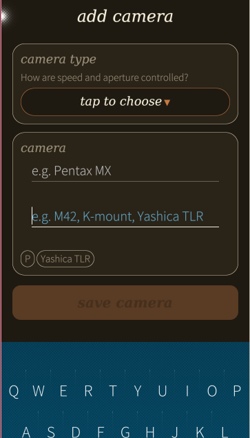
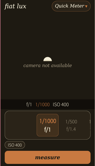
Looking at your screenshots, I’m inclined to say the app falls in the tool category, and I would prefer if you followed the native look and feel.

In saying so, I’m disregarding the accessibility aspect. Not because it doesn’t matter, but because I think it should be be tackled elsewhere. Accessibility applies to the system as a whole, including Ambiances (where applicable).

6 Likes

I completely get your point! Thanks for taking the time expressing it and I’ll read the Aral Balkan idea! :slight_smile:

1 Like

I do want to encourage you to make your app delightful to see and use, I just want you to stay with the framework. This is because apps that follow the Sailfish way generally present the least friction to users.

Unlike in my home, where all the appliances are from Siemens. Six machines have various timers in them, but the UI and the semantics differs. E.g., in some cases I can set a delayed start, in other cases it’s a delayed completion time. The logotype is the only thing being the same on all of them.

So, stick with the framework, but deviate when you have a strong reason - say, to achieve the optimal interaction for a light meter.

1 Like