Same here, now that I’ve seen the new UI a couple of times I don’t find it that bad, I just prefer the old pulley style and I don’t see why it had to change. It also had enough visual cues IMO.
1 Like
New design is unwated. Please revert back.
7 Likes
I guess nobody has really been waiting for my two cents on this, but anyway:
This change is atrocious for all the reasons stated above: unwanted, unneccessary, inconsistent, prone to error by experienced users, ugly and whatnot.
6 Likes
@Ruppana @csg1976
This kind of opinionated post doesn’t help the cause in any way.
Be constructive and suggest improvements or highlight were the new design has flaws or doesn’t work.
The OP took the time to explain motivation and purpose of the new design at length. You don’t have to agree or like it but please be so decent as to invest a bit more time than just offloading your negative emotion about the change.
22 Likes
I agree to rozgwi’s opinion.
But I do hope also that we keep this forum open for everybody to disagree (in a 'friendly manner’j. And let them express their consent or their disliking openly.
3 Likes
There will always be those who agree in a subtle fashion and others who feel the need to tell the world how pi$$ed off they are. Nothing wrong with venting, we are human and we all get pi$$ed off and to express how ‘pi$$ed off’ you are, shouldn’t be a problem, provided we are not dealing with direct name calling and slanderous personal comments.
I have not received a call since the update, so I have no idea how any of it looks and quite honestly, couldn’t careless, if I don’t like it, I will edit it until I do like it.
4 Likes
Complaining is fine and actually desirable (how else can we improve), but we should try to be civil, keep friendly tone and avoid personal attacks. Like said it will also improve of getting your message across.
We are already working on new projects, but in short term I am hoping we can still do few tweaks for the incoming call flow based on your feedback, in particular
- The strong green accept indicator transition divides people, some like it, some don’t
- Our scalability rules are not doing favours to the incoming call layout, the layout on the design mockups look more polished than what you get on some device displays
- Many commented that UI elements like arrow gesture indicators look too small
We are reading all feedback, keep it coming. 
17 Likes
Cool, I’ve been labelled a ‘complainer’ most of my life, I’m not sure I’ve ever been told it is fine to complain, regardless, I agree, how can we move forward without constructive criticism!, thanks @jpetrell
1 Like
Thanks Joona.
@Edz: My intention was not to forbid anyone to dislike the new design. Personally I’m not very fond of it judging by the screenshots and mockup. But haven’t upgraded yet.
I’m actually uncomfortable with the phrase ‘negative emotions’ above. It’s not meant to say 'stay positive and say good things only '.
My point was (as on other occasions) to avoid cynicism.
4 Likes
Thank you for your explanation. To my regret I have to say that I do not like the change. I am.still confused when answering a call. Not only because the pulley menu was a habit, but also because that was the most logical to me. The screen goes downwards and upwards too and not like iphones horizontally. I hope you will bring the vertical pulley menu back!
3 Likes
I did not read the other comments here before I placed mine. Now I see that some others are confused too. I am old and I never have had any difficulties with Jolla’s interface, on the contrary. But now, for the first time I am.confused picking up a call.
3 Likes
Pulley menus were never difficult to me, despite the fact that I am senior. They were /are easy. I do not understand why it has changed. This is no iphone that moves horizontally.
7 Likes
I haven’t had any issues adapting the the “new” answer action. It works quite OK for me.
I didn’t see a problem with the old version either. I was a bit surprised to the see the new action as I think the original version was more in keeping with the way other Sailfish applications work,
5 Likes
I am sorry to say, but if you need so.much explanation, it is not intuitive anymore. Sailfish is my daily driver for 6 years. Before that I had an iphone 3GS. Today I brought my XA2 to factory setting. Then you get that tutorial. I.was surprised again how easy the interface of 3.o3 was. Not only because I am used to it, but because the pulley menu fits into the rest of the interface of Sailfish.
You don’t have to be a ‘traditionalist’ to see that changing this interface is not a necessary improvement.
10 Likes
I agree. IMO the new incoming call experience is just different, not necessarily better or worse. After the first two calls I was used to it. It’s not like the remorse-timer change that caused panic and possible data loss (The “x” icon still does).
6 Likes
I prefer option B.Pulley menu is unique.Please don’t make it looks like Android.
3 Likes
In fact, in Android 10, it has the pulley style for incoming calls, you just have to swipe up to answer and it easily adapts to long screen phones, easy and beautiful. android is incorporating a lot the themes of gestures, in fact there are gestures that are in sailfish, such as showing the application menu, which are now incorporated in andorid 10.
1 Like
@jpetrell If you’re changing also the alarm interface, please don’t make it similar to this:
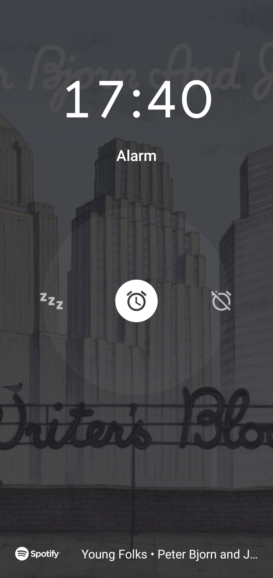
It’s like this in my Android device. You have to swipe right or left to dismiss or snooze respectively. Apart from having trouble to remember which is which, you also have to be VERY precise to start the gesture from the alarm icon in the center. I almost never get it right on the first try.
5 Likes
Well, if that gets changed, it’s bound to follow the same idea as the call overhaul: swiping left or right does A, swiping up or down does B.
5 Likes
What disturbs me is that after I swipe vertically to reject a call, some buttons appear on the bottom of the screen telling that pressing the middle one rejects the call. But if I swipe vertically, I don’t want to answer. Why swiping is not enough? I guess that vertical swipe only silences ringing, and I can still answer by horizontal swipe. But does anyone need that? Now I have a good chance to accidentally answer after silencing the ringing, I assume.
I think it would be good to use pulley menus to choose whether to hang up or silence the phone. Then the app would close and show the “send a message?” dialog.
1 Like