There has been a lot of comments regarding the new incoming call redesign in the forum. It has gotten thanks, but also some criticism. One resilient myth is us copying competitor UX, which is simply not true. We do want Sailfish OS to retain its unique character. The redesign progress is gradual, for example alarms still use the old gesture design, so some work was still left for the upcoming releases.
Nowadays we do much more user testing than before, try to base our decisions on empirical data to verify any new designs we introduce are measurably better than the old. Incoming call redesign arose from customer user studies showing new users were having difficulties with the old design. One key driver has been that users should be able to answer and decline calls without needing to go through any Tutorial first. Pull-down menus are initially difficult to grasp since it is an unique concept in Sailfish OS. One issue that caused confusion was related to the answer and decline indications being far from where the user’s thumb (that performs the gesture) was located. During the project we did dozens of design mockups, half-dozen different gesture prototypes and many short user testing rounds in between until we were confident of the experience. The test setup included both new and existing users.
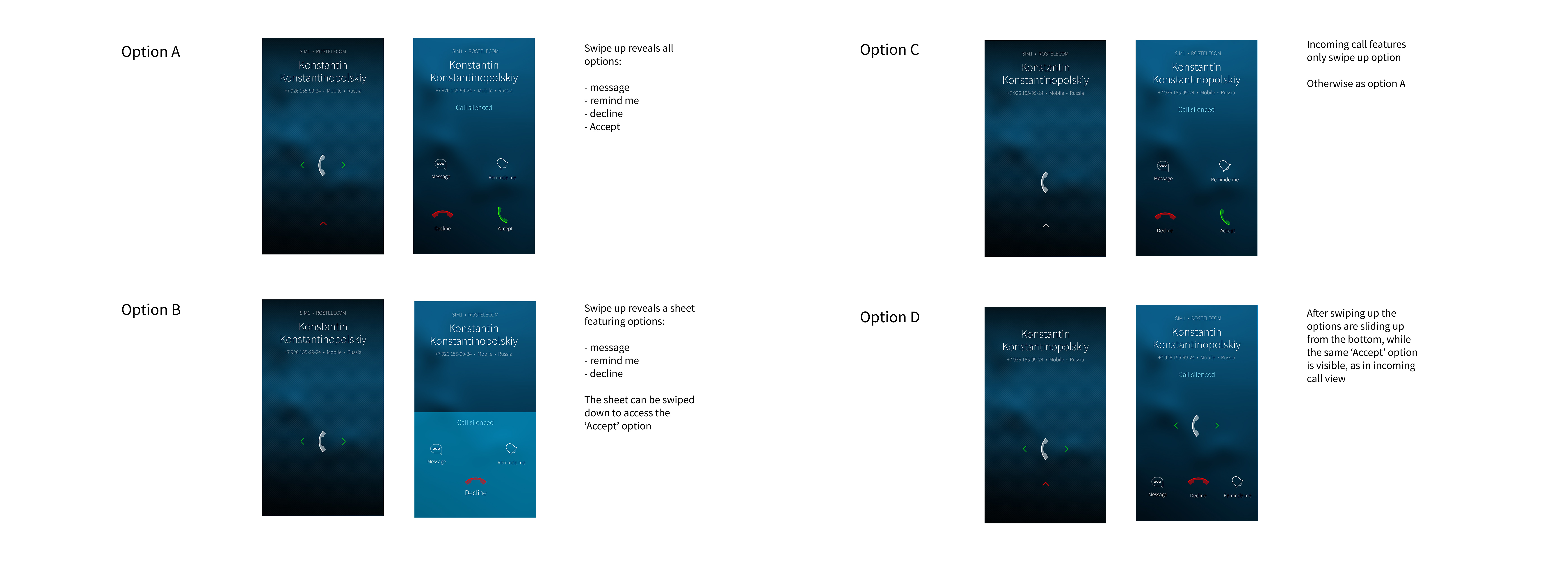
After iterating the same use cases in different tests and with different people you start to build confidence on the direction you should take. In incoming call case we ended up choosing the option, where accepting works by swiping horizontally. The most common action when you get a call is to answer and horizontal swipes are easier to perform than vertical swipes by most people. Also like one community member noted when quickly answering a call it is not always easy to figure which orientation the device is in, if you accidentally pick the device upside down the gesture direction reverses and with vertical gestures what was meant to be an answer becomes decline.
We were still not sure what was the best way to present different decline options so four more prototypes were created:
In user testing Option D was preferred, where the existing answer gesture is not blocked by silencing.
It is not always easy for us to revisit designs after the implementation project has already been completed. We are discussing internally how we could involve you guys earlier.
Thank you very much for this detailed description of your decision process!
That’s kind of communication I’ll like to get from Jolla always about main changes!
Whether it’s a great unification for SailfishOS, I agree with you, that pulley menus are not so intuitive.
Thanks
@jpetrell Thanks for explanations but I have to disagree with you. You made tutorial for purpose. Tutorial include answering calls. After tutorial everything is clear so whats the problem.
I showed new answering screen to couple “android” friends. For most of the new answering screen wasn’t intuitive.
Thanks for this insight of the design process. That’s very nice.
And I know nothing is more tiring that discussing about design. Normally you get six contrary opinions out of five people you ask.
I haven’t made up my mind yet what to think about this design change. As usual it takes a while till I have adapted and later on I would be irritated using the previous solution.
Thanks for the rationale behind the change, it helps in understanding. My answering screen does not look as colourful as option D, so I don’t know what is going on there. I really appreciate communication about major changes that has significant impact in the user experience.
In using Jolla/ Sailfish from the beginning I have never experienced an issue with answering a call wrongly. This strengthens my thought that you want to target Android users.
SFOS does left swipes to accept and right swipes to cancel. I do feel you have left the UX philosophy which you say to want to stick to. As this screen is the only screen in which a swipe either way performs the same action. The change still comes across to favour a single use-case where you may have the phone the wrong way.
SFOS is about single hand/ finger usage and the philosophy has set it apart. The pulley menu’s have been consistently used throughout SFOS. If that is not intuitive, why only replace that in a single spot/ screen?
Under settings there is the option added (after 3.x if I’m right) that you can quickly access events or do as SFOS 1, go to home. I would appreciate a similar setting for the answering call dialog.
Thanks for the detailed information.
For me, the old way of answering calls was part of “We are unlike”.
Unfortunately, this is the new spirit of our time. Nobody wants to read an instruction manual or watch a tutorial. But when I switch to Android or Apple, I also have to familiarize myself with the different operating philosophies. The slogan “We are Jolla. We are Unlike.” unfortunately loses more and more in favor of Android or Apple.
Just because of the convenience of some users.
That’s exactly what you are claiming for yourself. I don’t see the point why Jolla should stand still in awe of the old paradigms because a few (and loud) users are hardcore traditionalists. I like the hybrid solutions and to me (also user since Jolla 1 owning four different Sailfish devices) the new call income design was an instant “wow”.
Yes, I tried to pull the pulley a couple of times in the mail program out of habit. But from day 2 after the update I liked the buttons because it’s simply faster and less error prone than the unprecise pulley with 5 options.
Wrongly answering or declining a call happened to me a lot. I’ve been using Sailfish since day one and only used the N9 before it. While I do agree, that for most tasks pully menus make a lot of sense in Sailfish OS, this does not really apply to “Quick Time Events”. In some situations you need to be able to react quickly, no matter what orientation your phone was before and how sleepy you are. This applies to incoming calls as well as the alarm. Those should use gestures, that are immediately obvious, once you hold the phone in your hand. And for that you need gestures, that are in perpendicular directions. (Taps do not work, and gestures in opposite directions are easy to get wrong, if you have your phone the wrong way around.)
It’s important for Sailfish to keep a strong brand, but that should never come at a cost of worse UX. The new gesture is very easy to use one handed and much harder to get wrong. I think it is a positive change. Adding an option to get the old behaviour back is usually a bad idea. Option come at a maintenance and support cost. I’d suggest trying to get used to this change first for a bit. Change always feels bad at first, but often you find yourself appreciating the change, once you spent some time with it.
Thanks for this detailed explanation! I hope it’s still a work in progress, though, because when you swipe to accept a call, you now swipe in a big green overlay, and it looks ugly.
(I don’t understand why people still bring up the ‘unlike’ marketing slogan. That was seven years ago!)
After some time using the new way to answer calls, it’s finally more the UI than the UX which is problematic to me (but I’m still nostalgic of the pulley menu). The green part and the phone icon would indeed need some more refinements.
A consistency of the arrows with the ones used for the phone unlocking would be welcomed.
The phone icons need to look like the rest of the icons used in apps. And even though i’d prefer option B with a tip message (ie swipe the silence down to go back) i don’t mind the rest much.
@chazaq " As this screen is the only screen in which a swipe either way performs the same action." Isn’t the lockscreen also unlocking to both right and left!?
I am the same opinion then @sausset if the arrows in the mail client persist they should be accurate with the design to the unlock arrows
But interestingly there is the garbage can in the mail client that is not possible in the remorse timer. Wouldn’t a unification of those symbols back and forth, delete be a priority, so that you get one seemingless experience on the whole device @jpetrell
I’ll have to take this as a given. But it should look the same as the lock screen design wise. The design is using different arrows (and differently placed) than the lock screen. If this is the way forward, please make it consistently looking.
Thanks I appreciate your insights. From the user side, just by looking at your work, I could already see all the discussions and long internal talks, even before your post (nothing good comes easy).
The new incoming call design does makes sense as long as you manage to give consistency over the system, and that must not be easy - especially if that involves more than the alarm app.
On the other hand, I see those email buttons as the first real UI misstep, one that betrays the philosophy of SFOS without a sufficient advantage. Since I know you do not take UI decision lightheartedly, I’ll struggle to find all the positives:
It is more evident to newcomers.
If I need to e.g. reply and I am in the middle of a long email, I don’t need to scroll all the way up to activate the pulley.
The first reason though, could kill the pulleys altogether: if buttons are really better in this situation (with 3 options) they are likely to be better anywhere in the system.
On aside note, every time I showed SFOS to people I heard the most ‘oohs’ about the pulleys. They were a true flash of genius in the first place. So I hope you don’t ditch them.
Now for the cons.
To reply with the pulley, my thumb doesn’t need to stretch all the way to the bottom left and one hand can hold the device more securely.
As noted, that icon might trick newcomers into thinking there’s a recycle bin, while there’s none in SFOS (not good as we’re mostly on imap).
Aesthetics. SFOS is ’ airy '. These buttons are not, pulleys are infinitely more so.
Last and most importantly: consistency. SFOS is effortless , but any inconsistency is “effort”: it will prevent my muscle memory from working. It forces my brain to stop and think what app I am in and consequently decide if I need to pull or tap. Before it was automatic. It will never be automatic now since it works differently in different apps.
I know, people don’t like changes, but this time they are not complaining because they need to change habits, they complain because of the impossibility to create one.
Hope you will consider some of the points and btw thanks for keep trying to improve things constantly.
In my opinion, the design changes are made for a group of people who have to work with an SFOS smartphone during the day because their employer tells them to do. So that the daily change is not so difficult for them when they switch between private- and business-phone.