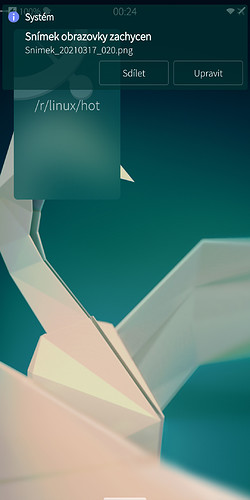
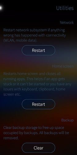
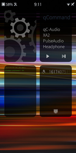
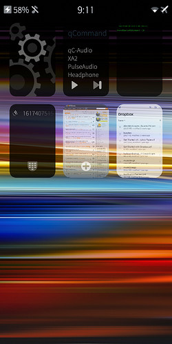
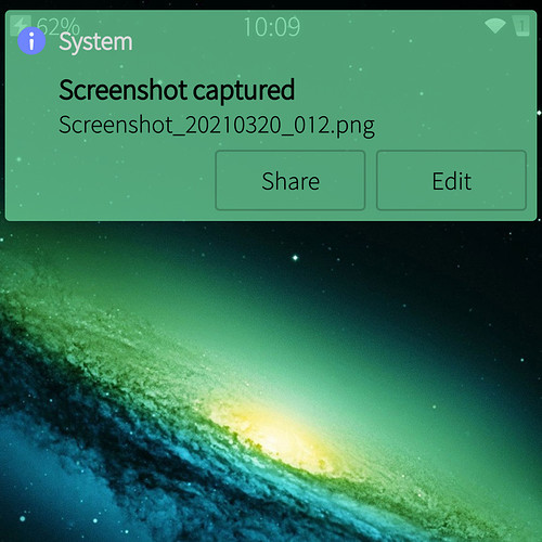
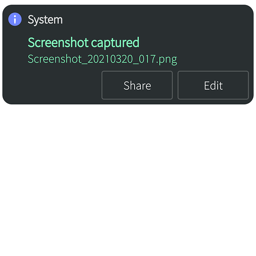
That is changeable. You can adjust that in settings
I cannot agree more with you. I hope Jolla changes current design for darks ambience to: bubble with same color than ambience, no borders and light color text
Nice one! Could you give me a tip on how you can lower the opacity of the rectangle while keeping the text visible?
I must be missing something but I can only change the global opacity and the text is barely visible.
Would you please share with me (PM?) the lines of the qml file you changed?
I would like to see it consistent without the shader - smooth dark glass throughout the ui. But I know some people like it… I can mes around and see if I can get the shader in the notifications, but maybe someone else could do it quicker / better.
here’s my qml…
Great! Thank you for sharing!
@Mister_Magister @ichthyosaurus What do you all think about buttons and switcher item…?
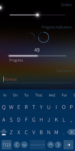
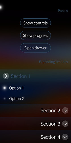
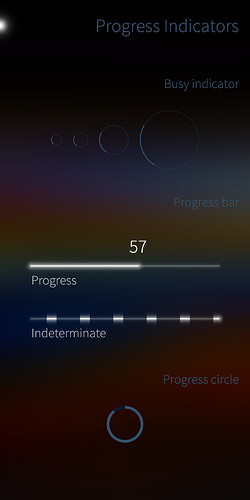
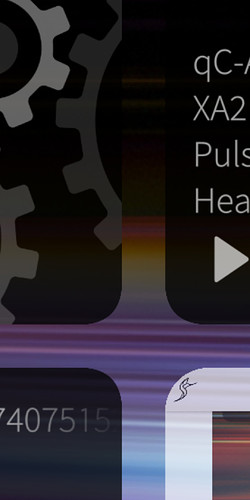
Also, here’s some examples of eliminating texture look, simply by replacing graphic-shader-texture png with a solid black png. I think the overall look is much nicer, and specifically stack indicators and progress indicators …
Would be great if we were to redesign glacier but it hella doesn’t fit sfos 
Nice! You should do pull request with this!
Hey mate
Thanks for sharing btw.
I have spent many hours trying to figure out which line(s) responsible for editing the edges. I failed. If you could just write out the line’s number, it’ll be great. thanks
You mean the border? I don’t have my SF phone on me at the moment, but the qml file is not very big, and there’s only a couple of lines that refer to “border”. Open the qml I attached above and find the lines for border and compare it to yours…(down around line 200)
This is looking so beautiful, especially the shader such that anyone is able to see the capacity of the battery e.g. Nice work. Is it (will it be) availiable on patchmanager? that would be so great. I have still no idea why Jolla merges some changes into their system, the more time is running the more the os looks like 2010ish style. When Sailfish first came up it looked and felt like a system from the future with unlike and nice ux. Now some of the gestures are in other osses, too and Sailfish starts transferring to go steps back - pity 

