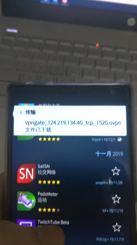
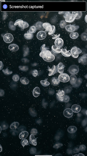
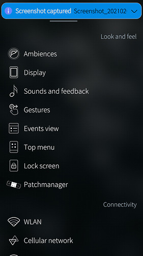
This notification UI should only for light ambiances and we need another UI for dark ambiances.
White background and black characters should for light ambiances only.
Notifications colours should follow ambience settings. But UX changes seem to break UI behaviour consistently with updates lately.
Latest UX improvements introduce extensive use of buttons, which does not feel compatible with SFOS gesture UX style, e.g. notification messages, etc.
Is it possible to adjust the position of the notifications?
I love new design including buttons.
No offence, but If that’s the case maybe you’ll find Android is more to your liking. SailfishOS’s greatest landmark was the novel gesture based UX. I feel like this is a bit of a step backwards, as teeny tinny buttons don’t translate well to handheld mobile devices, but to each their own I suppose.
I agree. There doesn’t seem to be a clear idea anymore regarding the UI design. It seems to have gotten lost for the past few releases. Sometimes, color follows the ambience while at other times, like with the new notifications, it does not. The new ugly text drop shadows in the status bar are also a good example. For some reason, it is the only place with text drop shadows in the entire UI as far as I know, making them look out of place. The new notice elements, like in the clock app, look pretty bland as well. But I don’t want to complain too much. The Sailfish OS design is still one those things in life that makes me happy  .
.
Notification popup should be the SAME color as the keyboard (following ambience) with white text. Pretty sure most people feel this way. Jolla please run these changes through your design team - if you still have one.
Try changing notificationPreview.qml if you want
Maybe this part:
Rectangle { id: background property color _color: popupArea.palette.colorScheme == Theme.LightOnDark ? Qt.tint("#8A8A8A", Theme.rgba(Theme.highlightColor, 0.5)) : Qt.tint("#FFFFFF", Theme.rgba(Theme.highlightColor, 0.3)) anchors.fill: parent radius: Theme.paddingSmall color: Qt.tint(_color, Theme.rgba(popupArea.palette.highlightDimmerColor, popupArea.down ? Theme.opacityLow : 0)) border.width: Math.round(Theme.pixelRatio) border.color: Qt.tint(_color, Theme.rgba(Theme.highlightColor, 0.1)) opacity: popupArea.textOpacity NotificationAppIcon { id: appIcon anchors …
At least they finally allow you to actually read the time, check network indicators, etc, if your background picture has light colours, and the drop shadows actually use the ambience colours.
Line 198 in NotificationPreview.qml says “rectangle…” with some code undet it. Down about 8 lines is a line for “color”. Change it so it says, “color: Theme.darkPrimaryColor”
A few more tweaks … (color: Theme.highlightBackgroundColor”)
I think there is less buttons - on Settings, tabs are used for Applicatios and Accounts, on clearing Notifications ‘x’ has been removed. Use of colors could be better, and use of shapes (old style pulley menu & button), but I think they are reducing buttons in general.
Waiting for Patchmanager!
i think with all respect the SFOS ux style is broken more and more with each new release. especially with accepted changes from omp
I would like to think that Sailfish OS is not about not using buttons. The important bits are elsewhere; community ported devices, Linux, privacy, accessible SDK, open community, active developers and actually being able to reach the devs! The buttons introduced (I assume the events view balloons here) eases use, shortens my workflow a bit, and sure makes the OS more user friendly, especially for newcomers, so I’m all in! If you want to disable the buttons, there will soon be patches to fix it.
Not everything is possible bring back with patches easily. Also this way we will have tens of patches or we will must do one big patch “make sailfishos great again”  and time spended on creating patches can be used better - for creating new apps or editing existing apps.
True. I’m not going to spend my time patching the buttons out, but someone else, who values it enough, will. I spend my time trying to advance my own apps 
The problem is the inconsistency which makes the OS not feel right. I think we had a topic or two about that. And since those are not fixed and new issues come with every release the situation gets worst.
And also i don’t buy the newcomers argument. Everything has a learning curve. If you want to use it you will adjust yourself in a few hours.
You are right; consistency isn’t there… Let’s hope things at least settle down a bit with SFOS 4…
I have been…required to use an iPad in this place, and while it does have all kindsa gestures nowadays, I haven’t memorized them at all. I guess I don’t even want to, so, I guess my newcomer argument bit me back 


