Sanitize your hands after each use ![]()
I really like most changes and do not think it broke any UX. Buttons in Email are simply much faster, I like the Call / Pickup UI (I most times swiped wrong before), I just do not approve the change on the notification screen to delete all notifications via button.
1 Like
What I find strange is that some “buttons” were just thrown there, some of them could be better integrated or converted to swipe gestures, e.g. the Notifications Exit button does not seem to add any functionality, it can easily be removed.
2 Likes
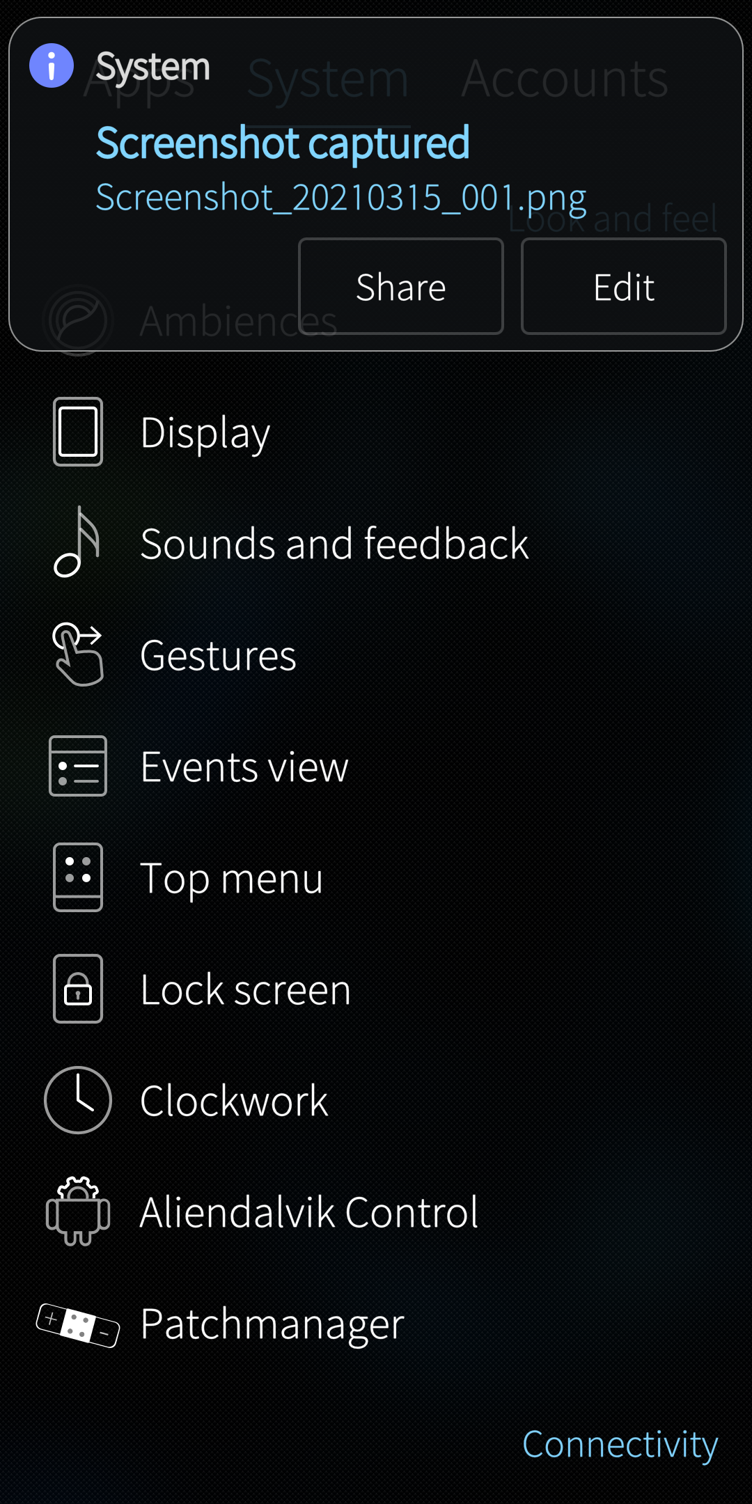
There is little issue with new notifications style (for sure on dark Ambiences). It’s almost invisible on bright backgrouds.
One more thing, white arrow (in transfer icon) is almost invisible on bright notification background
1 Like
Did i get that right. Before you got a call or a notification, which left an icon on the lockscreen that you could click away. Now those icons are directly linked with the events view, and lead you there after a click?
Just wanted to plug myself in here. As i was talking about patching whole ui SailfishOS UI redesign patch Maybe we could make group of people to work together on it? Notifications are one thing but i saw already at least 5 like-minded people that don’t like latest button and ux changes.
HMM we could merge that effort with https://github.com/Pretty-SFOS, @ichthyosaurus maybe you are in? If we collected like 2-3 people that would be enough to make something awesome in short-time
2 Likes
Nice work! If it’s not too much work, would you share your steps/changes? thx for sharing anw
To start is simple: open /usr/share/lipstick-jolla-home-qt5/notifications/NotificationPreview.qml and go to line 177. It says
palette.colorScheme: Theme.colorScheme == Theme.DarkOnLight ? Theme.LightOnDark : Theme.DarkOnLight
I cjanged mine to
palette.colorScheme: Theme.colorScheme == Theme.DarkOnLight ? Theme.LightOnDark : Theme.LightOnDark
That should change the general theme to a dark theme. Then search the same file for “tint” and starting around line 200, you see several lines of code that control the bg color and border color. Experiment based on your preferences …
Note - always make backups and always know how to recover a phone that won’t boot
2 Likes
That definitely sounds interesting, and Pretty SFOS might be a good place for it. (I’ll make the current projects public if you don’t mind.) My current focus is Whisperfish, though; I’m afraid I won’t have time for new projects until at least June/July.
@Levone1 (shameless self-advertising) If you want to use Patchmanager instead of changing files directly, you can use GitHub - ichthyosaurus/sailfish-patch: Develop SailfishOS patches to quickly create and publish patches. It’s also useful for iterative development.
2 Likes
You have been hard at work at them sorry that i wasn’t of any help but surely public should help us! I want use opal-about in my microtube update
That’s okay, its long-term project with updates and stuff anyway
1 Like
Thanks - I’ll check it out… I’m notoriously lazy in this area - I just can’t get myself to spend the time at the computer, so I end up just tinkering on the phone… But every once in a while I’ll bite the bullet and build or port something…It was the same on Android for years before I moved to SF…
1 Like
Well, we can package your tinkering and its better to keep everything together so that we do not branch into different patches because that would be suboptimal
3 Likes
ok - maybe I’ll have a chance later on to submit some ideas, etc… My first proposal would probably be to eliminate bumpy, noise look from the glas effect, and make it smooth glass. What do you think about that?
I think it would be better to have it with that shader, to keep it consistent
I would love to see your changes in the qml file to have this nice result! I have tried to change a few things based on your post, but I did not see any change.
Kinda funny finding many people asking same things again and again. Pretty Sailfish sounds great. I also asked for making many things configurable, like the top menu could also be brought on display by swipe up instead of swipe down (then obviously the launcher won’t come up but that might be ok for me but you could also make it appearing by swipe down - or swipe left/right). Also size of text and buttons should be configurable for everyone.
I had such good ux with sf1 and my jolla 1 is still on it, its just faster that any version after 1.7.
Btw cover swipe actions were so pretty and unlike.
For me Sailfish could be not configurable, but I would like to have OS which looks complex. Like Sailfish in version 2 or 3.
Now we have system which looks like proof of concept in every area. In one place text is align to left in other to the right. I don’t think if Jolla has complex vision how SailfishOS should looks like.
The most of this ugly changes coming from OMP…
3 Likes
OK. I’ll post it… Don’t have the phone with me atm… Far as I can remember, I just changed the lightondark code, and then changed all other color and tint references to “transparent”, except for the main one under “rectangle”, which I made her color 121518 and transparency 0.8…