REPRODUCIBILITY: 100%
BUILD ID = OS VERSION: 4.2.0.19 EA
HARDWARE: XA2U, X10II (and others)
UI LANGUAGE: Finnish
REGRESSION: Yes
DESCRIPTION:
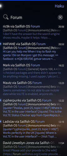
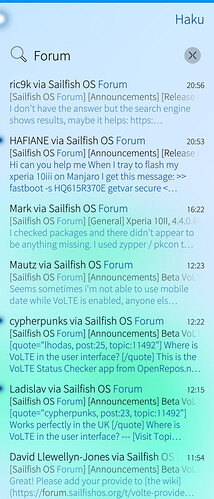
Jolla Email shows preview of body text in the list elements in inbox and other folders. The amount of lines is not consistent; if the email is unread it’s three lines, if it’s read it’s two lines. This leads to jumpiness and inconsistent item height, and wastes screen space. This also moves every item under itself up or down, which makes me at least lose track of where I was, causing annoyance, and once it made me delete a wrong email (no harm done, but still). Another way to cause visible bumpiness is to mark an email or three read on another device and then update the inbox.
PRECONDITIONS:
- Have an email account
- Have a few mails in inbox
STEPS TO REPRODUCE:
- Mark email as read on unread
EXPECTED RESULT:
- Mail list item size doesn’t change
ACTUAL RESULT:
- Mail list item size changes accordingly
ADDITIONAL INFORMATION:
Here is a patch to fix it, made with 4.2.0.19 EA:
--- /usr/share/jolla-email/pages/MessageItem.qml
+++ /usr/share/jolla-email/pages/MessageItem.qml.new
@@ -177,7 +177,7 @@
             color: Theme.highlightColor
             opacity: model.readStatus ? Theme.opacityHigh : 1.0

-            maximumLineCount: Screen.sizeCategory >= Screen.Large ? 1 : ( model.readStatus ? 2 : 3)
+            maximumLineCount: Screen.sizeCategory >= Screen.Large ? 1 : 2
             lineHeight: subjectText.height - Math.round(Theme.paddingSmall/2)
             lineHeightMode: Text.FixedHeight
             width: parent.width
I chose two lines, so more emails can fit in the screen - that’s my preference.
4 Likes
This applies to 4.3.0, too.
Thanks also for this bug report @direc85, for checking it with the latest release too, and for your proposed fix.
This behaviour is clearly by design, so while I can entirely see the issue that you’re experiencing (and why it causes problems for you), it may need some thought as to whether this is the right fix.
For example, maybe it would be better fixed by adding a gentle animation? At any rate, the bug is registered, so let’s see.
4 Likes
Yeah this is by design. We reserve more screen estate for the unread emails as they contain new, unseen information. DIfferent layout and coloring help clearly differentiate the unread emails from the read emails, previously we received feedback that the users had difficulties differentiating unread and read emails from each other. It does lead to some jumpiness when marking emails as read or unread, though not as much as moving emails to folders or deleting emails, or if you mark emails as read in comibned inbox view, where the read emails are just hidden.
3 Likes
Are you the Designer of the Sailfish UI? Good work, i like it very much!
1 Like
Thank you for the clarification. It is indeed clear from the code that this is intentional, but I don’t think I acknowledged it out loud originally.
I understand the reasoning behind the row count, but my personal opinion is that the item height should not change. It has caused some misclicks, too, but nothing unrecoverable. As an alternative, the first thing that came to mind is using bolded font for unread messages. I’ll test it myself, and let you know how it looks and feels to me 
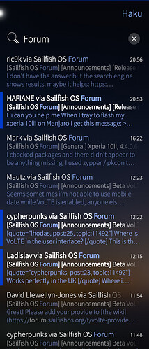
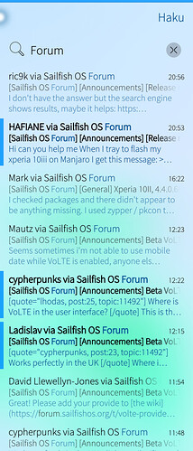
I tinkered with the UI during a few days, and this is what I came up with.
First, here’s the default view of the Email app:
It is indeed very difficult to make out if the email is read or not, especially using the light theme. The increased row count doesn’t really help that much. Here’s the updated view:
I replaced the glass item with a colored rectangle, bolded the texts, and removed the variable row count setting. Nothing that invasive, but the difference is notable! Here’s the diff between the files:
MessageItem.qml diff
--- /usr/share/jolla-email/pages/MessageItem.qml
+++ /home/defaultuser/MessageItem.qml
@@ -59,15 +59,17 @@
     menu: contextMenuComponent
     highlighted: menuOpen || down || (model.selected && selectMode)

-    GlassItem {
+    Rectangle {
         visible: !model.readStatus
-        width: Theme.itemSizeSmall
-        height: Theme.itemSizeSmall
-        anchors.horizontalCenter: parent.left
-        y: content.y + senderName.height/2 - height/2
-        radius: 0.14
-        falloffRadius: 0.13
-        color: Theme.highlightColor
+        width: Theme.paddingMedium
+        anchors {
+            top: parent.top
+            left: parent.left
+            bottom: parent.bottom
+            topMargin: Theme.paddingSmall
+            bottomMargin: Theme.paddingSmall
+        }
+        color: Theme.rgba(Theme.highlightBackgroundColor, 1 - (Theme.highlightBackgroundOpacity / 2))
     }

     Column {
@@ -95,6 +97,7 @@
                            qsTrId("jolla-email-la-no_recipient"))
                       : Theme.highlightText(model.senderDisplayName, (highlightSender ? searchString : ""), Theme.highlightColor)
                 textFormat: Text.StyledText
+                font.weight: model.readStatus ? Font.Normal : Font.Bold
                 anchors {
                     left: parent.left
                     right: msgDateTime.left
@@ -153,6 +156,7 @@
                     qsTrId("jolla-email-la-no_subject")
             textFormat: Text.StyledText
             font.pixelSize: Theme.fontSizeSmall
+            font.weight: model.readStatus ? Font.Normal : Font.Bold
             opacity: model.readStatus ? Theme.opacityHigh : 1.0
             width: parent.width - icons.width
             anchors {
@@ -174,10 +178,11 @@
                                         qsTrId("jolla-email-la-no_preview")
             textFormat: Text.StyledText
             font.pixelSize: Theme.fontSizeSmall
+            font.weight: model.readStatus ? Font.Normal : Font.DemiBold
             color: Theme.highlightColor
             opacity: model.readStatus ? Theme.opacityHigh : 1.0

-            maximumLineCount: Screen.sizeCategory >= Screen.Large ? 1 : ( model.readStatus ? 2 : 3)
+            maximumLineCount: Screen.sizeCategory >= Screen.Large ? 1 : 2
             lineHeight: subjectText.height - Math.round(Theme.paddingSmall/2)
             lineHeightMode: Text.FixedHeight
             width: parent.width
So there you go! I quite like it, what do you guys think?
5 Likes
I’m using a variant of this now, where the GlassItem is used, but with width and height of Theme.itemSizeMedium instead. It doesn’t break the visual layout but is more noticable.
did you by chance publish a patch for that?
I’m not sure… I meant to, but i I can’t recall if I managed to do it or not. I can try again later today.
Well that was easy! It’s now published and I tested it myself, works as expected  I’ll create the GitHub repo for my patches next (this won’t be the only one), it should be up shortly.
Edit: Sources are now available!
1 Like


 I’ll create the GitHub repo for my patches next (this won’t be the only one), it should be up shortly.