I’d like to start a thread with suggestions how to further evolve on the path Sailfish 4 is (subjectively) going. Similar to the “papercuts project”. However this thread shouldn’t be about bugs but more oriented towards easy/quick tweeks which would make the daily usage of Sailfish more elegant or sophisticated. “easy” as it intends not to change the general route which is mostly set by the developers. I assume little steps and polishings are much more likely to be integrated so let’s try this approach.
8 Likes
I’ll start with two things I noticed:
-
It would be great to be able to delete emails directly from the notifications area. There are a lot of mails you just need to see appear witihout opening them or you don’t want to see them at all (spam, newsletters). To be able to delete them directly without opening the mail app would be a great benefit.
-
The new qr-code feature of the camera could have an automatic line break instead of shortening the displayed link with “…”. Sometimes it is really neccessary to see the full link.
12 Likes
On the polishing part what needs to be done is SFOS to be consistent. There are a lot of inconsistencies here and there -and more creep in as we go- and they have started to pile up.
10 Likes
I would appreciate if we can keep this thread specific and keep the old discussion out wheter the general design is wrong or not. I hoped the opening post had made that clear.
The UI to dismiss an alarm from the system clock app should be changed to be consistent with the one to answer a phone call.
I know some users here don’t like the change to the answer call UI, but now that the decision is taken (and I found the arguments by the designers reasonable) the clock should follow suit.
9 Likes
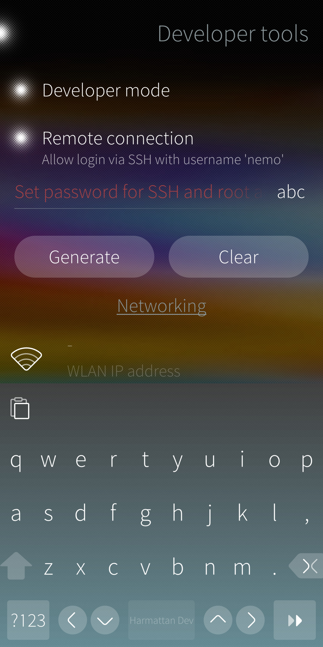
The default keyboard needs tweaking for easier typing.
The size for the space bar for example should be a lot bigger so its not so easy to hit the . or , keys. They are not very often used and should be a lot smaller.
This is what my small usability tests with some users show. Additionally also the height of the keys should be made a bit smaller.
An option for always showing numbers as a row with the shift key to switch to some useful charachters like !"§$%&/()=?" would be cool aswell
17 Likes
I’ve made a few keyboard layouts in one app that adds a number row, additional characters and emojis. It’s available at openrepos here.
4 Likes
That is great. We need that by default though.
2 Likes
swipe from the edge and down to move andorid apps to the bottom half of the screen so that the buttons at the top of the apps are more accessible with one hand especially on large screen phones and swipe from the edge and up to go back and eliminate the button on the screen, I don’t know if that would be technically very complicated, but I think the user experience would be even better than on an android phone
2 Likes
Swiping from the bottom to close apps: swiping in the middle gives me the app grid, swiping from the edges/corners closes the app. It would be consistent with the gesture we have now from the top, just kind of reversed.
2 Likes
I would like more notification controls. Specifically some apps (like e-mail in my case) I do not want to see notifications for at all. Just being able to disable apps from sending notifications instead of finer grained controls would be nice to have already.
This way, when I hear a notification I can be sure it is something I am interested in.
Also, I would like to customize my Lock Screen. My holy grail is having my agenda / calendar on there
so that I am confronted with it whenever I pick up my phone.
(I am aware of Patch Manager.)
6 Likes
Bring back sf 1.x ui, it was way faster and absolutely co nsistent
ok, maybe this wont happen - pity - make much more customization of gestures and icon size.
i suggest haveing 5-6 icons per row on launcher is way bettet than 4 10x10 cm fat icons, also for top menu
and gestures: why not making all customizable like button swipe: open “top” menu and top swipe = close or lock. And every possibility the user wants.
and remove all buttons from ui!!!
6 Likes
We urgently need an option for smaller text, more dpi and more icons in a row. This is imho an absolute must, it is really aweful the way it is atm, also because ui themer is not here any more
3 Likes
Add special separate keyboard layout with numbers and not alphabet symbols and select it over swipe.
5 Likes
I would like to add the delete option to SMS as well. These days, the only SMS I receive are from network provided, or my debit card purchase or SPAM.
1 Like
He means to delete from the notification area.
I posted a thread a couple of years ago about hacking the UI according to some of my personal preferences, (https://together.jolla.com/question/183151/hackingmodding-system/), and as much as I love SF, it’s pretty much the first thing I do with every new flash, or update, etc. I just really don’t like the “glass” look, as they call it. I do like the more traditional glass look, as is done in Android, and previously in WebOS, but the bumpy noise effect looks too cheap in my opinion. I think the UI should move more toward a dark, smooth glass look, and less colorful overall. Here’s some of my current tweaks, bringing more of a smooth glass look and replacing the highlight colors with dark primary colors throughout…
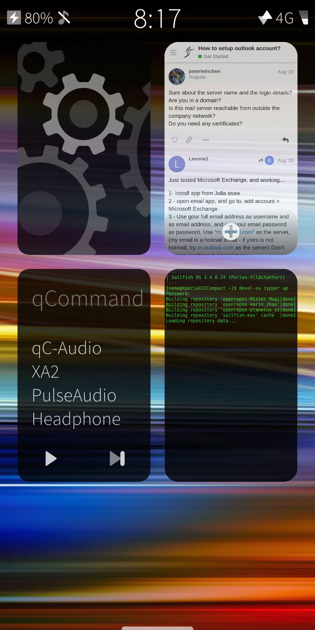
note - the keyboard is actually much darker than it appears in the screenshot - not sure why it shows up like that when I upload it; I guess the website has issues with the transparency or something. It’s nearly black on the top, fading gradiently to a dim highlight color at the bottom.
Also, I don’t typically have such a colorful wallpaper. I was trying it out. I think the look overall is best with dark and dimm, like…
8 Likes
Scheduled SMS. I am one of those who think it is inconsiderate to text/phone after 9pm. I do however want to write messages then, to be sent at 7:30am.
8 Likes
Speaking of polishing, I would like to be able to (re-) arrange:
- songs in playlists in the stock media player,
- bookmarks in the stock web browser.
Or am I missing something? 
3 Likes
Another idea about the qr scan feature within the camera:
I love the detail that the camera doesn’t actually feature a manual qr-capture mode (as it seems at first), but an on-the-fly auto-capture. The instant when a qr code is recognized the camera saves it, no matter if you tapped the icon or not. The appearing qr button is just a “call-the-result” button which can be used when the qr-code is already out of sight. Jolla didn’t stress the implentation of this feature but it is pretty awesome IMO.
Now this feature could be extended by not only saving the first qr code, but every qr code the camera recognizes during a session and saving them in a list (duplicates purged), which could then be opened by the user.
8 Likes