Hi!
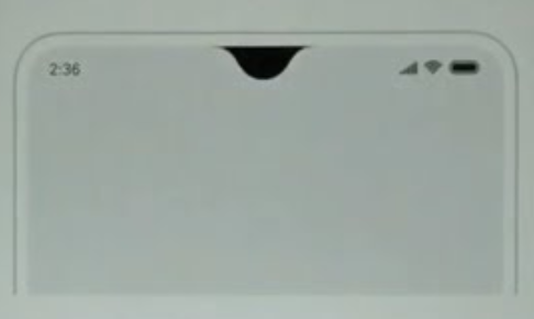
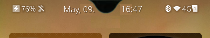
Question about time being displayed bellow the notch on C2 (and therefore not in the same line with other top bar’s elements):
Is there some alternatives that could be considered? Maybe the two hour numbers before the notch and the two minutes numbers after the notch? That could keep all on the same line…
Any other ideas?
2 Likes
Move it to the bottom of the screen?
(Which is harder than it sounds as Lipstick doesn’t have a “bottombar” component.)
1 Like
For volla there is a patch that moves the clock to the left.
But with the notifications showing up also below the notch, …
2 Likes
You cannot do anything elegant with such an inelegant turd of a phone.
All you can do are hackish workarounds like putting the clock to the side, like it is on Android and iOS.
Hours before the notch, minuets after the notch? But I have no idea how that “really” would look like.
1 Like
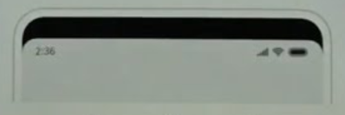
What about having a black line above the three elements (battery, time and network), so on both sides of the notch, so that they’ll be again in the line?
Some android manufacturers included this option, so that the notches or punchole camera are blended in a black line…
Just like the second image bellow:
2 Likes
Just vote for this UI change idea if you like it! Here comes the poll:
- I want to have a top black bar on both sides of the notch and get the UI elements (time, battery, network…) diplayed bellow that bar
- I do not like that UI proposal
- I would like to have that UI proposal as an option in the phone’s settings
1 Like
My opinion:
Clock could stay where it is and be extended with date.
Notification beeing not at top hurts my eyes more. 
1 Like
Hehe, great minds think alike. Jolla C2 Community Phone deliveries - #6 by nephros
My other idea would be to allow operation of the phone upside-down. Then the top edge would be as usual, notch isn’t as terrible at the bottom and doesn’t conflict with any UI elements.
But of course there’s drawbacks: speaker and mike are the wrong way around, sefie camera records upside-down (does it? it could detect orientation), and the buttons are “left-handed”.
The patch “allow all orientations” (or somesuch) can be used to try this, although of course the topbar changes respecting the notch don’t go away with this patch.
4 Likes
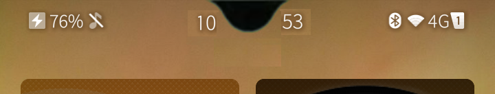
Whats about this idea:?
So, that is something new and innovative, and Apple can later steal it and claim it as their own innovation, like always. 
That is a waste of space. The C2 has plenty of space, but we shouldn’t waste it anyway.
5 Likes
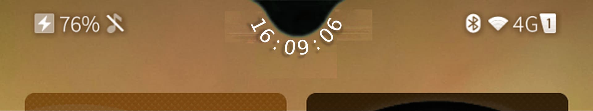
Curved text?, mmm, doesn’t look brilliant in reality, thought I’d give it a whirl.
Using the image from @fingus’s post;
3 Likes
Sorry for ugly editing, i thought about something like that:
9 Likes
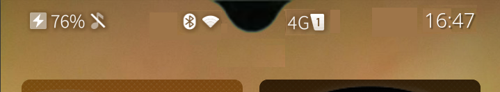
I don’t know if it would look good if you look at this for too long, but something that came into my mind was like clock on where the BT, Wlan and network icons are now and put BT and Wlan icons on the left of the notch and network icons on right side of the notch.
8 Likes
The amount of engineering required to recover screen real estate lost because of notched displays is saddening.
Also, I’m really annoyed by how the notch interferes with SFOS’s pulley menus - essentially forcing you to first pull down an empty menu item before getting to the actual actions. Calendar possibly being the most affected app.
This option looks the best and most natural to me, with the split time display taking second place.
But what happens to the good old upside-down-ternet  ?
?
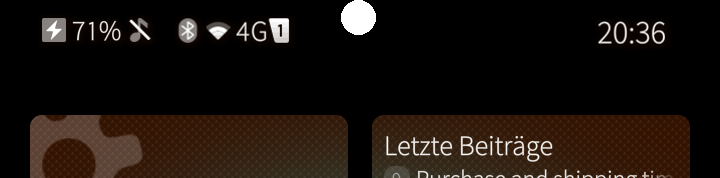
I think it would be less cluttered, if all status icons remain on the same side, clock (optionally with date) to the right…
1 Like
I like the looks and logic of this one, @fridlmue: system icons on the left, date and time in the middle and networking icons on the right.
I like the looks of your suggestion as well, @cnlpete, but the design feels right-handed, because left-handed people would have to make a longer swipe to take a peek at the clock. Since all the gestures are ambidextrous, I’d like the user interface to respect that as far as possible.
Great to see you all come with ideas!
For my taste, the clock in the center is a nice UI signature from Jolla, compared to ios or android who always put clock on the side.
I do enjoy the clock centered.
There is a sort of Gnome Flavor, linux UX, to have a clock nicely centered.
Maybe from your ideas i like @fingus proposal the most, maybe the most ‘clean’ and still keeping the previous design of having a clock in central position…
4 Likes
Do note that all the suggested designs stem from a single instance of notched displays. A generic design concept would need to consider notches of any width, any height, and any location along the edge(s) 

Hence,
1 Like
Sometimes I feel like a fossil, but after having owned a 3310 and N95 without touch, then an N900 with resistive touch, the big bezels on the Galaxy S2 were the last bastion between me and my behemoth hands from touching everything wanted and unwanted alike.
And here we are, bezelless capacitive touch phones with notches 
I’ll see myself out.
1 Like
That notch on the screen is such a pain, the only way to fix it is to mask off the display the top 50 pixel lines or so and use the rest of the screen.
The alternative is to waste resources redesign the layout of the OS itself and all the apps. I am looking forward for C3 with a normal screen and higher hw specs.
3 Likes