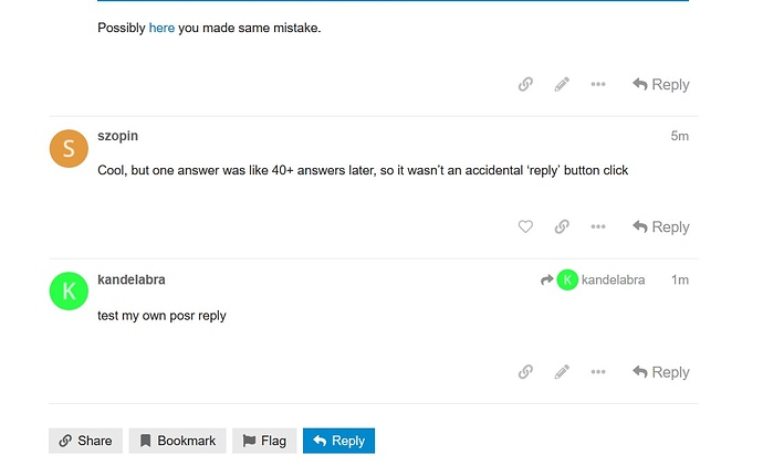
test my own posr reply
More recent post seems to be always at the bottom so no matter how much post were posted since OP. Buttons are near.
Indeed, your second reply to atlochowski was:
post_number 39
Your first was:
post_number 17
The higher number appears below the smaller one, as expected?
Edit: look I’m not really sure what you’re trying to argue but it’s obvious from the second reply it was conscious as you even clarify your position from first one (sorry for being vague about nfc paying support? that was mentioned vaguely in first reply about… being able to pay with my sfos smartphone?) are you sure you misclicked ‘reply’ because of terrible design and then clarified your original answer just by accident?
I don’t care what Discourse is. I care if it is usable or not
Hum. While I think you’re right that it’s not immediately clear how replying to individual posts and the OP/topic have different effects your above quote is kind of a problem. To me at least it reads like: ‘Don’t care how this thing’s supposed to work, make it work like I expect it to’. I mean Discourse has a certain philosophy in mind when presenting it’s interface the way it does. Don’t need to like it but sure it don’t help to just ignore it. There is a user tutorial.
And to me the general reply button looks very different to the one for individual posts (mostly viewing topics with my phone): It’s got a square blue background.
But: It took me a moment to realize why it was there and how it differs from the simple gray ones

