REPRODUCIBILITY: always
OS VERSION: 4.5, 4.6, 5.0
HARDWARE: Xperia 10 II, Jolla C2
UI LANGUAGE: Dutch
REGRESSION: no
DESCRIPTION:
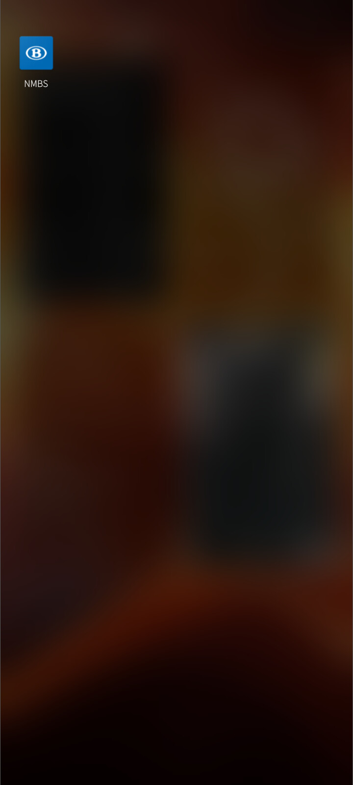
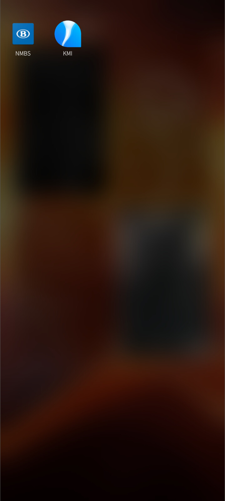
Some icons of Android apps are not correctly ‘Sailfishified’. See for example the attached screenshot of the Belgian railways app (NMBS/SNCB), which has a small square icon instead of the upside down water drop of other Android app icons.
PRECONDITIONS:
Have AppSupport installed on OS version 4.5 or higher.
STEPS TO REPRODUCE:
- Install the Belgian railways app (NMBS/SNCB) through Aurora Store.
- Wait a few seconds for the icon to appear in the app grid.
EXPECTED RESULT:
All Android icons get a water drop shape.
ACTUAL RESULT:
Some Android icons don’t get a water drop shape.
MODIFICATIONS:
none