Solving the issue with pulldown / -up menus

Sailfish has been known for it’s unique UX ever since the introduction of swipe in MeeGo Harmattan. Sailfish added on top of it multiple new ideas which could be summarized with 3 major key points:

  1. Most, if not all operations could be done one handed (Which Marc Dillon loved to emphasize :wink:)
  2. Allowing imprecise UI interactions (i.e. one action/element per UI “row”)
  3. Allowing operation of the phone without even looking at it (Combination of 1. and 2. + Pulldown/up menu and haptics)

When community usually picks up their pitchforks, it’s usually labeled UI becoming more “Android-like”, but I would argue that it’s more about UI changes conflicting with those 3 major ideas mentioned before.
I have for some time thought why this is actually happening and came to a conclusion long before, but it needed some time to materialize it into proper words.

Problem usually is that many applications need multiple interactable actions to use basic features. Email being a prime example. You can forward, respond, delete etc. a specific email and you need some way of doing these actions. Previously this was done using a pulldown / -up menu and recently sailfish has moved away from those in favor of buttons.

This is kind of okey, but it brings another problem: too many ways of interacting with an application can cause confusion between users and the developers on how to properly interact and implement the UI. With the current pace pulldown and -up menus will cease to exist in Sailfish, since they are much harder to use properly. Especially in listviews, accessing a pulldown / -up menu is a pain since you have to scroll to very top or bottom before they activate. Or when there is another touch element conflicting with the scroll gesture (map and email). Sometimes it’s possible to access the pulldown menu within the title element, but after the original Jolla 1 and Xperia X lineup, it has become harder and harder to reach to the top of the screen with one hand.

I think this is an important issue to solve. Rather than complaining about the current design decisions (which I can understand because of the underlying problems), I would like to discuss about possible solutions to the root problem. More and more Sailfish replaces UI interactions with buttons, more and more the 3 principles mentioned above suffer. Buttons take space and it’s more common than not to even stack multiple of them into single “row” (email-view as an example). More interactions you have in a single row, more precise touch input you need.

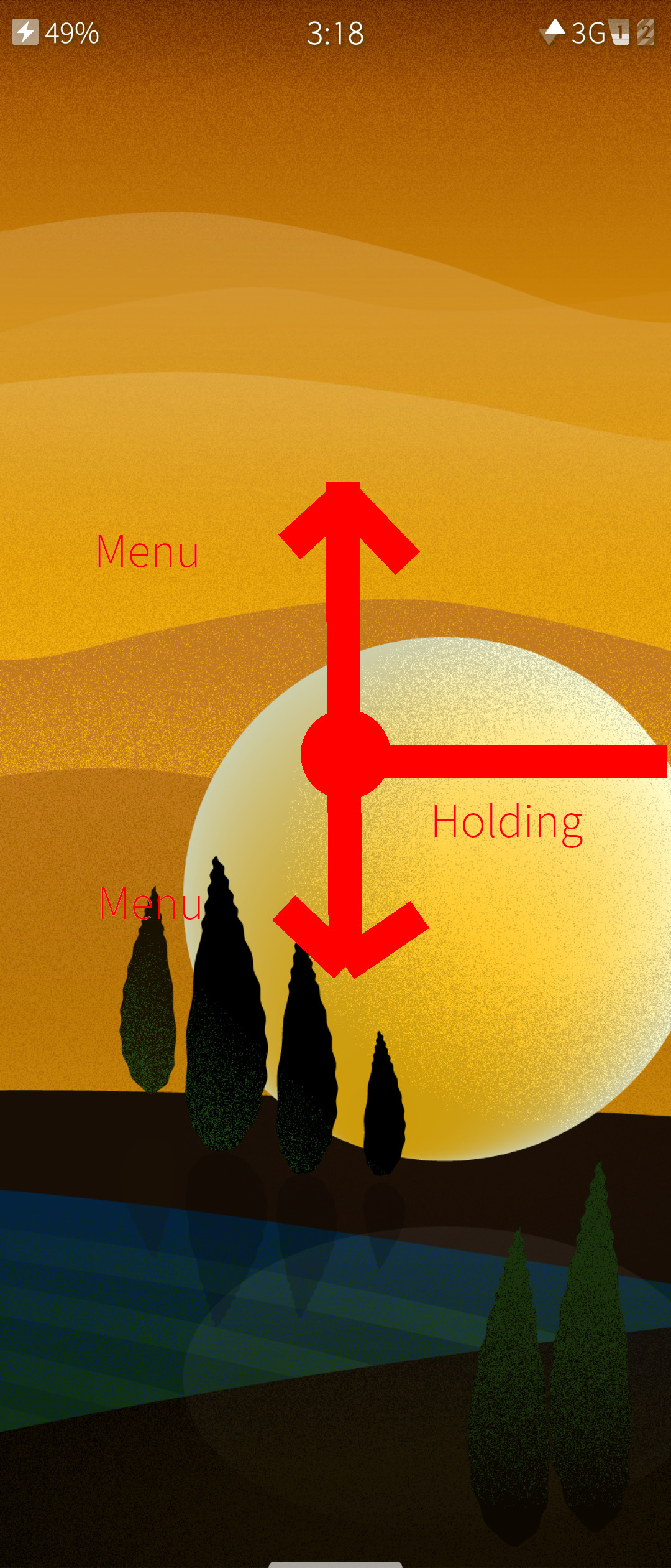
I think solving the accessibility of pulldown menus is the key problem here. You should have easier access to them. One solution I noticed some time ago (unfortunately I do not remember who’s idea it was) was an introduction of 1 new, system wide, gesture. Here I call it either “Treeshaking” or “Groundshaking”. In principle this would be a quick 3 action scroll, which would activate either pulldown or pullup menu:

Pulldown Menu - Treeshaking (First 2 actions in quick succession):

  1. Scroll down
  2. Scroll up (After user starts the next action pulldown activates)
  3. Scroll down (You can interact with the pulldown menu)

Pullup Menu - Groundshaking (First 2 actions in quick succession):

  1. Scroll up
  2. Scroll down (After user starts the next action pullup activates)
  3. Scroll up (You can interact with the pullup menu)

This would work any time there is a menu available. That way, regardless of a touch element (list, map etc) you would have access to the menu.
This is probably not the only way of solving the issue and when discussing it with @jpetrell at the Sailfish 10-year event in Helsinki, he had some other ideas as well. I still think this is a discussion worth to be had. Maybe I bring this up in upcoming community IRC events, but it would be nice to maybe discuss it further first.

17 Likes

Maybe discussion could also be expanded upon how gestures are defined within the OS and how they could be implemented. I think it could be something that community would love to help with.

Nice, I suggested exactly the same feature in a topic about difficult to access pulley menus on TJC many years ago. I still think and therefore agree that it’s an extremely simple movement, and it would fit the rest of the UI perfectly.

The only thing it doesn’t solve, however, is that you still need to remember that there is a pulley menu, because pulley menus are not indicated at all if you’re in the middle or at the opposite end of a page. Perhaps, for that purpose, the pulley menu indicator could always show up, but that could look ugly and take up too much screen space.

1 Like

The only thing it doesn’t solve, however, is that you still need to remember that there is a pulley menu, because pulley menus are not indicated at all if you’re in the middle or at the opposite end of a page. Perhaps, for that purpose, the pulley menu indicator could always show up, but that could look ugly and take up too much screen space.

Yes, this is a second aspect of the problem. I think couple of pixels flat line at the top/bottom of the screen would not be too invasive. There could be an option in the settings to turn it off user wants. This combined with the proper use of built in tutorial components, I think we would be set.

3 Likes

When i want to close any app (swipe from side) the animation sow me a transparency of the desktop, if the gesture is short the app doesn’t close. a short swipe from side can remember me if there are a pulley menu and hold a finger for a moment confirm that gesture, at these moment the transparency may disappear, and the pulley menu indicator show up, at these time i have two options, swipe up and down across the pulley menu, or swipe to the middle of the screen these action give me the focus, for example in one mail from list, then i can swipe up an down moving the focus from the different mails from list, if i swipe back to the same side, the pulley menu now is about the focus for example answer, resend or delete that focused mail. These gesture mode should work in Android side too and we can forget the go back button, a short swipe from side may be sufficient and you can get the control of the focus for example from a whattsap message an copy it without need of touch whit your finger. Sorry for my English I hope you understand me.

3 Likes

Swipe from the side could be another option as well to activate pulldown menus. This is something Joona was talking about in the Sailfish 10 year meeting. I think both ideas would require testing to check out which option conflicts with the current design the least.

why not a double tap on the screen to activate and show a pull up/down menu?
After reading that I tried in many apps including the browser while writing here. the worst action a double tap created was closing the keyboard…

tap tap to let the menu/s appear, using it, done.

tap tap to let the menu/s appear, doing nothing, tap tap to let it disappear.

After thinking and experimenting the best option. ai would not want to miss the actions already existing by swiping from one of the 4 edges…

3 Likes

Tapping on a screen is not usually the best option, since touch area has to wait for double tapping input for all touch controls. That could substantially hamper the user experience. I am not sure how well it could interact with other touch elements either.

I would assume that that’s the reason why it’s only used to wake the phone .

1 Like

The problem is also that most areas in the UI have large buttons, which would be in the way if you had to open the pulley menu by double tapping. Even the gallery would be unusable if you had to open the pulley menu with a double tap. On a picture, it could work, but there’s no pulley menu there in the first place. In the overview, it couldn’t work…

1 Like

Something like that would be nice. Being in app, sliding. No matter of Y position. Respect for left, right side. Reaching % X of screen allows to enable slide top/down menu. Otherwise act as nowadays. Btw, i did skecht in Imageworks :slight_smile: - nice app.

A bit of a brain dump … I’m going through a farily lengthy process of reworking and adding additional interface modalities to tidings, the rss reader. And, as it happens, Imageworks :wink: Where the former is concerned two things were apparent:

  1. Not everyone likes to use swipe the same way. So I’m adding two experimental interfaces to tidings. One SlideshowView based, one using Dialog for swiping. Perhaps some experiments here can be usefull…
  2. It’s often a question of context how and when menu entries or buttons need to appear. In tidings, I’m removing unneeded Pullup/down menus which makes Pullup (for next entry when in an Item view) usable for Items that are not ‘too long’. As it is now, Pullup wasn’t easily usable since it had two entries.

I’m also going to implement some ‘long press’ actions which I think are underutilized. I believe ™ that is an unconscious convention by now that can be helpful. Sometimes a Swipe Left on Item (Detail view) is a good answer. The new release should be out this week.

I personally don’t like the newest version of the mail app since it doesn’t really utilize the Pullup/downs at all. The Swipe Left action gets you Meta info. hmmm. Why not Attachments? As it is, I get HTML by default (uhg), can’t access a list of attachments without a button and KNOW that the additional pully menus could be productive. The current buttons for reply/delete/forward don’t bother me that much, but I’d prefer to have delete in pullup, and the attachments in the swipe or pulldown menus. That would let me do most things I can do with one hand, well, in one hand. Forward and reply require a second hand, so it’s a moot point. Buttons are ok. But for just flicking through views, the pulleys should be there, imho.

Since Imageworks was mentioned, one of the things I liked about Tobias original design and which I’m trying to be careful not to screw up, is a fairly judicious use of minimal icons as buttons. But this is the kind of app where the number of options for any given operation can’t be normalized. The context never really allows OR calls for pully/swipe gestures. But more or less anything list based can take advantage of them… end dump.

2 Likes

So, version 1.2 of Tidings is in the queue.

In the ‘traditional’, aka default, view of an Item, if you flick up and left (don’t need to exagerate) you get a fairly quick, simple forward. Not always with the click affirmation :slight_smile: But always with visual cue.

On the other hand, one can enable the experimental (slideshow) view to see how that feels. The downside (from my vantage) ist that it’s a carousel. So you can’t return to the list view without using the left top corner area (probably your second hand).

While working on variations, what occurred to me is, I like being able to go back to list view and don’t just want to flick through details (ie. I want to skip stuff). Among other things.

One other thing that occured to me is that the scrolling (whether in list of item view) has an accelerated form. Filck fast and you get an extra double arrow. Hit one of those and you jump to the top/bottom. This makes the use of Pulldown/Pushup more feasible. So, another lesson is that context + gesture modification can also have an impact on utility of some screen elements.

1 Like