Sailfish OS update from Jolla
Some years back we tried to publish 3 to 6 big releases every year. This turned out to be unrealistic for a small company like Jolla. Schedules got delayed often. Making big releases took months. During that time so many things changed - those significant for the release but also some less relevant ones. This implied massive testing. Well, with limited resources, it was challenging.
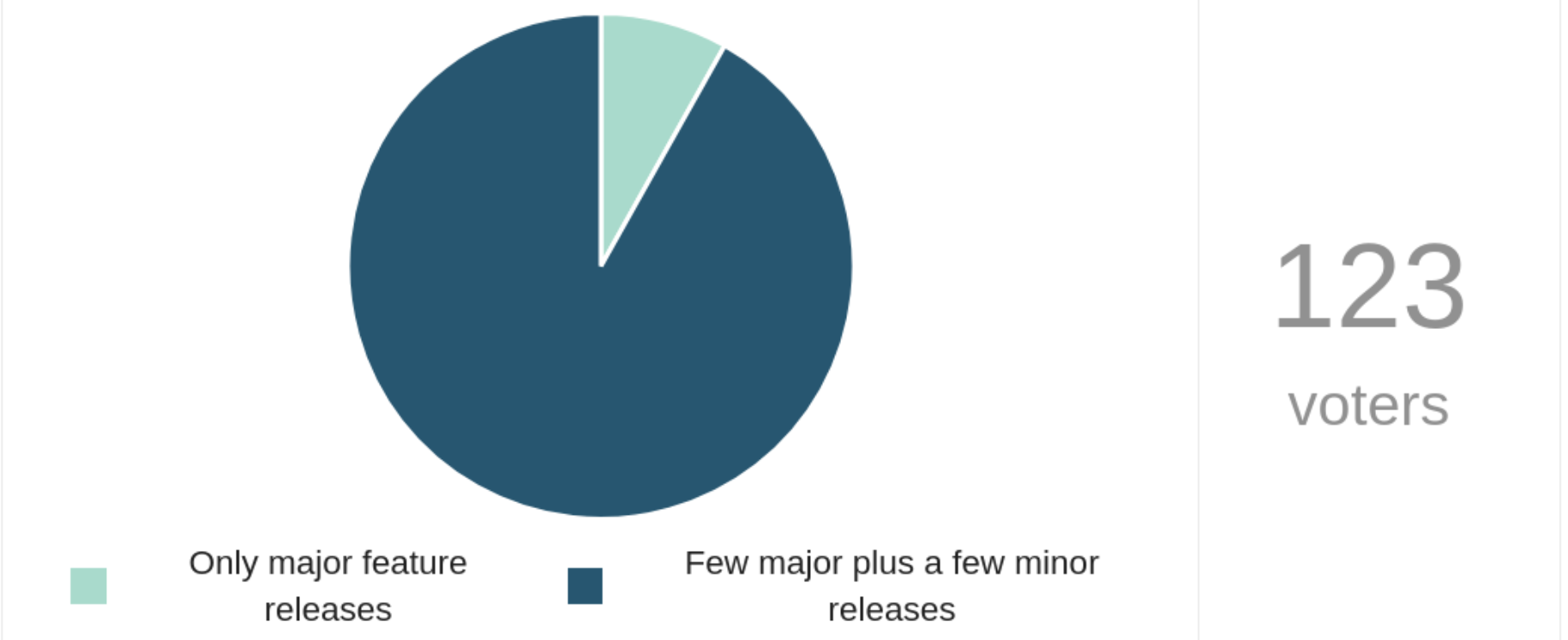
Every now and then, a big release bringing major changes is needed. According to our new policy, we supplement the big release with 2-3 small ones soon after. This policy appears to have gained popularity in our Community, judging by this poll result:
The hotfixes usually improve or solve just a couple of critical issues while the rest of the release remains the same.
This allows for making hotfixes quickly, and the users do not need to wait for the fixes too long. The risk of breaking something is lower. Testing effort stays reasonable, too.
Sometimes, also a hotfix may grow big if there is a challenging problem to solve. We had to spend hundreds of working hours fixing the mobile data for the 4.5.0.19 update. Adding the CLAT feature to Sailfish required lots of debugging, research, planning, test rounds, feedback from the Community members in different countries, iterations and reviews.
The help from our Community was indispensable. Thank you!
Energy from the Community
Qt 5.15 for app developer testing
Those of you who are app developers, and probably many of you who aren’t, are aware that Sailfish OS uses something called Qt as a building block. It provides the main application development environment and APIs for most commonly used device functions.
The Qt version which is used in Sailfish OS is 5.6, which is already quite old. While it still performs its duties, the later versions have new features which app developers might find useful, especially when porting apps from other operating systems.
Those who actively follow the forum or the discussion on IRC might have noticed discussions about Qt 5.15 for app developers. This is something that two active community developers, piggz and rinigus have been working on during the past few weeks.
What they have done is an alternative Qt build, using the version 5.15 of the framework, which app developers can link against. This is not something to replace the Qt libraries which are shipped with Sailfish OS, but a separate framework to be installed on the side. The applications can link against the new version and gain access to the new features and APIs it offers. Among the new APIs are Qt Charts, Qt 3D and Qt Quick Controls 2. Also QML performance should be improved, and the developers are working on bringing Qt WebEngine in.
The downside is that the framework is basically entirely separate from the Silica framework, so having apps integrate nicely into Sailfish OS might be difficult. And, as we don’t allow outside dependencies in Harbour, the apps linking to these new libraries can only be distributed via other repositories.
Some of the integration issues are alleviated by Qt Runner, which wraps Qt 5.15 applications in a nested Wayland compositor. Using Qt Runner allows apps to use Sailfish OS provided keyboard, be minimized, and rotate with the screen.
So far, at least at the time of writing this article, we haven’t seen any apps taking advantage of the new libraries, but I’m sure it doesn’t take long before the first experimental apps arrive. There is a Getting Started guide for developers, which should help you get up to speed quickly. Please continue reading and discussing on the announcement thread.
App roundup
Like the world in general, the weather is a wonderful thing. It shapes our environment, affects our daily lives, provides a shared communal experience, while at the same time contributes to the diversity of different parts of the world. We’ve not learnt to control it, but we certainly will have a jolly good go at predicting it. In fact, of the 500 most powerful supercomputers worldwide, 19 are devoted to crunching weather and climate data (the largest allocation behind general research and services).
The fact is, we’re all a bit obsessed by it. And Sailfish OS users are no different. In the last two years there’s been a weather app in either the top twenty downloaded apps, or top twenty favourited apps.
So if you’re also obsessed by the weather, what are your options for apps to track it? This newsletter we thought we’d take a whistle-stop tour across the apps available.
Most of these apps are specific to a particular geography or country. That may limit their interest for some. But what impressed me most about each app is that apart from their unique geographical focus, they all also find a unique way to visualise and present the weather data that underpins them.

Weather
If you’re looking for a weather app, your first port of call should of course be the official Jolla Weather app. The fact it’s integrated into the operating system means that while you control it through the app, a quick swipe to the events view is all you need to check the weather using the weather widget.
The weather data is provided by Foreca, a Finnish company, but with worldwide coverage. That means that no matter where you are in the world, you’ll always be able to get a forecast for the coming week.
On the events view you can check a weekly forecast offering daily high/low temperature and weather summary. Tap it to see an hourly breakdown, including a nice visual temperature graph.
A bit more information is provided by opening the app, including daily cloudiness, precipitation, wind direction and wind strength information.
As you would expect from an official Jolla app, it’s slick, easy to use and global in scope. A very good place to start, and for most people, this may be enough.
German Weather Service
Most of the weather apps developed by the community tend to be focused on national meteorological data providers, offering more fine-grained data but covering smaller areas (usually individual countries).
The German Weather Service app from Mark Washeim (poetaster) is a great example of this. It uses data from the Deutscher Wetterdienst (“German Weather Service”, hence the name of the app) based in Offenbach, Germany.
The benefit of choosing a national-level provider is immediately obvious when you choose a location. The geographical areas are much more granular compared to the official Jolla app. Depending on your interest, and where you live, this may be an important differentiator. The forecasts, even for places quite close to one another within Germany, can be quite different.
The downside is of course that you are restricted to places within Germany.
The app itself is nicely presented. Unlike the Jolla app with days presented horizontally, the German Weather Service app lists the daily forecasts vertically. Each shows temperature highs and lows, a summary icon, precipitation likelihood, precipitation quantity and wind speed. Selecting a day provides hourly forecasts with similar data (with the addition of wind direction and pressure).
There’s a lot of detail here. You also get the benefit of a longer forecasting period: German Weather Service forecasts run for eleven days, rather than the seven-day forecast from the official app.
The German Weather Service app is still actively developed by poetaster and available from the Jolla Store, OpenRepos and Chum.
3bmeteo
If you live in or travel to Italy, then the 3bmeteo app from saveria provides a very different perspective on the weather compared to either the official Jolla app, or the German Weather Service app.
Rather than offer summary icons and summary data for specific locations, the app presents all of its data in map form. There’s a lot of information to explore here, going beyond summary and temperatures to include cloud, wind and sea. The last of these, for example, will tell you whether the seas in a particular region of the Mediterranean around Italy is calm, rough, stormy, or somewhere in between.
A further six maps offer air quality information: PM10 for inhalable course particles, PM2.5 for smaller inhalable particles, Carbon Monoxide, Sulfur Dioxide, Nitrogen Dioxide and Ozone.
The maps cover five-day periods in six hour jumps, and the app implements a neat gesture mechanism: swipe up or down to change the day, left or right to jump between times within a day.
The app pulls its data from the 3Bmeteo service, and while the app itself hasn’t been updated in a while, it still works very well with the 3Bmeteo backend to provide up-to-date information.
My only criticism is that while the maps are visually very clear, the map keys are too small to read effectively: I found I had to visit the website to figure out what the different colours meant. Having done so once, the maps become clear and it’s a one-off exercise, but even so it would be nice if a clearer visual key could be given.
The 3bmeteo app is recommended for providing a different perspective on the weather if you’re in Italy, and is available from the Jolla Store.
Welkweer
The Welkweer app from Arno Dekker (adekker) provides information for the Netherlands, pulling in data from Buienradar (part of the RTL media group) and toKNMI (the Royal Netherlands Meteorological Institute).
It manages to provide a different approach again, with a wealth of data presented in a variety of ways, from forecast tables, to animated maps, to descriptive text. When digging through the different pages I was genuinely impressed by the breadth of information and care with which it’s presented.
The animated maps are particularly nice, with pinch-to-zoom for closer inspection. In general the maps show either the whole of the Netherlands, or the entirety of Europe, meaning that while the app will be most useful if you’re in the Netherlands itself, it’s still useful for users in other countries as well, or when travelling.
This is all great if you’re exploring, but a common page for many users will be the five-day forecast. This shows an icon summary, temperature highs and lows, wind direction and speed, and likelihood of precipitation. This means the summary isn’t as comprehensive — either in terms of depth or breadth — compared to some of the other apps here, but that’s easily made up for by the wealth of other information available from the app.
Welkweer is still being actively developed by adekker, and is an excellent way to explore the Dutch Weather. It’s available from the Jolla Store and OpenRepos.

SWeatherRadar
The Jolla app store description of SWeatherRadar claims it’s a “Simple Weather Radar app for Sweden”, leaving open whether the “S” in the name stands for “Simple” or “Sweden”. Either way, it’s a good description that captures the fact that SWeatherRadar is only doing one thing, and only in one location, but doing it well.
Unlike the other apps here, SWeatherRadar doesn’t attempt to make any forecasts. Developed by Anton Thomasson (attah) of SeaPrint fame, it provides only historical precipitation data collected for the current day in five-minute intervals.
Pressing on the screen allows you to ‘scroll’ through this data, from the beginning of the day on the far left hand side of the screen to the current time on the far right hand side. As a result, by pressing and dragging you get an animated view through the day.
The only other piece of user interface is a small button in the bottom left of the display that updates the data from SMHI (the Swedish Meteorological and Hydrological Institute) and jumps you back to the current time.
The visualisation suits Sailfish OS beautifully, picking up the colours of the ambience without losing clarity, and showing a smaller version in the cover view.
If you’re in Sweden this app provides a very vivid view of the current state of the weather. The app is available from the Jolla Store.
MeteoSwiss
MeteoSwiss manages to find yet another unique way to present its meteorological data. It takes some cues from the official Jolla app, with time-ordered summaries shown in a horizontal list which can be pressed to uncover expanded data. But the real beauty of this apps comes from the beautiful scrollable graphs used to present the weather data.
This is far more detailed that the graph shown on the events view. Hourly temperature is shown as a line-graph over a 24-hour period, spreading out to a range as we move from the past to the future. Precipitation, measured in millimetres per hour, is presented as a bar graph over the same period. Finally we also have a nice graph of wind speed. Swiping left and right scrolls the graphs from earlier to later in the most satisfying way.
Besides these graphs, daylight (sunrise, sunset, twilight, etc.) times are also detailed.
In terms of duration, this is one of the shorter periods — only twenty four hours — of the apps here. Icon summaries are provided for three-hour periods, while more granular hourly data can also be viewed on a separate page. But while it’s only a day’s worth of data, the location granularity goes down to individual postcodes within Switzerland.
Developed by Mirian Margiani (ichthyosaurus), the app makes use of the MeteoSwiss API for its data; that’s the Federal Office of Meteorology and Climatology in Switzerland. It’s a very nice app, available from the Jolla Store.
France Météo
France Météo is an app we’ve covered in the newsletter a couple of times before. Developed as part of a university project by students Aziz Tchakounte, Manka and Jaeemiel Rey, the app is now maintained by Adel Noureddine (orangecat).
This is the closest to a locale-specific replacement of the official app of those we’ve covered today. In practice, it provides a very vivid and rapid summary of the weather, either for the current day, for tomorrow, or for the next fortnight. So that’ll give you the weather right up until the next newsletter!
The fifteen-day summary provides the ubiquitous summary icon, alongside daily temperature highs and lows, and a precipitation likelihood range. For the coming 48 hours there’s a bit more detail, with humidity, as well as hourly wind-speed and temperature predictions.
Another nice feature is that you can either enter your location to search the database, or let it select the location automatically using GPS.
While the other apps here provide a wealth of data presented in ingenious ways, credit goes to the France Météo developers for their focus on presenting a very clear and direct summary which is, after all, what most users will be after. It even provides a nice summary on the cover page.
The app collects its data from Météo-France, the French national meteorological service, and is available from the Jolla Store and OpenRepos.
avaRisk
The last app for today is slightly different from the others, but one that we didn’t want to omit, given it’s such a great addition to the Sailfish ecosystem.
The avaRisk app from Friedrich Mütschele (fridlmue) brings bulletins from the European Avalanche Warning Service (EAWS) directly to your phone.
If you’re an avid downhill skier, this could be a lifesaving app, and it’s notable that fridlmue undertook an internship with EAWS as part of its development.
The app provides information form individual ski areas, which you find by drilling down from a top level covering nine European countries. For each area there is a danger level, avalanche information and careful description of the state of the runs. Some of this information is presented using quite detailed icons, also shown on the app cover, but these aren’t always straightforward to interpret. Happily there’s also an entire section on ‘Know-How’ which covers the meanings of the different scales, the iconography, and much more besides.
The thought and care that has gone into this app really shows. Sadly the newsletter budget didn’t allow me to fly out to a ski slope to test it, so we’d love to hear from anyone who has real-world experience of using the app directly.
The avaRisk app is available from both the Jolla Store and OpenRepos.
Repository roundup
The network stack
-
tayga, an out-of-kernel stateless NAT64 implementation for Linux, LaakkonenJussi is removing EAM patches since they are breaking the initial CLAT implementation. It may be reverted later though according to the commit message. EAM stands for Explicit Address Mapping and is defined in RFC7757. It extends themap <ipv4> <ipv6>intomap <ipv4 subnet> <ipv6 subnet>. -
connman, the connection manager, LaakkonenJussi finished the main pull request on CLAT support and it got merged. It’s also part of aupgrade-4.5.0branch, and has been published already as a hot-fix to the 4.5.0 release.
Sound stack
-
amber-mpris, QML bindings for remote control of music players, pvuorela hided theMprisClientobject since it’s an internal implementation detail that should not be exposed in QML. flypig and tomin1 addedcanShuffleandcanLoopproperties.
Calendar stack
-
mkcal, storage backend using SQLite for calendar entries, dcaliste removed the deprecated support of non standard timezone in the database. He also cleanup theExtendedCalendarand theExtendedStorageAPI removing used methods. pvuorela fixed later on an issue in the declaration of theDummyStorageclass. -
nemo-qml-plugin-calendar, the QML bindings for calendar events, dcaliste fixed a long standing issue making the displayed date and times wrong in the calendar application on timezone change. -
contactsd, the daemon handling contacts, since a contact can now have an empty name, pvuorela implemented fallbacks to display a sensible label for birthday calendar events.
Synchronisation framework
-
buteo-sync-plugin-carddav, the plugin used by the synchronisation framework to sync contacts via the CardDAV protocol, pvuorela avoided to restartmsyncddaemon on plugin installation, since the plugin is now an out-of-process executable called by the daemon. -
buteo-sync-plugin-caldav, the synchronisation framework plugin for CalDAV content, pvuorela fixed a missing dependency onblts-toolsto run the package tests on the test-farm and also adjusted the test label. pvuorela cleaned up the.specfile also to avoidmsyncdrestart on package installation. -
buteo-sync-plugins, various plugins including Bluetooth synchronisation, pvuorela updated the plugin to usesystemsettingsinstead of the deprecatedQSystemInfo.
System control
-
timed, time and alarm handling daemon, dcaliste fixed a missing dependency in the development package makingtimed-develnot pulling QtDBus and the associated package. -
sensorfw, sensor framework, spiiroin is proposing a fix for deadlocking state on exit due to pending interactions withlibgbinder. Igtrombetta is proposing a fix on values reported by magnetometer coming from a patch developped on Ubuntu Touch on the Pine Phone.
Low level libraries
-
openssl, utilities and library for cryptography, direc85 is proposing two commits fixing issues reported byrpmlintwhen building the package. -
mce, mode control entity, spiiroin got two commits merged in allowing to request to just blanking the screen without automatically activate the lockscreen. From the log message, spiiroin is mentioning situations where the lockscreen is not desirable. Maybe, IVI (in vehicule infotainment) is the kind of situations where there is no lockscreen… -
sailjail-permissions, the configuration files for system-wide sandbox permissions, dsuni removed the inclusion ofdisable-passwdmgr.incfrom the base permissions since it is no longer used byfirejail0.9.72. -
cairo, the drawing library, attah updated it to 1.17.8 and migrated to Meson for the build.
SDK and developer tools
-
sdk-build-tools, a package of scripts used to build the Sailfish SDK, vigejolla changed default viewer backend for LiteHTML. He also added a patch to fix build on MacOS because of a missing include. -
sdk-setup, part of the Sailfish SDK, Thaodan got merged his pull request to ensure thatmb2 applywill work when there are tabs in the spec file. -
sdk-test-suite, the test suite for the SDK tools, vigejolla is using specific commits to teststoremanandOSM scout. Olf0 commented and discussed the validity of the change. -
buteo-syncfw, the framework handling synchronisation, vigejolla fixed a building issue with the documentation when the target directory does not exist.
Sailfish OS website
-
jovirkku complemented the media application article with a section on adding a playlist for Internet streaming.
-
jovirkku prepared a page explaining how to use VNC and fixed later on the detail of usage over WLAN, see VNC Access to Sailfish | Sailfish OS Documentation
-
pherjung fixed a typo in the basic concepts of the user interface, see User Interface Basic Concepts | Sailfish OS Documentation
-
vigejolla moved the
rebootcommand before exiting root shell while updating the device from command line, see Updating Sailfish OS | Sailfish OS Documentation -
okruhliak corrected some translations in the slovakian localisation guide, see Slovak | Sailfish OS Documentation
-
jovirkku added a page explaining how to reinstall Sailfish OS on Sony devices using Emma, see Reinstalling Sailfish OS | Sailfish OS Documentation
-
vigejolla updated the backend.
-
vigejolla moved the
build-shellSDK command documentation to a dedicated page, see Build Shell | Sailfish OS Documentation -
vigejolla added a page describing single sign-on (SSO) service and provider concepts, see Providers and Services | Sailfish OS Documentation
-
vigejolla added a page describing briefly the API of the setting UI related to SSO services, see Settings UI | Sailfish OS Documentation
-
vigejolla added a page about the synchronization framework, see https://docs.sailfishos.org/Reference/Core_Areas_and_APIs/Apps_and_MW/Accounts_and_SSO/Synchronization
Please feed us your news
We need your support in writing these newsletters! Please write any possible ideas for future content in the comments below. Thank you!
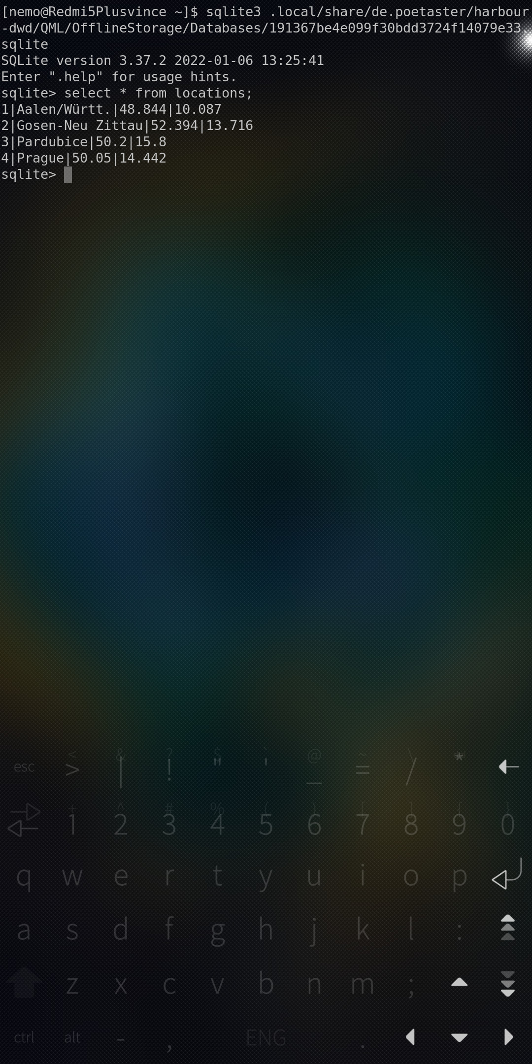
 but probably only in states around Germany, last year I found on the API website that they have some cities outside Germany. So I tried to add some Czech cities - Prague and Pardubice. It’s needed to add them manually by editing app’s database sqlite file (add name and GPS coordinates from the website to locations table).

 )
)