Remorse timer layout

Hey, thank you for making this great forum happen!

I have followed the various permutations of the remorse timer and like the way it is going,

If I e.g. delete an app, it’s intuitive for me to tap on the left side of the timer to cancel the deletion process.

On the right side, however is an :heavy_multiplication_x:, which also kind of stands for cancelling processes. This has confused me at first and might confuse other new users.

I would therefore propose to substitute it with a checkmark to imply a confirmation: yes, i want this process to be done :heavy_check_mark:

15 Likes

i think small things like this should be up to the user. and a finely user-configurable ui is to be aspired. i, for example swipe the remorse timer away. the :heavy_check_mark: and the :heavy_multiplication_x: both are distracting for me. i want to be able to just disable them for a cleaner look.

3 Likes

I am also in favor of removing the x. Adds nothing and kind of makes it look like a window from a desktop app. The tap to undo text is more than enough.

5 Likes

Oh,
I feel so reminded

So what to do with such “bug” report now?
Continue on TJC where all discussion/info is present. Or just start anew (freshly)??

1 Like

I DO VOTE FOR REMOVAL OF THAT ‘X’!
Yes, it is a complete sentence.

3 Likes

Seconded! :wink:

That ‘X’ has always been confusing and unnecessary. If you are worried, people may not understand, that you can simply ignore or swipe away these timers, just display a tutorial hint the first few times…

5 Likes

You can change it yourself…

1 Like

File is /usr/lib/qt5/qml/Sailfish/Silica/private/remorseBase.qml. Down to line 178, you see icon.source: enabled ? "image://theme/icon-m-cancel or something like that . The images are in /usr/share/Themes/sailfish-default/meegotouch/z1.0, (etc). Find the image you want to use, and change the reference in qml file…

Of course, you mess around with this stuff at your own risk. Make backups, and also wise to unapply or uninstall patches that may use these files first…

3 Likes

Today I accidentaly deleted bunch of my vacation photos by pressing this cross. I did this not for the first time and I’ m sure I will make this mistake again and again.
This cross is horrible design solution.

10 Likes

Sorry for quoting and posting:
but a simple ‘like’ is just not enough to support that this X vanishes again asap.

Meanwhile I am using ancelads patch “Return old remorse popup notification” and set the time to 2 or 3 seconds with “Remorse items timeout control”

2 Likes

My suggestion is no taps at all. Swipes only.

Delete --------------- <_>----------------------- Restore
________________^ marker that moves from left to right and can be pulled to the left (immediate delete) or to the right (restore).

6 Likes

This morning I just got this idea when i was swiping the remorse timer. I was about to comment, when i saw this comment and liked it. Looks like a cool idea and robust design. There should also be a text indicator - like now - to indicate what action is being performed by the user.

Why do they need to look at Android style but not make it right?
On Andy only the section on the right where 'Undo is written does actually the undo (not the commit labeled ‘X’)! The other section labeled ‘Deleted’ does nothing.
So on Android this quite similar looking thingy does it right!

Samsung standard mail app (folder Recycle bin)

1 Like

There is also patch “Remove cross icon from remorse timer” in Patchmanager3 https://coderus.openrepos.net/pm2/project/remove-cross-icon-from-remorse-timer-iii.

1 Like

I vote for changing the x into a small trash icon.

So its easier to understand for the user that tapping the (present) x means delete immediately while tapping on the remorse countdown bar means abort the deleting process.

and I vote against swipes! (sorry Kandelabra…) this may sometimes not be recognized by the telephone if done in a wrong way, and then it is too late for aborting and the file is gone away…

edit: maybe it is possible to implement both, the tapping and the swiping method?

4 Likes

There didn’t used to be different zones tapping.
Before the re-design, tapping was used cancel and swipe to confirm.
Imho, that’s the best way to do things, for the sames reasons you mentioned: the quick and easy action (tap) should abort, while the deliberate action (swipe) confirms/deletes. Doing things that way makes it very hard to mess up by accident.

9 Likes

But the remorse bar isn’t just for deleting files - that’s the confusion, because as it is, tapping on the ‘x’ is actually a confirmation, so having a trash can might be sensible in the case of deleting a file, it wouldn’t be for other things… I guess there are only so many things the remorse bar is used for, so maybe there could be different logos depending on the situation. Too much codeing for me personally. If I remember right, tje first remorse ‘confirm’ patchactually showed the words “tap to confirm” or something like that…

3 Likes

Now I changed the X into a trash icon, doing the following:

As Levone1 wrote, in the RemorseBase.qml, in the line 178 there is the filename of the icon, but without the filename-extension and with an incomplete/strange path. Little bit confusing, but do not worry about it.

178: icon.source: enabled ? “image://theme/icon-m-input-remove” : “”

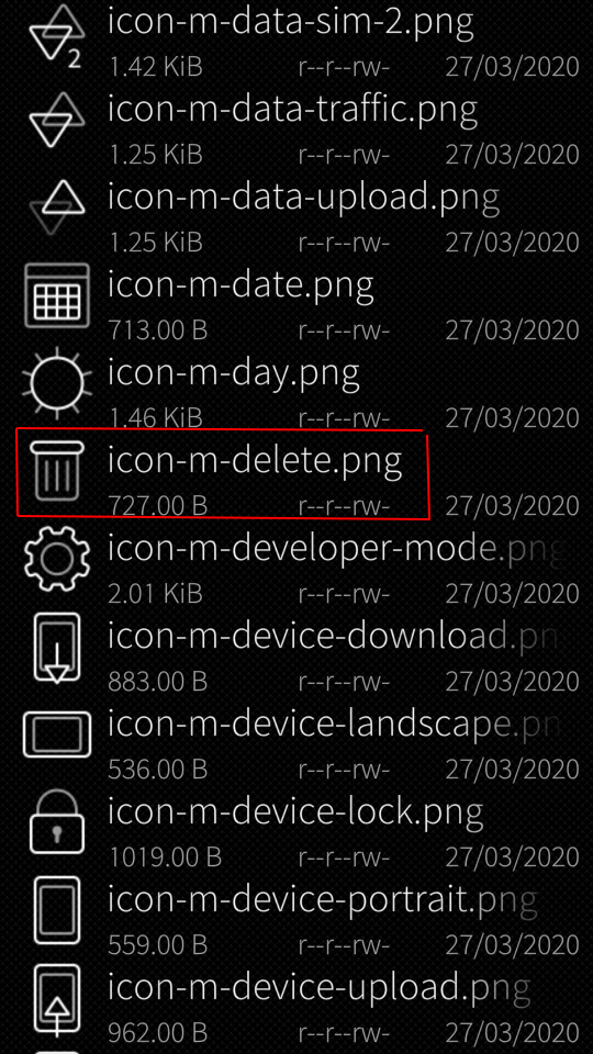
This image “icon-m-input-remove.png” is in the directory

/usr/share/themes/sailfish-default/meegotouch/z1.75/icons .

Because I wanted to change the X to a trash icon, and found not a single one on the Sailfish Phone, I downloaded one from the internet. Using GIMP, I set its size to 112 x 112 pixel (the same size as the original X icon), made the background colour transparent and named it “icon-m-trash-remove.png”, to keep the filename at the same number of charakters.

This new icon I added to the directory /usr/share/themes/sailfish-default/meegotouch/z1.75/icons .

In the RemorseBase.qml I changed the line 178 into:

178: icon.source: enabled ? “image://theme/icon-m-trash-remove” : “” .

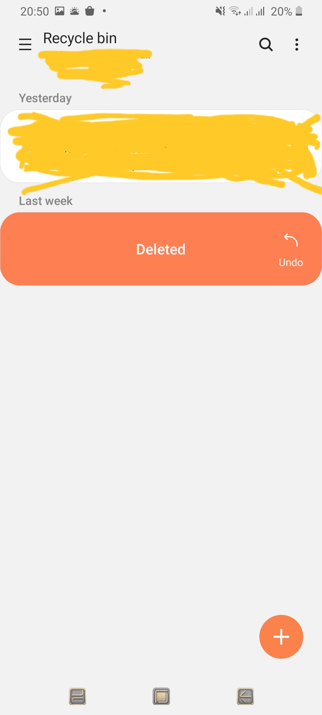
I tested with deleting some files on the phone and deleting old e-mails. In fact there occurs now the trash icon instead of the X, and this without rebooting the phone! Future will show if this makes sense for other situations where the remorse countdown occurs… and in the mean time I am happy that the hack worked and will think what icon will better express “Do now & don’t wait” or “do immediately”.

Now it is possible at any time, to change this icon, the only thing to do is storing an icon with size 112 x 112 px and name “icon-m-trash-remove.png” in the directory /usr/share/themes/sailfish-default/meegotouch/z1.75/icons .

edit: changed trash icon into check mark, this is really more appropriate.

2 Likes

Because I wanted to change the X to a trash icon, and found not a single one on the Sailfish Phone, I downloaded one from the internet.

Really?, I’m pretty sure there is a trash can icon in the system, at least on my Jolla1;

/usr/share/themes/sailfish-default/meegotouch/z1.0/icons

and the end result looks like this;

3 Likes

nice picture ^^
post must be at least 20 characters

1 Like