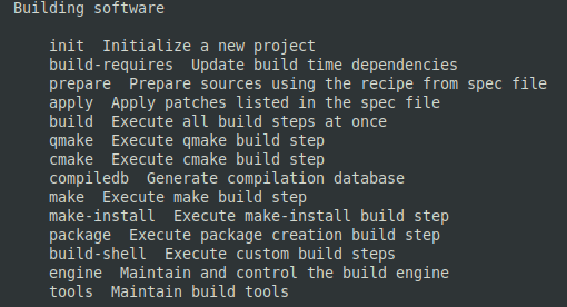
In the paginated help that you see with sfdk --help it is pretty hard to just skim through for what you are looking for, since there is no visual distinction between keywords and their descriptions. Most man pages has this so you have an easier time finding the option you are looking for, and only then having to bother to look at the description (as it is easily distinguished).
I also have some choice cursewords for forced pagination by default and not accepting -h for help, but that’s not really productive to worry about, so i will try not to.
One could argue that this is still help printout and not a man page, despite the pagination, so that bold is not commonplace. But in that case, please consider making the separation between option and description more clear some other way, e.g. by putting them in columns, not just separated with two spaces.