Greetings Everyone,
I have a suggestion on reworking notifications more in the traditional way of Sailfish UX.
On Sailfish 4 we do now have that stupid Android alike arrow (in yellow), which lets further options like “share”, “edit” ect. emerge. Activation of those does cost another click. Pretty unhandy, don’t you think?
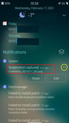
I would really prefer to see here more of the classical approach of Sailfish OS, where by doing a hold on the notification (in red), a fall menu with the options needed emerges. Hence one only does need to hold & swipe down in order to select the option needed.
P.S. I would really love to spare myself all that clicking, what we all know from Android!