Jolla Phone Camera: Too many details are lost

I am actually looking into this via the JPG →Quality mode. Still nothing concrete in terms actual difference.

@Orologiaio

but I think the UX could do with some streamlining (there is too much stuff always available on screen for my taste)

You are absolutely right, @ric9k and I are actually working on it. Menu contents, split into "Standard" and "Advanced mode"? · Logic-gate/RAWfish · Discussion #21 · GitHub

Mind you, some of the options are just for testing.

What do you think?

I have no idea why I like it. Cheers. Can you perhaps have it exported in SVG?

3 Likes

You are absolutely right, @ric9k and I are actually working on it. Menu contents, split into "Standard" and "Advanced mode"? · Logic-gate/RAWfish · Discussion #21 · GitHub

Mind you, some of the options are just for testing.

Glad to hear that and looking forward to see the progress!

I have no idea why I like it. Cheers. Can you perhaps have it exported in SVG?

Unfortunately, no. I tried to have the LLM convert the png image it generated to svg, but it was a mess. I can make it with a transparent background by hand, though, if you need.

I’ll fire up inkscape and try to recreate it in svg directly when I find the time (but as I was saying, I’m not that good, so I’m not sure how it would go). In the meantime, I tried to refine / simplify the concept with the LLM, though. I quite like this new version.

2 Likes

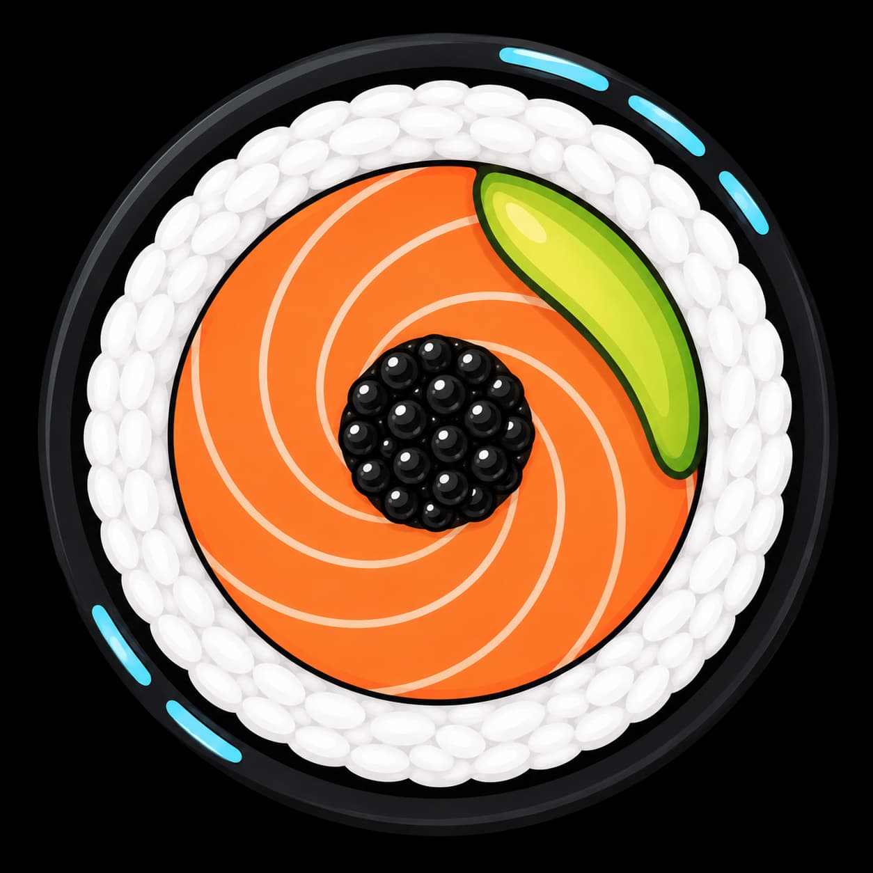
Just realized the salmon resembles the blades of the diaphragm.
Nice idea.

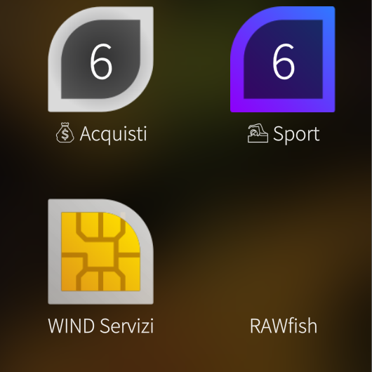
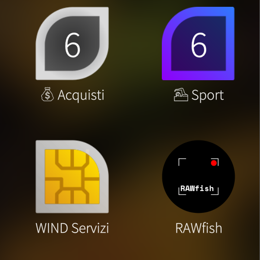
Strange, the icon I had in the appgrid was this one (perhaps appeared after a reboot?):

Not typically sailfishy but very nice too, though.

3 Likes

Black icons have the issue that the app drawer for many is either black or at least very dark, making those either merge with the background or having very low contrast to it. Some sort of bright frame would resolve that, if possible without ruining the design.

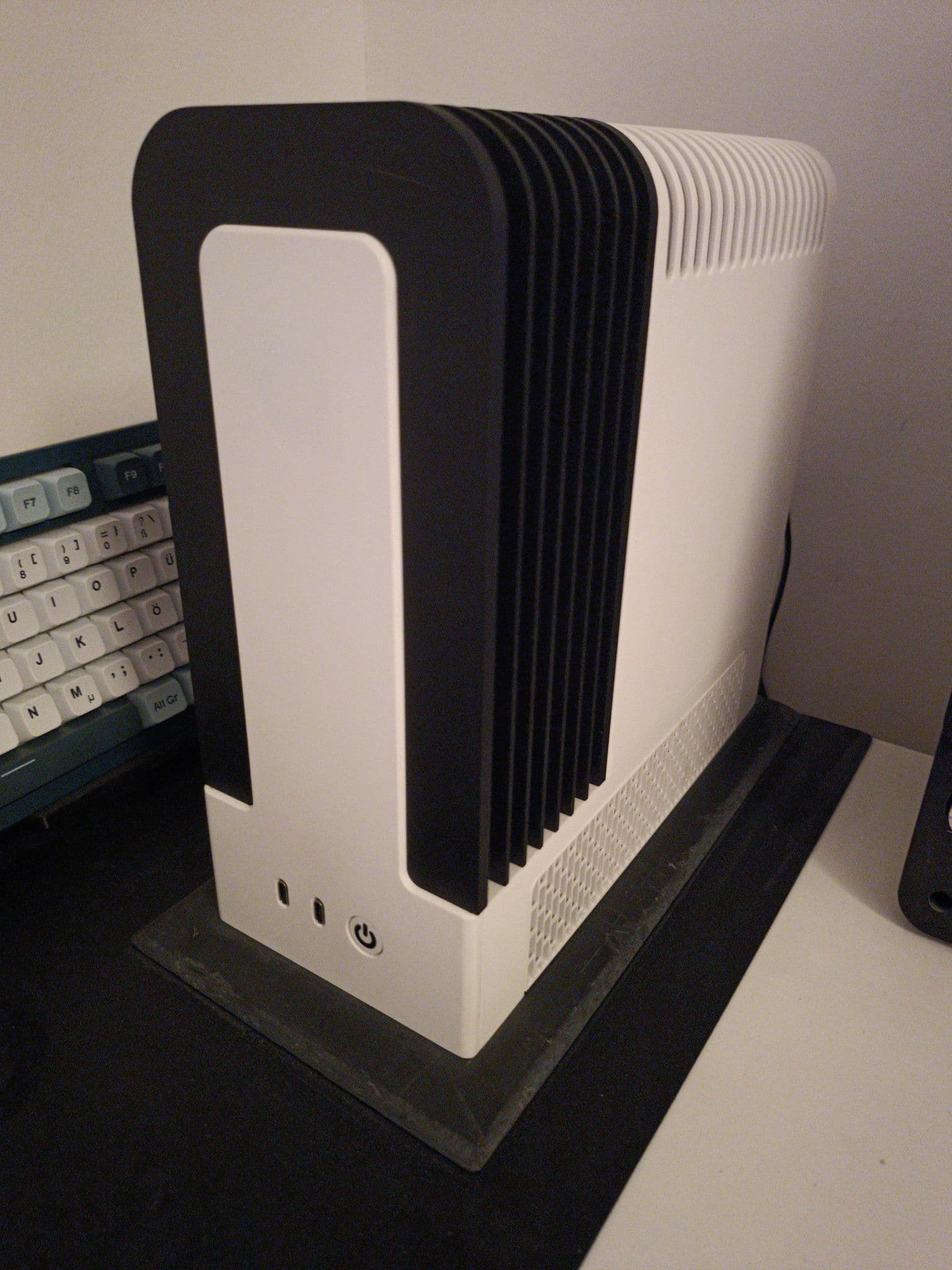
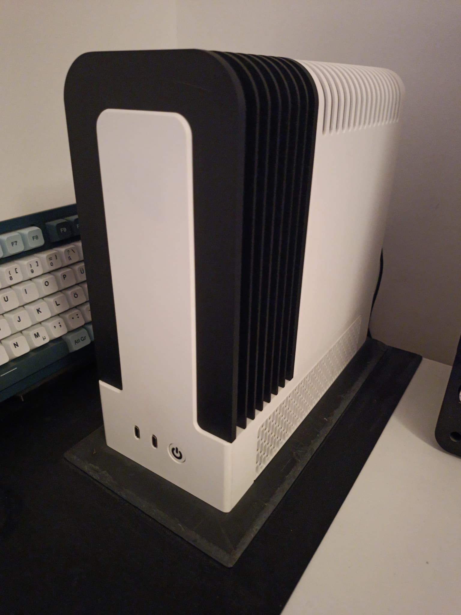
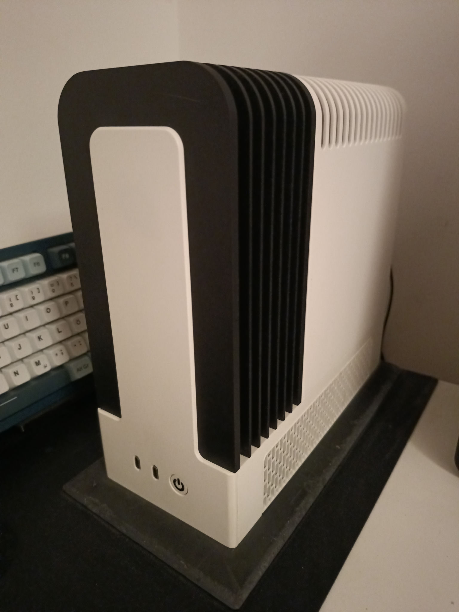
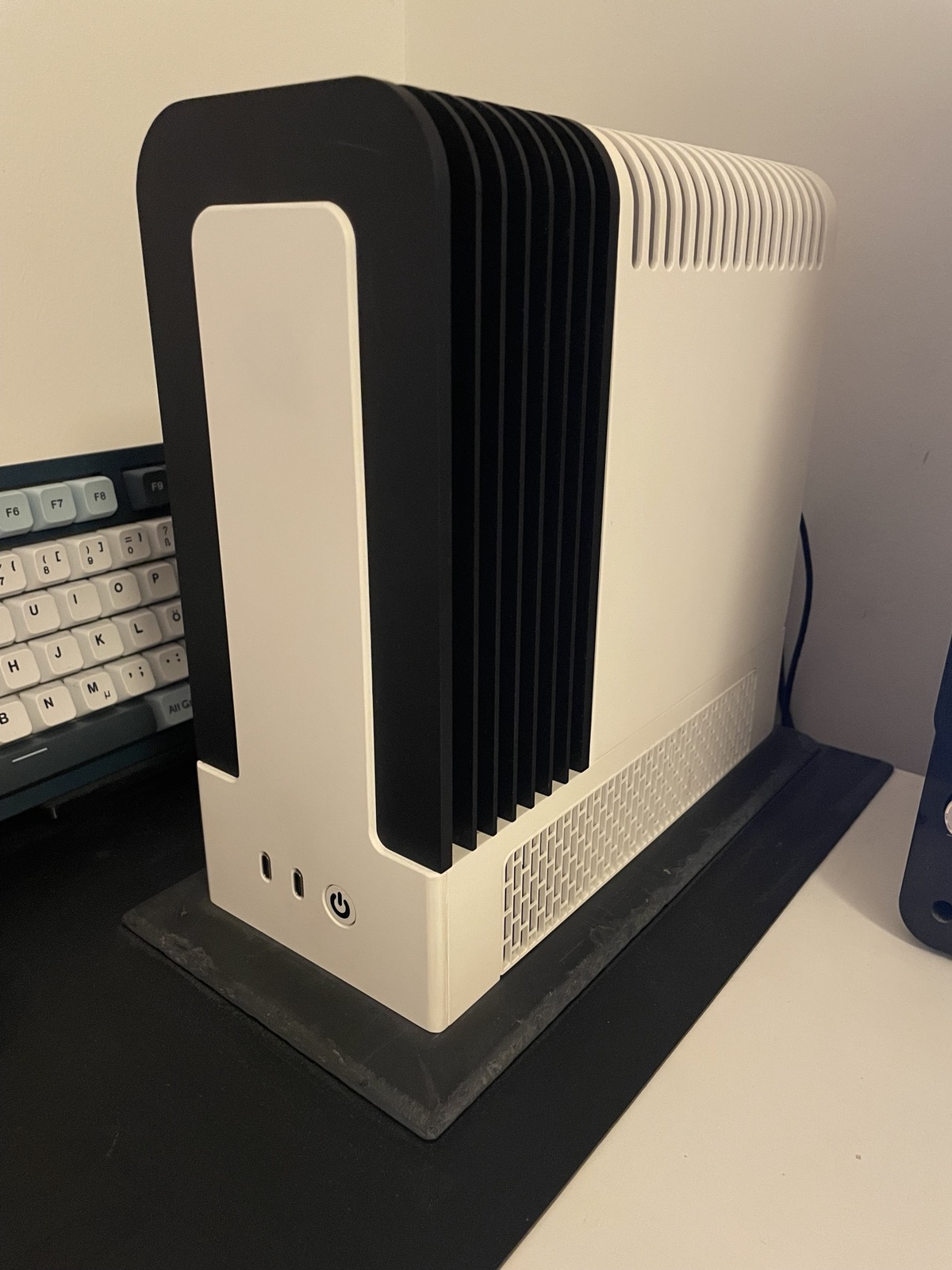
Ok, don’t crucify me but I made some quick comparisons. Jolla with stockapp, rawfish and iPhone12 in not terribly strong warm LED lighting.

RAWfish-nodenoise (“Focus auto” but with manual focus on the ON/OFF button)

Same RAWfish image with astrophoto denoise in Darktable

Jolla stock app (manual focus on the ON/OFF button)

iPhone12 stock app

The black mat under the stone slab is rather featureless in real life. The iPhone got it quite well. But of all the images the white balance of the image looks the furthest off subjectively.

I think the noise on the Jolla Phone sensor is quite challenging in low light situations for any denoising filter. Of the Jolla images I find the noisy one still the closest to reality. The stock app makes it look quite strange.

I am not sure if the focus on the stock app is narrower but I tried it a few times. The keyboard was slightly less in focus than with rawfish, each time manually focusing on the on/off button.

1 Like

Just realized the salmon resembles the blades of the diaphragm.
Nice idea.

Thanks! Glad you like it!

Strange, the icon I had in the appgrid was this one (perhaps appeared after a reboot?):

rawfish-sfos

Not typically sailfishy but very nice too, though.

Mmm, weird, this is how it looks on my device:

EDIT: …aaaaaand after a reboot, it appeared!

2 Likes

Is this in JPG mode or RAW-DNG?

I should really have a write up about the settings. I know it’s confusing with some redundancy.

There are certain instances where the stock camera produces acceptable JPEGs.

The salmon and @ric9k’s observation is the way to go I think. Anyway, I open for anything. Cheers.

1 Like

JPG mode. So yes, the denoised image might be worse than what you would get from RAW-DNG. I have not tried RAW-DNG yet.

Ok, this is now a DNG with denoise (profiled) in darktable and some reduction in exposure and modification of the “filmic rgb" to make the blacks as dark as I see it. The noise is more persistent but overall the mat looks a lot better.
Forgive my very basic darktable skills, I barely know what I am doing when it comes to RAW, DNG etc.

1 Like

I like the idea of the salmon-diaphragm blades.
But the original icon is hand-crafted and I like that very much.
Generally speaking, I find the AI images less original and less personal.
Plus the camera viewfinder represented in the icon is a simple and very good find, imho.

4 Likes

I had no icon first…

Reboot gave the black icon, I like that because it really pops and when I want to take a photo every millisecond counts.

But the sushi-as-aperture-blades is clever.

Whatever, the main thing is the app is just fantastic, already took one nice picture. This is one of the biggest improvements for me with sailfish since the first one.

I’ve never bothered with my Jollas to use them as actual cameras, they’ve always just been cameras in an emergency. Now I’m actually going to have this as my main camera for a while. Very exciting.

EDIT:

I would say that one thing I would love to change, is that at the moment it’s basically M manual mode. I would love a default of A Aperture priority.

What I mean is, I love having the shutter speed/ISO right there, so I am going to take a picture, I can see that I have decent light, Shutter is 1/33 and ISO is 800 or so.

My reaction is, if handheld, just push up the ISO to 1600, and expect shutter speed to increase to 1/66 or so. Tiny bit more noise, no shake.

Instead it just pushes the exposure atm. Both settings have to be manually changed to give correct settings.

This is a minor thing, hate to be nitpicky, but with a more-or-less fixed aperture lens ISO/shutter are the only real variables (aside from exposure compensation, which in the current interface is fine with the focus-selection gesture which seems to accurately set the general exposure to the point on the preview touched).

Anywaaaaay, going to go take pictures all day now. And sort out some kind of file syncing.
5 Likes

Yes, that’s a good point.

Just for the sake of discussion, and not to defend AI but… regarding “originality” in this case I did not just tell the LLM a general idea and let it do its thing, I was very precise with my instructions and I’m still pretty amazed that it was able to recreate the vision I had in my head so closely. Honestly, I still feel this is my idea, it’s a weird feeling.

Anyway, I’ll play with it some more, just for fun, and see where this goes. If I had seen the black icon from the beginning I don’t know if I would have come up with the salmon-diaphragm idea, but with the djinn out of the bottle now I have to try :sweat_smile:

1 Like

Yeah, I had the same feeling once I wrote a text and ask an AI to make a song of it. Felt like I wrote it!
Anyway, question of personal tastes.

Oh sure, please show the next versions!
I’m going to give my inflexible brain a workout :joy:

2 Likes

I made a first step to “sailfish-ify” the salmon concept, I wanted to make a closer connection to the icons of the stock Camera and Advanced Camera apps (with a “tuna” background color, it makes it stand out and I just really like tuna :sweat_smile:). It’s also now an svg, but it is still just a tweak of the LLM-assisted design. I’ll try a proper recreation in the near future (maybe this weekend, maybe the next).

I can’t upload an SVG here, so you can find it at this link.
Here’s a raster image for preview:

icon-launcher-rawfish

3 Likes

Wow, it flashes!
The sushi is immediately identified.
And the visible black border makes the lens idea much present too.
Very nice!

3 Likes

I like the overall composition of the icon. Personally I would reduce the fine detail (but keep the samon stripes).

2 Likes

Yes, I think that is the next step.

1 Like

Hey….

So, I am actually on leave at the moment. But I got a new release out. Not everything was addressed, but now we have Simple mode. Most importantly, raw is now much faster.

I am open to all suggestions.

Yes, i have it written somewhere, S mode, P, mode, M mode.

Cheers. I agree with @thejiral in reducing a bit of details.

Simple mode demo: https://imgur.com/a/mWcKjad

6 Likes