In RFC for CalDAV, there are three types of incidences : the events, the tasks and the journals. The journals can be used as a transmit structure to move notes between a server and a client. Basically, journals has a summary (the note title), a description (the note body), a colour, a last modified field.
Nextcloud is not using this protocol for notes, though. But some other servers may.
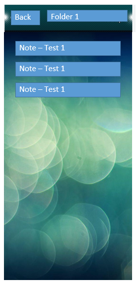
If you have a large number of notes (in my case, 10–30) and are migrating from iOS to SFOS, it is difficult to maintain a clear overview in the native Notes app. This is because each note takes up a significant amount of screen space.
I suggest adding a second view option that allows users to organize and display notes in folders/ lists or columns for a more compact layout, as shown in this example (quick drawing by myself how it could look like, NO finalized UI Interface):
I realize you are not proposing literal blue rectangles.
But there is no need to mess with the base layout just because you are viewing notes in a certain category.
Not sure if the enormous margins are intentional - but the reduced preview length is definitely for the worse. Notes, for better or worse, don’t t really have headings - so a multi-line preview is a good thing.
indeed - currently i do have organized my notes with headlines, to find quicker what i was searching for.
The preview of more lines is a good thing, maybe let’s switch from one headline to the first 3 lines of notes text - can be headline or text or whatever is in there.
Then we do have enough space in the list left to show more notes at once to get a better overview.
I think everybody has his preferences how to organize notes, it just needs to be flexible enough that the preferred view can be adjusted
Can’t count on that for anyone else - especially with it not even a hint to add them.
What do you mean switch - it is currently 6 lines. The switch you are proposing is the other direction - and hidden in a proposal about categories at that. The current overview of 10 notes is a pretty great amount.
I disagree. Keep it simple. Nobody needs the headache of a config swamp. Add a high-value feature or three and be done with it. You will actually please fewer people if you start going advanced.