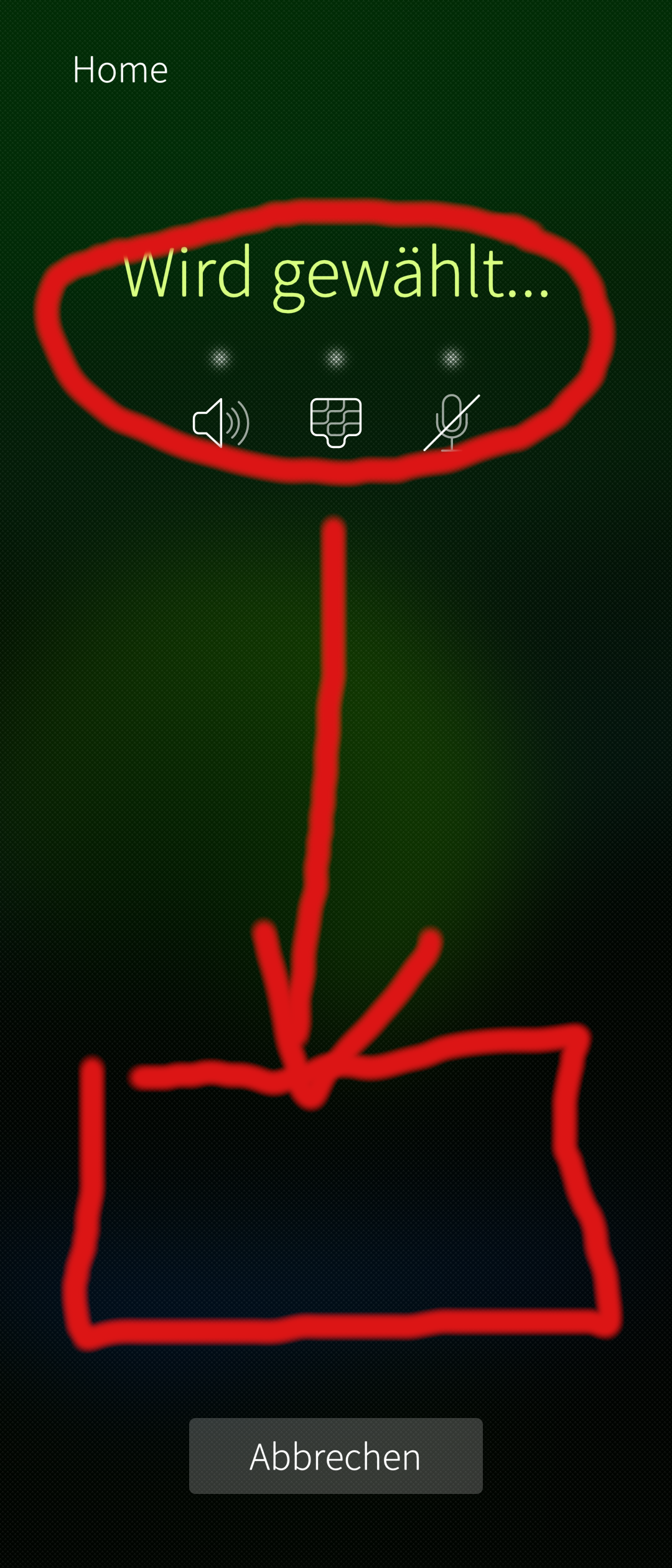
First - thank you for this great piece of software. I really like it on my Sony Xperia 10 II, but the phone size is a little challenging. If I start a call and want to activate my speaker, it is impossible to push the button with my thumb (smartphone too large or maybe my thumb is too short ).
In Call-app, if I call a phone-number, all buttons are accessible on the bottom screen. So maybe it’s straight, to set the buttons in a call also at the bottom?
Not something I particularly care about as I simply use my other hand to push buttons, but, that said…if you want to fiddle around, the file to edit is here;
But actually i think all those things should be adaptable by the user. I hope i don’t say something wrong, but wasn’t this one of the USPs of Blackberry that their UI was highly adaptable by the user. Because if you now adapt the position of this, you will always have problems. Depending on the device, it might be too high/low, and maybe in the usage one user would like to have it that way, the other user the other way. So a highly adaptable UX would be great
That’s the beauty of pulley menus, they are always reachable (unless used in scroll areas).
I wonder if these buttons can be made pulley menues (as well).
 ).
).