Sailfish OS Forum
Browser redesign in Sailfish 4.2 feedback thread
Design
thigg
2 September 2021 09:58
15
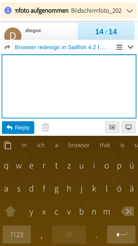
Bildschirmfoto_20210902_009
1080×1920 285 KB
Bildschirmfoto_20210902_007
1080×1920 196 KB
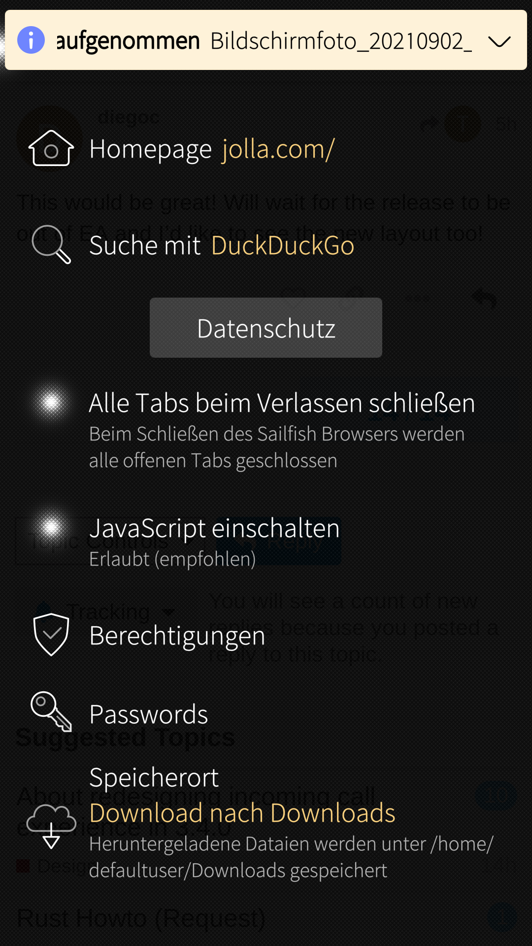
Bildschirmfoto_20210902_006
1080×1920 441 KB
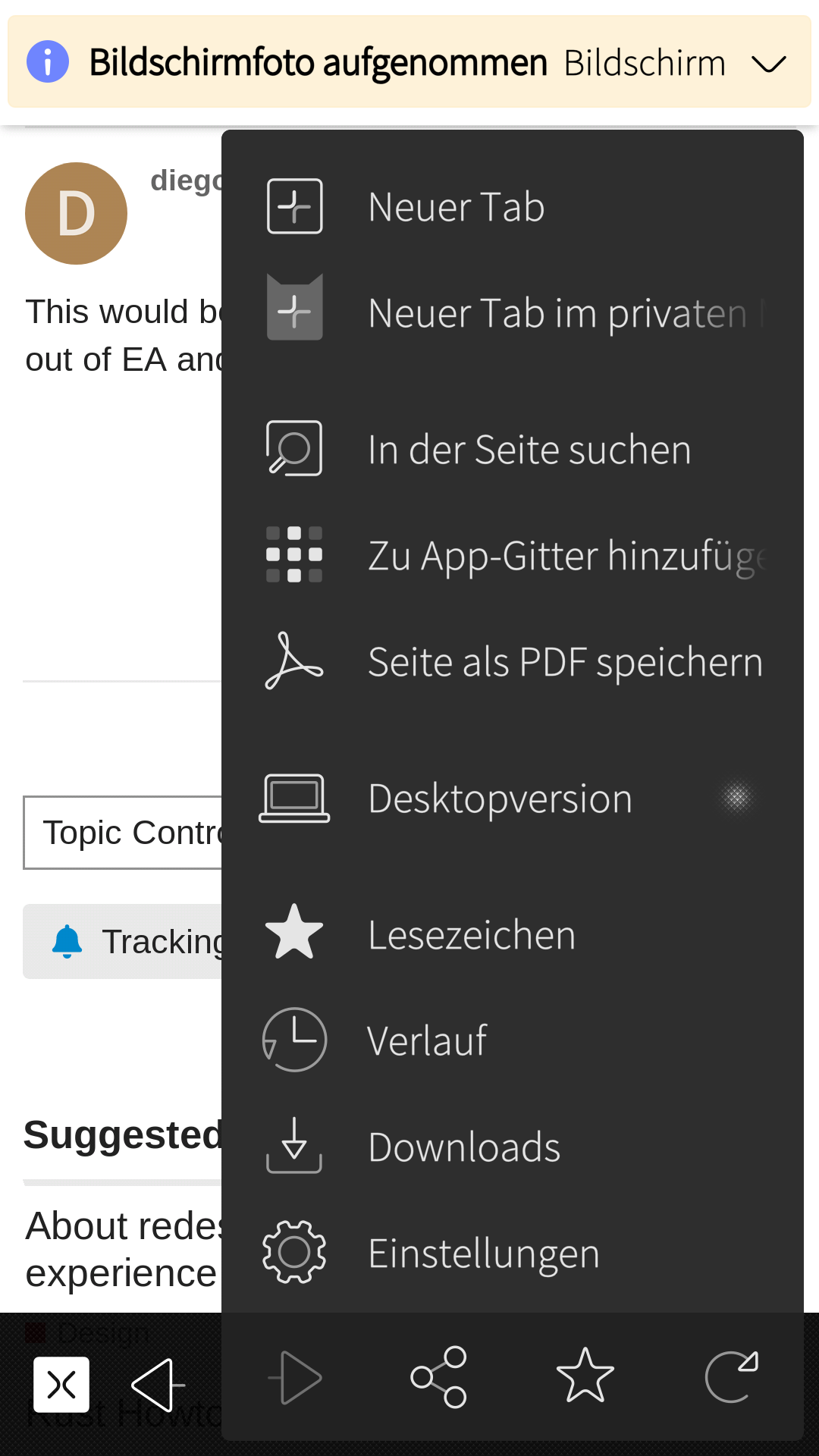
Bildschirmfoto_20210902_005
1080×1920 521 KB
Bildschirmfoto_20210902_004
1080×1920 249 KB
Bildschirmfoto_20210902_003
1080×1920 241 KB
Bildschirmfoto_20210902_002
1080×1920 207 KB
1 Like
show post in topic