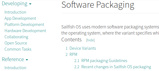
I find the Developer Documentation website SailfishOS Documentation very hard to read, compared to other sites. Specifically, the used fonts and colors are a bad choice. The font Source Sans Pro Light is rendered very thin on Linux (Kubuntu), but that is a property of the font. It’s also light greenish and (dark) gray. And it’s SMALL. Of course I can zoom to fix the latter.
Example:

Please don’t sacrifice readability for style.

