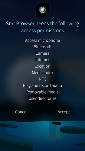
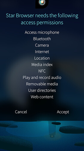
Something I’ve noticed is the permissions popup when you first open a App doesn’t show if there are more permissions in the list by scrolling, this will make it very easy for users to accept permissions that they wouldn’t know the App is asking for.
The Scroll Bar should flash or be visible permanently to ensure the user can see the full list of permissions.
3 Likes
As shown in the screenshots the popup has reached its maximum height which is making the list scrollable and hiding a permission from the user, as there is no visual indication that the list does scroll.
To make sure that the user sees and acknowledges all the permissions, if the list is longer than the visible part, not only the scrollbar should be displayed but also the Accept button should be inactive until the list gets scrolled to the bottom by the user.
2 Likes
Either show the scroll bar, or the last line in the displayed permissions should say “scroll down for 5 more permissions” or something similar.
1 Like
I’d support this, the message would be a better hint for newbies.
@flypig could you possibly share your thoughts on this please?
1 Like
I’d say this is a fair point. I’m not sure what the best solution would be (that would require some careful consideration), but I’ve created an internal issue in our Bugtracker to highlight the problem (we don’t have the “tracked” tag in the Feature Requests category, so I can’t tag it as such I’m afraid).
Thanks, at any rate, for highlighting this and the nice suggestions for solutions.
2 Likes
The “Accept button is inactive until the user scrolls the message down to the bottom” approach is commonly used in EULA popups on many websites like Google, YouTube, etc. and in many computer/smartphone applications, so newbies are probably familiar with it. Whereas - in my opinion - displaying a message in the middle of the permissions list would be disturbing.
1 Like

