Sony’s Xperia 10-series phones have a 21:9 (Yes, I know, that can be reduced to 7:3  ) aspect ratio, so you can have a big screen and hold your device safely in one hand anyway.
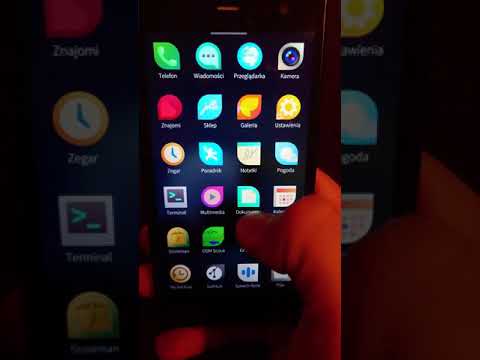
I wonder if Sailfish X for those devices could support this concept by placing icons in the App Grid starting from the bottom instead of from the top?
That would help users who don’t have a lot of apps installed accessing those with their thumbs while holding the phone in one hand.
Or as an alternative: The App Grid could slide up just far enough to show all installed apps, when activated.

 Thanks for the reply.


