WebView produces incorrect screen.height, window.innerHeight values

REPRODUCIBILITY: 100%
OS VERSION: 4.4.0.72
HARDWARE: 10ii, volla/gs290
UI LANGUAGE: en/de
REGRESSION: yes, since 4.3

DESCRIPTION:

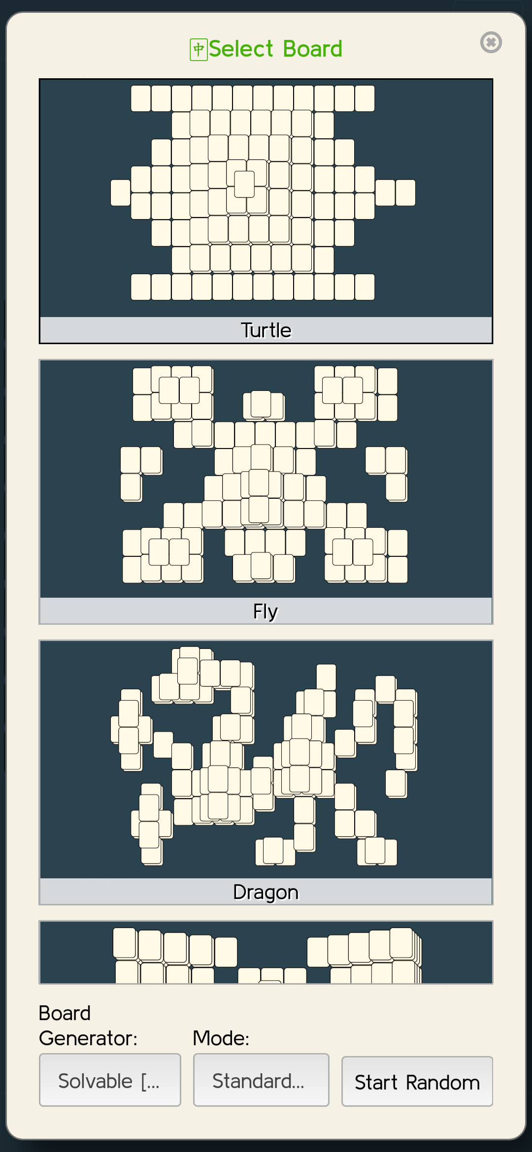
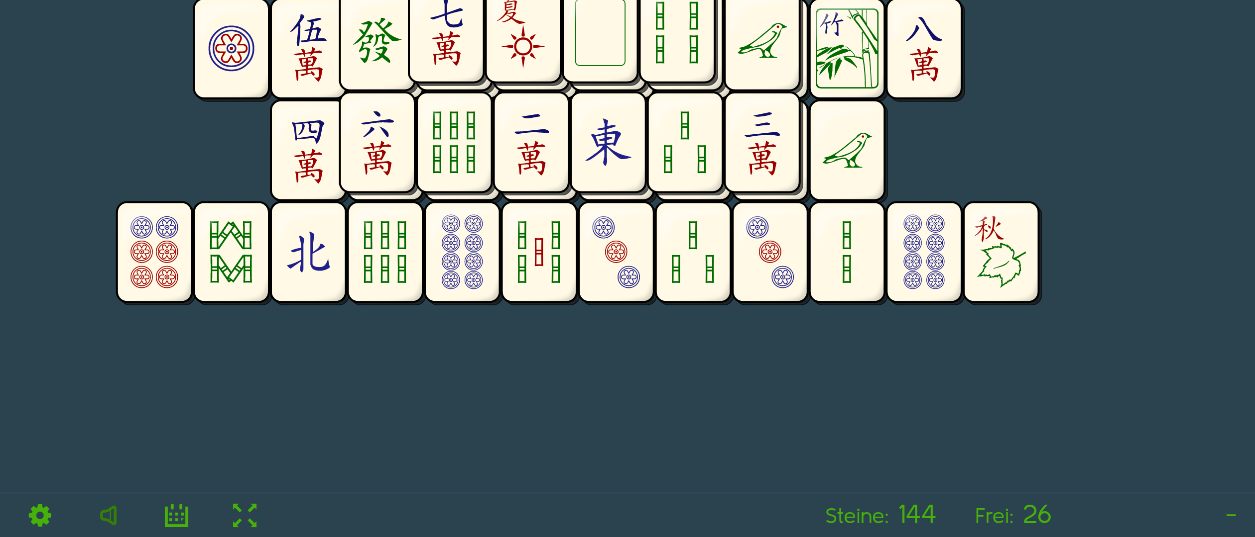
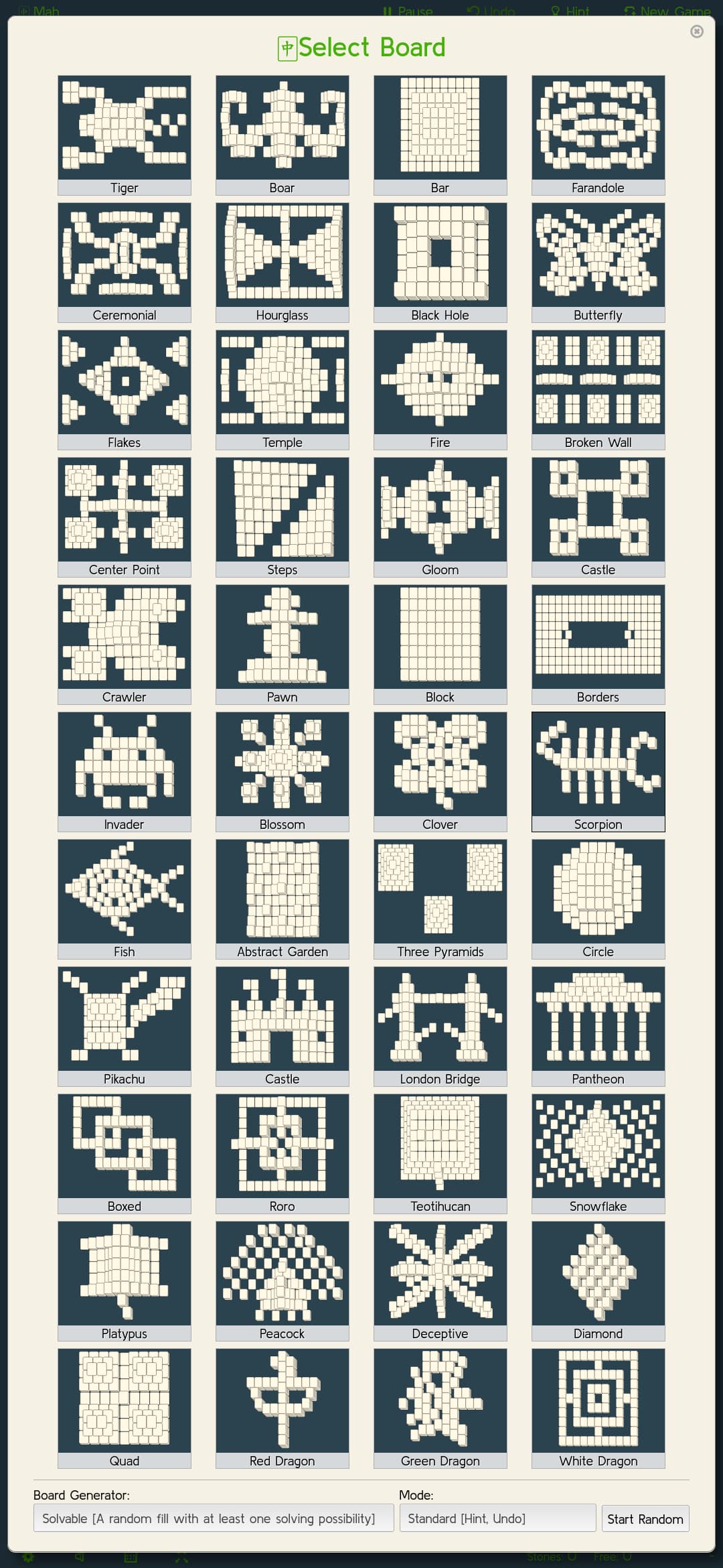
When scaling elements (tiles area for instance, in harbour-moremahjong), scaling can’t be applied correctly in Landscape mode:

In landscape rotation of 270,

window.innerWidth  = 780, screen.width = 360
window.innerHeight  = 780, screen.height = 780

With 0 degree roation, Portait, we get:

window.innerWidth  = 360, screen.width = 360
window.innerHeight  = 780, screen.height = 780

This error occurs on all 4.4.0.72 devices I tested. In ALL these cases, the same app can be played in the browser (Mah) and it’s ok.

I went through versions of the mahjong app to see if it’s a regression in my last release but it is not

PRECONDITIONS:

Have updated to 4.4.0.68,72.

STEPS TO REPRODUCE:

  1. Install harbour-moremahjong
  2. Start a game/pattern
  3. Rotate the screen to landscape

EXPECTED RESULT:

Scaling in a WebView should work as it does in the web browser

ACTUAL RESULT:

In Landscape mode, WebView content if scaled to window.innerHeight will overflow, not be visible, etc.

MODIFICATIONS:

The xperia 10ii is a clean, licensed device. I haven’t even enabled the android stuff that comes with the license. No patches, no mods.

The volla/gs290 test devices have chum and openrepos installed apps and are targets for the SDK.

The symptoms are the same.

ADDITIONAL INFORMATION:

1 Like

Thanks for reporting this @poetaster, and for checking it carefully. Just to be completely clear, am I correct in understanding that the error is for the window.innerWidth value in landscape mode (it’s giving 780 when you’d expect to see 360)?

I’ve created an internal issue for this and tagged it as tracked here.

2 Likes

Correct. There are a number of other distinct behaviours that don’t appear in the browser but seem to plague the WebView. I’d noted some issues with audio in another ticket.

I’ve just reverted to an older version (.64) on volla and the bug doesn’t appear here. It does appear on .72 x10ii and volla/gs290 .72.

The state where moremahjong works (volla, .64)

sailfish-components-webview-qt5-1.5.9-1.19.1.jolla.src
embedlite-components-qt5-1.24.33-1.35.1.jolla.src

Maybe that helps.

1 Like

For reference? [components-webview] Respect component height. Fixes JB#57689 · sailfishos/sailfish-components-webview@df9ae3c · GitHub

I now have three different results. On .64 volla, harbour-moremahjong works as you’d expect. On .72 volla, the display in portrait mode is obviously desktop (far too small). Select a game and play and it zooms in but is cut off (see title). On .72 on the 10ii, the display in portrait mode is correct. Select a game and play and it’s just like the volla.

This seems to be two different bugs.

volla .64 correct (portrait select, landscape play):


10ii select is the same as above, but landscape play:

The .72 version of GS5 and GS290 have a portrait select as follows:

The landscape play mode looks the same as that of the 10ii one before.

Sooo. Looks like somewhere after .64 (.68-.72) something snuck in.

EDIT:
Just to confuse things:

  • the 10ii with .72 webviews of web pages from servers are rendered correctly (with or without user agent string).
  • the GS290 with .64 they are also correct.
  • the .72 GS290/Volla/GS5 are rendered as if the user agent where desktop (regardless of user agent string).
1 Like

Test tool: GitHub - poetaster/webview-screensize: a tool to test webview screen, browser sizes and orientation

2 Likes

Thanks for your test tool, and other comments, which have been very helpful. Would you be willing to test out this change please, attempting to address the height value issues on the 10 II?

I tried it with your test tool (also on a 10 II) with positive results, but it could do with more practical testing as there’s scope for a lot of edge cases here.

Ok. That fix makes mah solitaire, among others, scale properly again. Looks like one less issue :slight_smile:

2 Likes

Also works with leaflet.js resizing and scaling on orientation change.

1 Like

That’s good to hear. Thank you for testing it @poetaster. I’ll aim to get this change in for the next release, but that depends on it passing review of course.

I did an evil variant on the Volla 22 and just removed the viewportHeight completely. Same effect :slight_smile: But I’m only mentioning that to ask a ‘related’ question.

On the vollas, regardless, of useragent string, and even with the correct browser window measures, the display always looks ‘desktop’. I’m trying to determine how the qtmozembed component ‘goes’ there. Is it trying to guess the display size by some other means from the compositor? It doesn’t having anything to do with css media selectors, per se. Any ideas where to poke around?

I’m not sure, but one thing that springs to mind is that the pixel density may be set differently. In that case, the site may be thinking the screen is larger (physically) than it is.

You may have already answered this above (I skimmed though again but couldn’t see it), but on the Volla, is the browser working correctly (and e.g. switching between desktop mode and mobile mode works fine)? It’s only the WebView that defaults to desktop mode?

Yes. Only the webview displays this behaviour. Have tried @mal’s suggestions vis. /var/lib/environment/compositor/droid-hal-device.conf but DPI at that environment level doesn’t change things. I’m guessing that the compositor tells qtmozembed what effective DPI is?

EDIT: but if it’s only in WebView, can’t be DPI per se, or?

I did only the briefest of testing using your test app, but editing ~/.cache/org.myorg/webview-screensize/.mozilla/prefs.js and changing the layout.css.devPixelsPerPx value I was able to persuade GitHub to switch between mobile and desktop mode (on a 10 III, a value of 1 gave desktop mode, while a value of 3 gave mobile mode). I’m not saying this is where your problem lies, but maybe it’s an avenue to explore.

Since the browser is working correctly, you could compare the value with that found in ~/.local/share/org.sailfishos/browser/.mozilla/prefs.js.

1 Like

Thanks! Every avenue helps!

I also noted on the 10ii that the rendering seem desktop in portrait but mobile in landscape. But it doesn’t have that effect with ‘actual’ web pages (so, ones with media selectors and viewport meta tags). Did you notice that?

Sorry, just for clarification, rendering of what?

I meant the content of the test app. When in portrait mode, the size of fonts, the blue div are scaled differently than when in landscape mode.

Yes, I see the same, and I don’t have an adequate explanation for that I’m afraid, except to say that this is at least the same as the behaviour with the web browser (independent of whether Desktop mode is forced or not).

Interesting. That value is not set in the webview prefs.js at all in the case of Mah solitaire. I wonder if this is a fault in my dependency declarations in the spec?

Adding this to the prefs.js file of any webview app works! Thanks!

1 Like