Please, open a bug in the report category describing your problem : version, number of calendars… You can also follow what I wrote there: VALARM-loop of jolla-alarm-ui to list and edit your alarms. It may help to understand the issue.
To clarifiy: Multiple reminders are gone since I updated to 3.4.0.24. At least, for me, as of now.
Above I posted Improved Calendar Design a workaraound that worked for me in the meantime after sync stopped working. Using the solution linked above, sync worked again, but (up to) tripled the reminders.
Now, in 3.4.0.24, everything is fine. ONE reminder per date.
I wouldn’t mind trading some level of event detail for better overview information (and maybe even better aesthetics). Here’s a quick sketch:
Of course some use-cases would need a bit further thinking, e.g. what if one would have a lot of 10 or 15 minute things on one day?
edit: typo
12 Likes
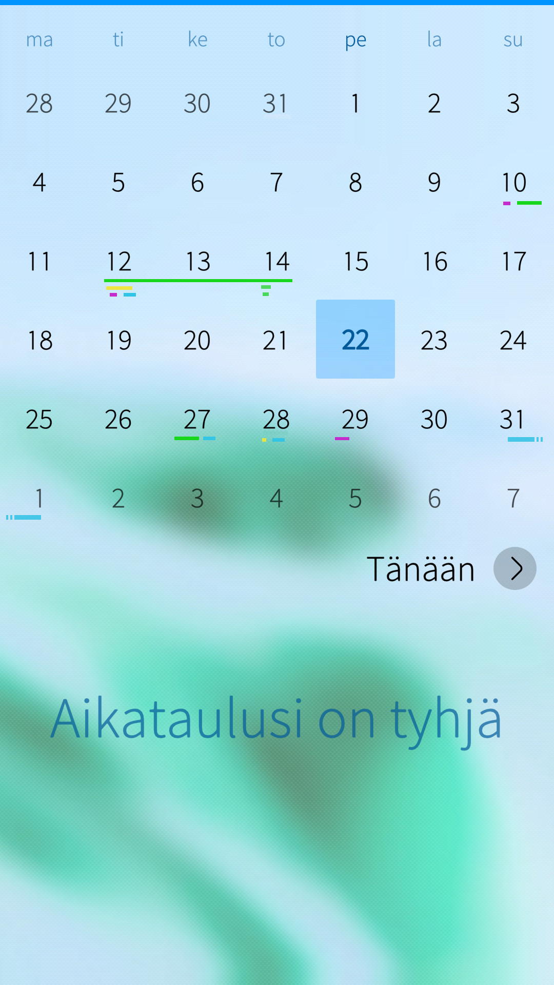
I was happy when I saw that the calendar was updated in SfOS 4.3. But for me it looks too much like Android, and MUCH MORE IMPORTANT I think the dots are too small and so hard to see (1.). The dot from a new entry should be replaced with a dash like an event (2.) It looks more consistent that way, I think.
Edit: A raised number in (screenshot 2) creates additional space for more appointments than necessary and also draws the user’s attention.
1 Like
well I think for private use of the calendar dots or lines are OK. But for business usecases it is irrelevant if it may look like android or elsewhat. The overview should be clear. Less searching for the right entries is not solved with dots or lines. Only if there is possibility to show text in the month overview you have what you need in one second when you look at the basic calenderview (month). Like i described in the beginning…
the Design of the Calendar got improved, that is very nice to see, but not improved enough in my opinnion for business use. Jolla seems not keen enough in the designstrategy of the calendar. Design should follow the function not the other way round! Thats the Architect - Engineer issue 
you are right. If I said 'it looks too much like Android ’ I only mean that we are on SailfishOs.
And I Agree with you that funktion is more important as dots or lines. Jolla should add the patch ‘add more calendars’. that would help in biusenes i think.
I’m nitpicking but if design always follows function then you’ll get inconsistencies, clutter and other Ux troubles. It should be some kind of sweet spot, an synthesis of the two. Overview, of course, will be a compromise due to limited screen real estate; especially when you are a calendar power-user with many calendar items per day.
But yes, it needs work, especially when considering business and power-users.
1 Like
I’ve been using Android calendars for the past decade or so. Now trying to use SailfishOS calendar is difficult. The minimalist month overview looks nice, but usability is not great when I’ll have to tap over each day to see the upcoming events. I’m aware of the day view, but we should at least have a week view too to make any serious use of the calendar.
I see this is an old topic. I can only hope this gets more attention going forward. In the mean time, is there any patches that could help us out? I found this on Github, but sadly it does not work on the current OS version.
3 Likes
Yes, the Callender app could use a few updates to improve usability.
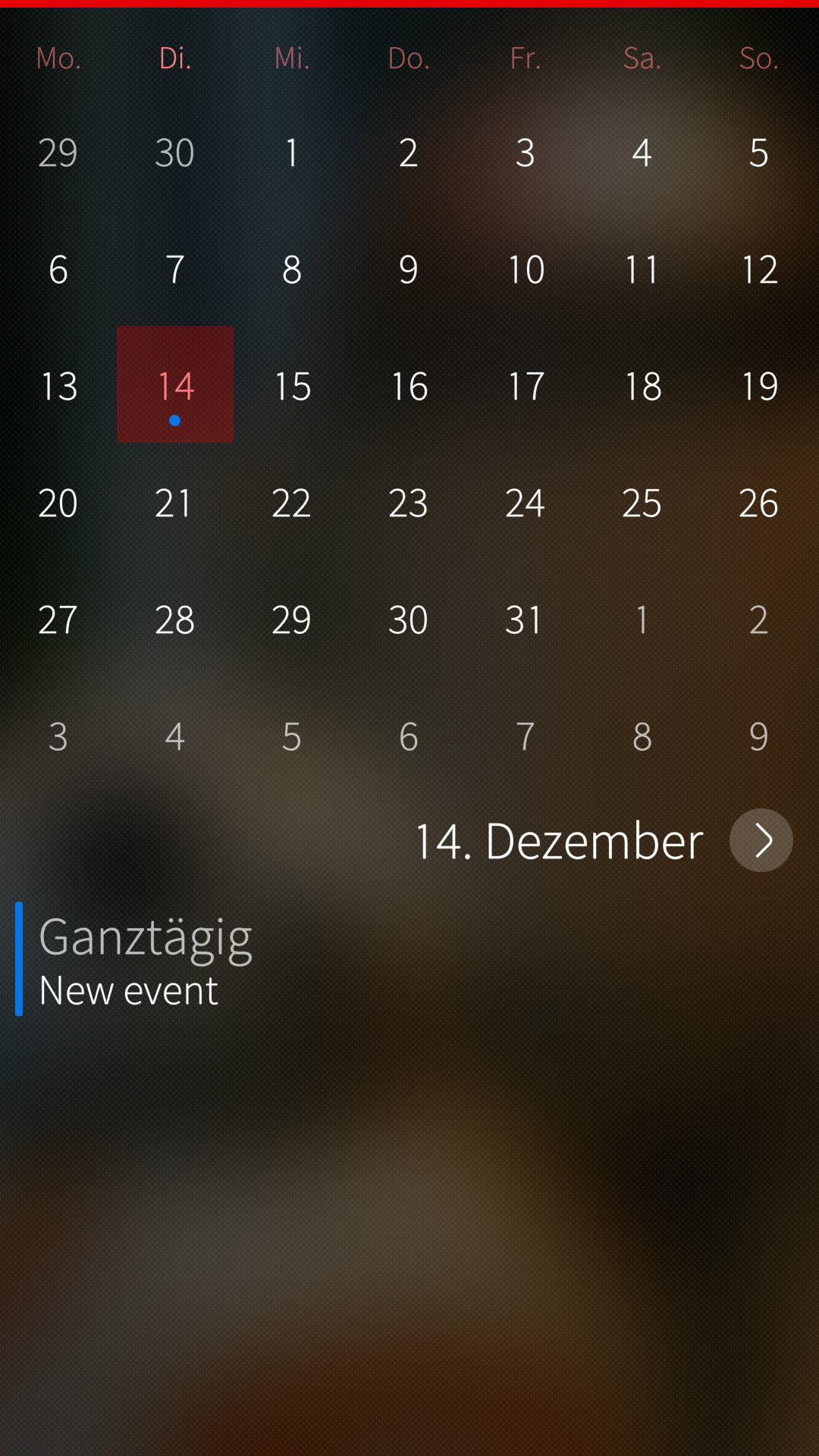
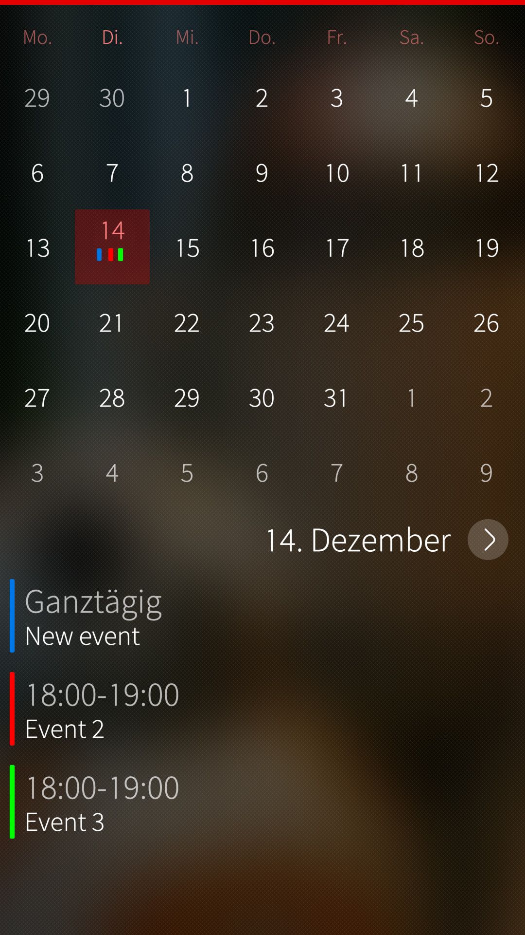
Tap the “Today” button at the bottom of the month view to get a detailed day view. And there you can scroll through the days instead of having to tap each one.
1 Like