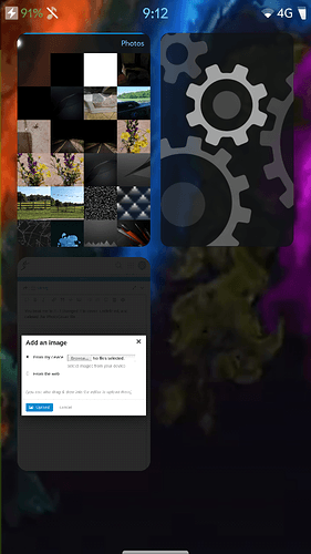
Enhanced gallery cover

Hi !

Maybe some of you find the gallery cover beautiful.

I will prefear, and wish to see, the same area in cover than in the app.
For exemple, if i zoom on a picture, i want to see the zoomed zone in the cover.
This way, you can use it to see something very quickly, by starting to swipe from another app.

When you take a wlan password, or a phone number in picture, and want to rewrite it in another app for exemple.

Thanks, nice day !

6 Likes

Just edit the file /usr/share/jolla-gallery/gallery.qml and change

    cover: Qt.resolvedUrl("pages/GalleryCover.qml")

to

    cover: null
8 Likes

@lukasj Wooaah ! Thanks a lot !
You should have made a patch and go drink a few beers :smile:

You beat me to it - I changed it to cover: undefined, and deleted the PhotoCover fileā€¦

5 Likes

I think itā€™s a great idea and obviously you hit a nerve judging by the two patches you so promptly received.

But I do think your tone is a bit inappropriate.
If we keep demanding a better communication from Jolla, the same applies to us.
Itā€™s not what you say but how you say it.

5 Likes

@rozgwi
I understand you, and iā€™m sorry if you found my tone inappropriate.

However, itā€™s a regression ā€œimplementedā€ by Jolla. It was working like this before.
So if you are a Compagny, with low ressources, i mean people / budget, when you decide to do something, you have to do it correctly, you canā€™t lost time and ressources for unfinished or not well thinked things. Specially when your community ā€œcarriesā€ you.

Thatā€™s why i said, i donā€™t think Jolla will do it, because they removed it.
And iā€™m sorry about ā€œuglyā€ and ā€œuselessā€, i just donā€™t know best words to describe it.
My english is quite poor, and iā€™m using google translate a lot.

3 Likes

@malibu1106: Donā€™t get me wrong. My point was not about speaking good English. Iā€™m not a native speaker either. But I do suppose the equivalents of ā€˜uglyā€™ and ā€˜uselessā€™ still mean the same in your native language. Itā€™s not that I think, we should only say ā€˜nice wordsā€™. I was more referring to the attitude than the words themselves.

I suppose you are using SFOS for a longer time than me (October 2017), since I canā€™t remember the Gallery ever having that feature. But Iā€™m probably wrong, so it may be a regression after all. Otherwise, weā€™d be talking feature request here.
But set aside that, have you considered that the design choices Jolla made regarding the Gallery were thought through and the App is not ā€˜unfinishedā€™? Aesthetics can be a valid purpose of design, too. Not only functionality.
And obviously liking or disliking the white photo square is a matter of taste (although I agree that itā€™s a bit pointless). You donā€™t have to agree with Jollaā€™s ideas about design and surely can criticize/suggest improvements to the software. But why discredit the way they chose to design it?

I donā€™t know if you have experience with software development: But to the contrary of what you say, Jolla is (for the time being at least) not carried nor driven by the community but by their investors and enterprise customers.
Even though your suggestion may be a good feature request: How motivated would you feel as a developer or project manager to implement it, if itā€™s requested with that attitude? You said yourself that they have limited resources. Plus: They wouldnā€™t earn a penny with it since you offered 10 ā‚¬ and then withdrew that offer (I think @Levone1 or @lukasj wouldnā€™t be demotivated by that financial appreciation either)
As I said: My problem is the attitude. If youā€™re happy paying 10 ā‚¬ for a good pizza, why not for a good feature addition, also?

Now I have gone way off-topic. But sometimes it just gets me, sorry.

To be fair, @malibu1106 sent me a private message offering me a donation, but I declined.

3 Likes

I see, didnā€™t know that. Then please ignore my pizza comment, @malibu1106 :wink:

@rozgwi So excuse my attitude.
Thatā€™s true iā€™m a lot frustrated about Jolla choices, iā€™m using sailfish OS since the JP1 has been released.
And i desagreed with the most part of updates, about design / functionnalities, thatā€™s only my opinion, thatā€™s sure.

And i donā€™t have any experience about software development. Sorry if i said a mistake about who ā€œcarriesā€ Jolla. But all people who bought Jolla1, JollaC, JollaTablet, Aquafish, sailfish X ( maybe i forgot one ā€¦ ), itā€™s not the best way to carries Jolla as a customer ?
And i said that too because, in my case, without the very nice developers community, i would have left SFOS because 90% of what i love on SFOS is made by community developers.

About the gallery cover, iā€™m sorry i can consider that the app is ā€œfinishedā€, if you remove a functionnality for an esthetic choice, give a settings to users to set it up.

Basically you are right, thatā€™s not a productive attitude.
But seriously, covers was one of best features of SFOS, and it has been more than one regression.
Seeing this white square, i canā€™t think anything else than ā€œWTF?ā€

I would be happy to vote and paid for decisions about roadmap, maybe a nice way to finance Jolla directly and satisfying the community.
And to see paids apps on Jolla store, for our beloved developers.

I removed my ten euros offer, because the solution was now public, and it that case pretty simple.

But like said @lukasj i was ready to pay him one beer just because he solved my problem. (Thanks to said it btw)

iā€™m going to eat ā€¦ my pizza :wink:

@rozgwi Edited the original post, question of attitude ā€¦ :upside_down_face:

3 Likes

The important thing to remember here is that due to the design choices of the SFOS UI stack it is trivial to make chanes like that, to suit whatever aesthetics one has; with just editing one line of qml it is possible to get the result you want.

Something like that is just impossible in Android/iOS/Windoze, so in this regard it is not relevant whether Jolla implements it or whether you patch it yourself.

3 Likes
qml

But only if you are able to (speaking as still-qml-noob :roll_eyes: ).

3 Likes

Iā€™ve been using a Jolla 1 since January of 2014, and I donā€™t recall the Gallery cover ever being changed, at least not the part when youā€™ve opened a picture. I do agree that the cover should also be zoomed in if the picture is zoomed in, though.

The Gallery application needs a lot of work still, thatā€™s for sure. Sorting pictures under date/time headers, sorting them according to which folder theyā€™re in, creating folders, adding favourites, etc.

3 Likes