SFOS 4.0: clicking on missed clock alarm icon shouldn't open Clock app

BUILD ID = 4.0
REGRESSION: Yes

DESCRIPTION:

Since redesigned notification area on SFOS 4.0 clicking on missed clock alarm icon not clears it, but opens Clock app.
Which doesn’t make sense.

EXPECTED RESULT:

Just like in previous SFOS versions clicking missed clock alarm icon should just dismiss it.

1 Like

In such case, can’t you just clear it like any other notification?

I sure can, but it takes more than just tapping on it.
Besides there’s really no reason to change it from how it was.

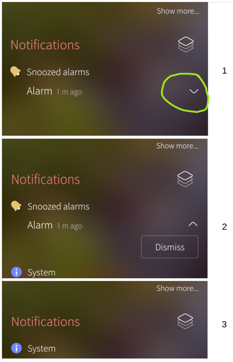
Confirming an alarm after it’s timeout leads to sounding alarm again after 5 minutes!!!

I want to say with this:
An alarm rings, and it stops sounding after abt. 40 sec. or so,
Often I am too slow to confirm the alarm within this time,
Then I try to confirm the alarm, after it stops from itself,
→ Alarm sounds again after 5 minutes!!!

So I have to confirm again, while the second alarm tone is sounding the second time, thats not good.

There should be a ‘Stop’ button remaining active on the screen, the whole time after an alarm, till the alarm is confirmed, and not only while the alarm is sounding.

The notification of a missed (snoozed) alarm appear in the Events View (swipe sideways). To the right of it, there is an arrowhead. Tap that and the Dismiss button appears. Tap it, and the alarm is killed forever.

Why is it not on the active screen? Well, to keep the active screen less crowded. To keep it focused to what is handled by the active app. The notifications have been collected to the Events View - easy to find, easy to access.

2 Likes

To be fair, if you do not know that there is a dismiss button hidden, you would probably not find it.

I understand the design decision behind that and I do not have a better idea. But maybe someone does.

(Maybe just change the dismiss button to an icon and put it where the arrow is?)

Thank you @jovirkku , I understand the line of thinking behind this. But if there appears only one item after clicking the down-arrow, it would be more commonsensible to place this one item directly instead the arrow, to make it quicker accessible.

In a case where there are two or more buttons hidden behind the opening arrow, this line of thinking would be 100% right.

As I understand it, while there is valid discussion around design decisions here, the original bug has now been answered by @jovirkku.

To try to keep things clean and understandable, I’m therefore going to close this topic. If there are strong feelings about the events view design, I’d suggest creating a separate Feature Requests topic so that it gets the visibility it deserves. Having said that, if anyone is unhappy with me closing this, please let me know via direct message.