MikroBitti (Finnish tech magazine, issue 9/26) publish a review of Jolla Phone. One of their statements about display was:
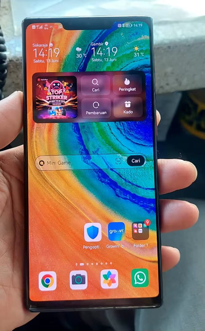
The phone’s AMOLED display appears to be poorly calibrated. Shades of red and blue are particularly emphasized, appearing distorted in a way that is jarring to the eye.
According to Jolla, the display on the phone we tested was defective, and the display quality of retail units should be better.
(translated by Google)
But still they managed to measure “infinite” contrast.
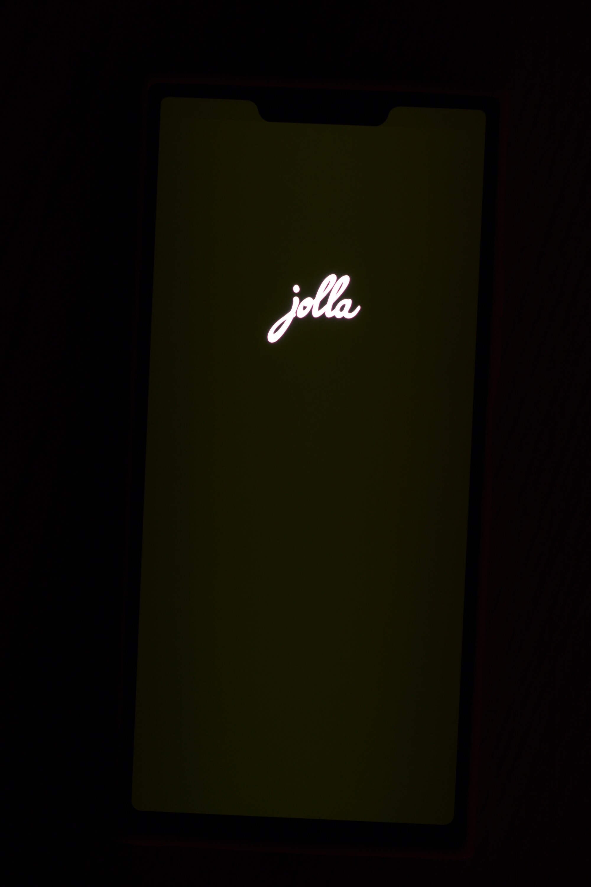
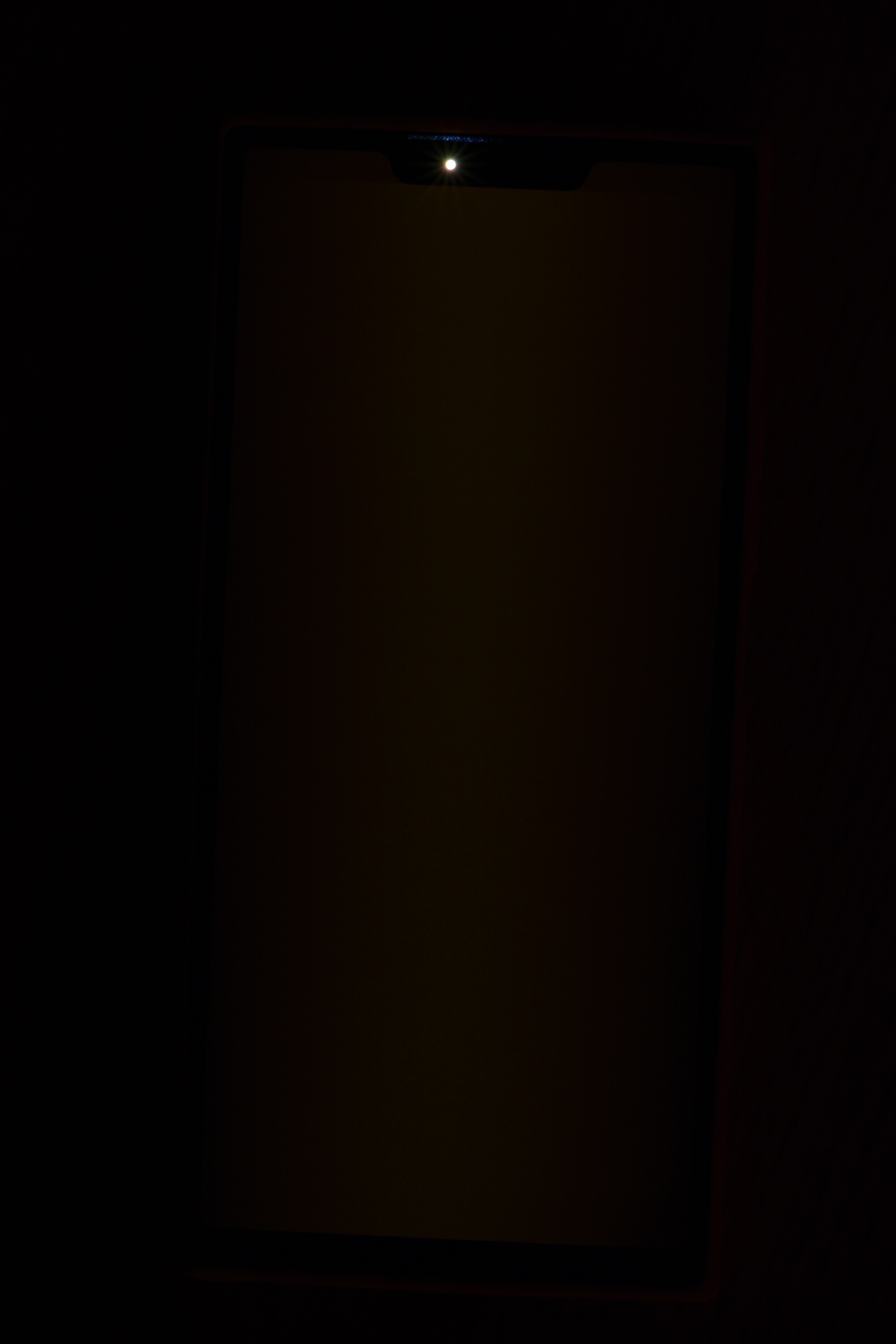
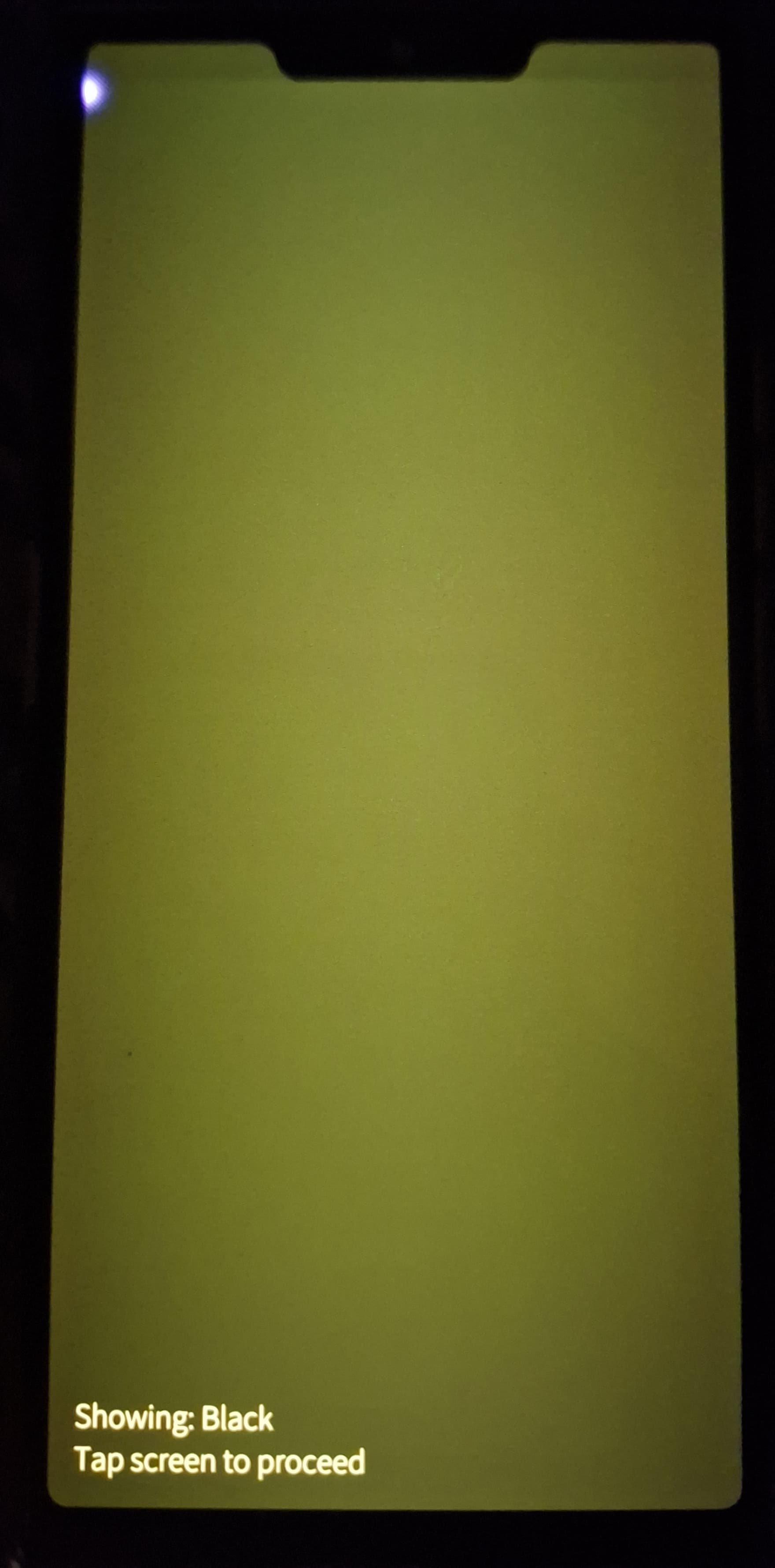
Anyway, my batch #1 specimen is one of those ‘gray is new black’ units. Slightly annoying when days get darker and un-OLEDness comes more visible… I read lot of ebooks, white-on-black, now white-on-grayish-black. I changed wallpaper to black, so bleakness of colors does not pop up like it did with ‘Water’ ambience.
But I trust that Jolla handles this so that all will be happy.